| Image |
Comment |
| 05/12/2007 03:19:02 PM |
|
| 05/12/2007 04:39:54 AM |
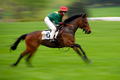
off and runningby cybermayberryComment: Really good motion blur shot. Great composition, nice plain background, perfect amount of blur on the horses legs and good focus on the horses head. If the jockey's face was as sharp as the horses head this would have been perfect but I think for this challenge it's a great shot. |
| 05/12/2007 04:35:55 AM |
|
 Photographer found comment helpful. Photographer found comment helpful. |
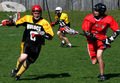
| 05/12/2007 04:31:01 AM |
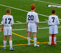
Put us in the Game, Coach!by TwigComment: Good bright colours and contrast. Good light and I like your theme of this aspect of the game (I never got picked much as a kid). A bit more space either side of the outside guys would make this a better shot I think but It's pretty good all round still. |
| Photographer found comment helpful. |
| 05/12/2007 04:23:39 AM |
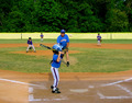
The wonder yearsby Dirt_DiverComment: Cool shot. Nice colours and the ball in mid air is good. The outfield is well placed against the green background. |
| Photographer found comment helpful. |
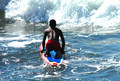
| 05/10/2007 07:05:43 AM |
Into the Surfby ShanzlComment: Looks like an exciting moment for this guy. The whites in the breaking waves are a bit blown out which stops you seeing the texture in the wave. |
| 05/10/2007 07:01:05 AM |
Determinedby drewyramoneComment: Nice and bright. The guy in the background ruins the free space between the 2 main subjects in the front. Your title suits well. |
| 05/10/2007 06:53:02 AM |
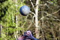
effortby kristofoComment: I like this different composition and the concentration on the guys face. Light on his face looks good too as does the blurred out background. My only pick is the out of focus or motion blur on the ball it's only slight but it would have been nice if it matched the sharpness of his face. Good shot. |
| Photographer found comment helpful. |
| 05/10/2007 06:20:16 AM |
Oops!by abigatedComment: A good fun shot and title to suit. A boost in contrast and saturation may have made this a stronger looking image. Overall composition actually isn't too bad even though you've chopped away at the edges of everything. You have a plain background and space around your model and the ball and that makes it good. The blurred motion is good too. |
| 05/10/2007 06:13:25 AM |
come join usby Car54Comment: Hope you got out of the way. I think your choice of black and white was a good one, save a those different competing colours. The symmetry of the buildings in the background looks good too. |
| Photographer found comment helpful. |
Home -
Challenges -
Community -
League -
Photos -
Cameras -
Lenses -
Learn -
Help -
Terms of Use -
Privacy -
Top ^
DPChallenge, and website content and design, Copyright © 2001-2026 Challenging Technologies, LLC.
All digital photo copyrights belong to the photographers and may not be used without permission.
Current Server Time: 07/22/2026 03:47:42 AM EDT.