| Image |
Comment |
| 04/21/2005 06:43:55 AM |
the Colors of Musicby peterishComment: what an interesting image. you could probably make it a bit more dynamic by putting the guitar on a bit of an angle, though. good luck! |
 Photographer found comment helpful. Photographer found comment helpful. |
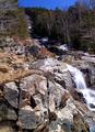
| 04/21/2005 06:41:53 AM |
Spring Snowmeltby mfairbanksComment: this looks like a beautiful place. it would probably be better, though, to come back when the sun isn't so harsh. here, it overwhelms the details that could make this more interesting. good luck! |
| Photographer found comment helpful. |
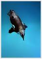
| 04/21/2005 06:39:18 AM |
The Diveby michael_pComment: without any other visual context, this image comes across very strange, almost like a surreal penguin. shame the focus is so soft, because those colors are killer. interesting composition as well. good luck! |
| Photographer found comment helpful. |
| 04/21/2005 06:37:19 AM |
|
| Photographer found comment helpful. |
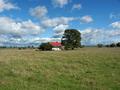
| 04/21/2005 06:30:25 AM |
Little house on the prairieby tasha4pawsComment: i can almost breathe in the fresh air coming across the field...what a beautiful place!
you've got a great vista, but what you're missing is composition and drama. when you center your subject like this, it comes across as a documentary snapshot. simply by changing your perspective and using the rule of thirds, you can make that subject something that catches the eye and invites the viewer to come and visit a while. sometimes, splitting the horizon down the middle can work, but it usually only works best when the two halves are equally compelling and interesting themselves. here, the foreground is just doesn't compete with the sky.
i can't tell if you had the opportunity, but it really would have been killer if you could have caught some of the cloud shadow on the ground.
lastly, you might want to take a look at this desaturized. this looks like it would have some strong potential as a black and white.
all the same, i love the colors, and hope it does well for you. good luck! |
| Photographer found comment helpful. |
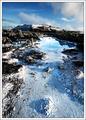
| 04/21/2005 06:13:59 AM |
The Blue Lagoonby oskarComment: this is a wild image. i love the colors and the composition, but also feel it is a bit oversharpened. this definitely has great postcard appeal. hope you get to shoot here often! good luck! |
| Photographer found comment helpful. |
| 04/21/2005 06:11:57 AM |
Lincoln Theatreby PerezDesignGroupComment: nice composition, and fun colors. the focus is a bit soft, giving this a bit of a hand-held field. i think for a shot like this to really work, it either should be razor sharp, or the blurring should be accentuated to take advantage of the colors and lighting. all the same, hope this does well for you. good luck! |
| Photographer found comment helpful. |
| 04/21/2005 06:05:51 AM |
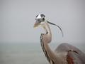
Great Blue Heronby wkmenComment: excellent work! this is one of those shots that are so easy to take for granted, until you try to do it yourself. the composition is fantastic and the capture is priceless. i really hope this isn't overlooked, and that others will take the time to appreciate this. good luck! |
| Photographer found comment helpful. |
| 04/21/2005 06:02:53 AM |
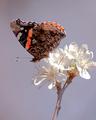
Red Admiral on Plumby vtruanComment: excellent work. beautiful colors, great composition. a wee bit blown out (you might consider burning in some of the petals a bit), but all the same, spot-on on the butterfly! good luck! |
| Photographer found comment helpful. |
| 04/21/2005 06:01:02 AM |
Mountain Bikeby tyrkinnComment: yee-ha! love the capture, but not too keen on the composition. the subject is a bit too far into the image. a vertical or square crop would make it stronger. it also appears that you could boost the contrast just a hair more to take some of the softness off the edges. on the other hand, i love the treatment. good luck! |
| Photographer found comment helpful. |
Home -
Challenges -
Community -
League -
Photos -
Cameras -
Lenses -
Learn -
Help -
Terms of Use -
Privacy -
Top ^
DPChallenge, and website content and design, Copyright © 2001-2026 Challenging Technologies, LLC.
All digital photo copyrights belong to the photographers and may not be used without permission.
Current Server Time: 07/18/2026 11:11:21 PM EDT.