| Image |
Comment |
| 10/07/2008 12:54:40 AM |
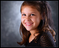
Little Miss Sunshineby scalvertComment: The lighing is very nice except that you have her facing in towards the main light instead of the fill. This has the effect of making her face look thicker then it really is, and is not condusive to a portrait of a little girl. She is also almost sideways to the camera which makes her body look a bit distorted as well as means that for her to look at the camera her eyes are in the corners of the sockets so there is too much white on one side and none on the other sides. I am also interested in why you chose a horizontal composition and cut off her head instead of a simple verticle one with all of her head? This does nothing to add to the photo.
I love your background light in this, it is very effective. She is a great little model and overall this is a pleasant photo, but was very close to being outstanding.
Good luck. |
 Photographer found comment helpful. Photographer found comment helpful. |
| 10/07/2008 12:50:06 AM |
Wild Childby scarbrdComment: If only the background was not totally distracting this would be a really nice portrait of this nice young lady. Everything else about it I like. |
| Photographer found comment helpful. |
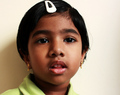
| 10/07/2008 12:49:21 AM |
Shyby mqnaufalComment: If she was a bit farther from the background to get rid of that shadow it would be a very nice portrait of this little girl. Also watch the cropping of the head, either make sure it looks like it was on purpose or do not do it at all. Is there a reason why you took this as a horizontal instead of a verticle shot? I think the extra space fights for the viewer's attention at the sides.
Overall a nice rendering of her which would have been much better with a couple of adjustments. :)
Good luck. |
| Photographer found comment helpful. |
| 10/07/2008 12:46:57 AM |
A litle girlby biggisComment: A nice little model you have there. :)
The main issue I have with this shot is the severe craning of her neck to face the camera. She is totally sideways to the camera. Try her at a 45% instead. Seems slightly overexposed as well. Fix those two things and you have a winner. :) |
| 10/07/2008 12:44:47 AM |
That's a real Stradivarius.by jimsappComment: the real expensive violin would explain why he looks so tense and nervous perhaps? To me the photo even though the lighting is ok just lacks some pop, like it is amost missing some tonal range for some reason. |
| 10/07/2008 12:42:49 AM |
Little Boy Blueby emily212Comment: If you are going to do an ultra closeup it is a good idea to so so with a longer lense so that the nose does not look extra huge like it does here. Sorry but this one does not work for me at all. |
| Photographer found comment helpful. |
| 10/07/2008 12:41:44 AM |
Sugar and Spiceby karmatComment: unfortunately this shot is way overexposed, to the point that trying to bring it back to normal has shifted all your skin tones horribly. A nice idea, but needs a re-shoot to fix this overexposure. |
| Photographer found comment helpful. |
| 10/07/2008 12:40:17 AM |
My Preciousby artvetComment: Great lighting job here. It is a shame about the crummy apple laptop he is holding. lmao 8 |
| Photographer found comment helpful. |
| 10/07/2008 12:37:19 AM |
L'homme de penséeby slide12345678Comment: It could use a bit more fill to keep the shadow side of the nose from going almost black, and it looks like your background light is spilling onto the side of your subject causing discolouration. I am also not a fan of the crop off of the head.
fix those things and it would have been a 10. now it is a very nice 6. |
| Photographer found comment helpful. |
| 10/07/2008 12:35:09 AM |
|
Home -
Challenges -
Community -
League -
Photos -
Cameras -
Lenses -
Learn -
Help -
Terms of Use -
Privacy -
Top ^
DPChallenge, and website content and design, Copyright © 2001-2026 Challenging Technologies, LLC.
All digital photo copyrights belong to the photographers and may not be used without permission.
Current Server Time: 06/21/2026 05:24:48 AM EDT.