| Image |
Comment |
| 12/27/2004 03:51:50 PM |
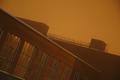
-empty storage-by HokaheyComment: Quite a stark photograph which symbolizes the emptiness within. I like the toning you performed on this shot. Everything appears to be focused well, and the overall composition is pleasing.
If it was in a different challenge, this entry would probably fare better. |
| 12/27/2004 03:48:57 PM |
The Vaseby xtabintunComment: Famous illusion...did you draw it in with photoshop or did you use cardboard cutouts? |
 Photographer found comment helpful. Photographer found comment helpful. |
| 12/27/2004 03:20:15 PM |
"Hidden Face"by tfarrell23Comment: I see it, over on the larger rock. Nice composition overall and very appropriate entry for this challenge. |
| Photographer found comment helpful. |
| 12/27/2004 03:17:31 PM |
|
| Photographer found comment helpful. |
| 12/27/2004 03:16:18 PM |
Santa and friends (only cropped and rotated)by CamComment: Nice fluffy clouds, but I cannot spot the face, much less something that resembles Santa.
Technically, this shot is somewhat flat. Under advanced editing rules, you could have increased the contrast to give this shot more depth, by adjusting either levels, curves, or bright/contrast. I would suggest doing a hue/saturation adjustment to deepen and saturate the blues. Lastly, there is noticable JPEG artifacting due to aggressive compression and the resulting miniscule 24,000 byte file size. |
| Photographer found comment helpful. |
| 12/27/2004 03:09:56 PM |
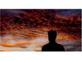
to ugly face for such beautiful sunset!!!!by simbaComment: Border is poorly constructed. The margin on the right is wider than on the left. You can create a pleasing border with balanced proportions by using 'canvas size' in Photoshop (or equivalent).
The sky is out of focus since you focused on the silhouette. I agree that the sky is very beautiful, and if you got the sky in better focus, this shot would have much more appeal.
As for meeting the challenge, "the face you submit may not be something that is intended to be a face". I think this means that you cannot use a person's head, silhouette or otherwise, to represent the hidden face.
Overall, you have here an out of focus shot of the fantastic sky and the silhouette is very distinctive and adds much artistic interest. The border kills this shot for me, unfortunately. |
| 12/27/2004 02:30:48 PM |
Small Naughty Birdieby RayEthierComment: Quite a unique entry, in that most submitted human faces. Technically and artistically presented very well without any glaring deficits. The background complements the bird well, but the texture is slightly distracting..perhaps a more solid, uniform backdrop would have given this a more clean presentation. Overall a great entry.
Can't figure out your title (naughty) but doesn't bother me. |
| Photographer found comment helpful. |
| 12/27/2004 02:25:29 PM |
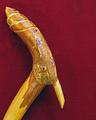
Kahunaby SkipComment: Clever and with good focus and DOF. The mouth and nose are not that obvious but yes I can imagine the lines to represent those elements. |
| Photographer found comment helpful. |
| 12/27/2004 02:23:41 PM |
Weathered And Beatenby dpdaveComment: Creative and artistically presented. My only concern is that those eyes are literally 'eyes' and thus some may question if this entry meets the challenge requirements (I think it does). With that aside, this is a worthy entry without glaring technical deficits. (probably could have adjusted the saturation selectively to make the red and yellow more lively) |
| Photographer found comment helpful. |
| 12/27/2004 02:14:03 PM |
Double Freakedby A VaryaComment: Great idea! Wish I thought of that. There's a bit of blur near the top which detracts. Some noise and lack of sharpness and detail as well. I like your choice of color, given your title. Overall this is a worthy entry that suffers somewhat from a technical aspect. |
| Photographer found comment helpful. |
Home -
Challenges -
Community -
League -
Photos -
Cameras -
Lenses -
Learn -
Help -
Terms of Use -
Privacy -
Top ^
DPChallenge, and website content and design, Copyright © 2001-2026 Challenging Technologies, LLC.
All digital photo copyrights belong to the photographers and may not be used without permission.
Current Server Time: 07/22/2026 04:30:51 PM EDT.