| Image |
Comment |
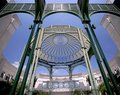
| 06/14/2006 10:03:03 PM |
Duplicityby redeemerComment: Great job on getting both sides fairly close to exposed the same. I was going to try something like this for architecture and could never get it right. |
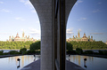
| 06/14/2006 09:51:28 PM |
Vertigoby awpollardComment: I have to get myself a super wide angle lens! this is great I find myself looking all around the photo. The only thing I wish is that the canopy in the background was centered between the green posts. but i only noticed that from looking around so much in the image. |
 Photographer found comment helpful. Photographer found comment helpful. |
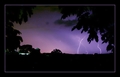
| 06/14/2006 09:41:12 PM |
Light in Nightby sacredspiritComment: hmm looks familiar, glad you put an entry into this challenge too. you seem to have some strange colors/artifacts where the opening in the trees in the sky. If you use the full allowable 150 kb size, it will help get rid of that, yours is 77kb. hope that helps and good luck. |
| Photographer found comment helpful. |
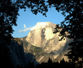
| 06/14/2006 09:29:04 PM |
Half Domeby steffyldComment: great find, I would have moved over to the left abit to get more of the mountain in frame. Also your colors seem abit off, the mountain is abit too yellow. Just some suggestions. |
| Photographer found comment helpful. |
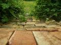
| 06/14/2006 09:12:14 PM |
The Pathwayby Ohshooot2Comment: try this linkIt will show you how to resize images to the max allowable size and your scores will go up. Also I don't see whats supposed to be framed, the bricks are leading lines lead to the gap in the plants but then just grass. |
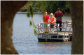
| 06/14/2006 09:09:39 PM |
No Luck!by BugzeyeComment: you should try and always use the full allowable 640 pixel limit on your photos, it will help with your scores. Your picture seems out of focus in both the foreground and background, but you found a nice frame and father son moment, I would have nudged over to the right alittle so that none of the family are blocked by vines. |
| Photographer found comment helpful. |
| 06/14/2006 09:02:59 PM |
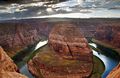
Colorado River - Framedby amit_sahaComment: excellent wide angled shot but I would really loved to have seen the bottom of the river so that we could see the whole "frame" even if you lose some of the sky. |
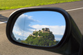
| 06/14/2006 08:59:30 PM |
looking back in historyby cirraschComment: this is a great find in the mirror, I wish you could have had a deeper depth of field so that the mirror was in focus too. 8 |
| 06/14/2006 08:57:37 PM |
::Industrial:Strength::by tmhallingComment: cool shot, I have to hang scaffolding before and it no fun. I think you could have gone wider unless there was some really distracting elements because you would have still had the same vertical distance. |
| Photographer found comment helpful. |
| 06/14/2006 08:55:24 PM |
|
Home -
Challenges -
Community -
League -
Photos -
Cameras -
Lenses -
Learn -
Help -
Terms of Use -
Privacy -
Top ^
DPChallenge, and website content and design, Copyright © 2001-2026 Challenging Technologies, LLC.
All digital photo copyrights belong to the photographers and may not be used without permission.
Current Server Time: 06/11/2026 06:54:05 AM EDT.