|
|
|
Showing 2411 - 2420 of ~2806 |
| Image |
Comment |
| 12/27/2002 05:28:12 PM | |  Photographer found comment helpful. Photographer found comment helpful. |
| 12/27/2002 05:27:19 PM | |
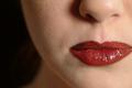
| 12/27/2002 05:25:40 PM | Lipsby bstewartComment: Great focus on the lips! If you could have cropped it just a teeny tiny bit different and kept the entire shape of the lips, this would be perfect. I love the framing of it, though. |
| 12/27/2002 05:24:46 PM | Guidanceby dltruexComment: I like the attempt at a warm tone, but the yellow tint is a bit much for me. Great shot, though. |
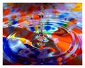
| 12/26/2002 09:04:29 PM | Thirty Three to Forty Five (RPM)by seasickComment: CRITIQUE CLUB!
Sorry this is so late.
Well, there's really not much more that I can say that hasn't already been covered in your comments below. The hot spot of light on the right is a bit much for me, but I'm sure you made that conscious decision and I can't argue with that. The subject of the image is perfect for the challenge and, alien or not, it definitely does depict motion.
This would probably be effective in B/W as well, as you might lose some of the prism effect around the edge of the spinning head. Some higher contrast, either in color or B/W would also bring the belt (?) out more from the background.
Great depth of field, though. I think it was very well done.
Rob :) |
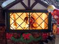
| 12/26/2002 08:47:24 PM | Nosey Neighborby DigipixerComment: CRITIQUE CLUB!
It's late. I know. I'm sorry. I suck.
I have to laugh at the comments on this one. What's funny to me is that the people with purple shirts seemed to "get it" and the people with the grey shirts didn't (for the most part). Personally, this shot did not appeal to me at first, but the more I look at it, the bigger kick I get out of it.
Framing is an issue. I understand that you were trying to put the focus on the people inside the house, but the focus of the photo, IMO, is really the guy on the outside looking in. To that end, the cropping is a bit tight. I would have tried to include the entire figure of the peeping tom, as well as the peak of the window. Granted, it would detract from the "motion" of the shot, but I think it would make for a better photo. Also, the picture could be straightened just a hair. The windowsill especially shows a slant.
Technically, the photo is well-focused. The lighting inside the house is just perfect, but the lighting on the outside is a bit harsh. Notice the hotspot on the peeper's head, esp., and the way the lighting casts a bluish cast on the snow. The photo probably could have been brightened up somewhat without detracting from the lighting and coloring on the inside. I don't know what your software options are, but you could try playing with the levels and also reducing some of the bluish tint overall to make the colors a bit more natural. (Sidenote: ppl in the forums have been recommending a program call THE GIMP as a free alternative to Photoshop. Poke around online and see if you can get a copy if you're interested in more post-production.)
My last comment, really, is that I can see how some ppl would have a hard time seeing the motion of the dancers (?) inside the house. If you were using a tripod, you could have played around with a variety of shutter speeds to allow you to see if there were some other ways of capturing the dancers so they looked more in motion and less plain blurry.
Overall, a great shot and a great idea. Sorry again this came so late. :)
Rob | | Photographer found comment helpful. |
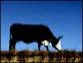
| 12/22/2002 09:48:32 PM | Grazeby FrooberComment: It looks like a cow in the distance on a really hot day. LOL :) |
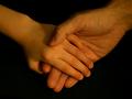
| 12/16/2002 07:44:22 PM | A Splash of Color by RackatComment: I tip my hat to you, ma'am. Excellent work, and I'm still totally jealous.
And please ignore any horrible rumors about me wanting to kick your bootie. They're lies!! All lies!!! LOL
Rob :) |
| 12/16/2002 07:43:02 PM | Corne by muckpondComment: Thanks, kids! I'm thrilled! And I'm also going to kick Rackat's bootie! How dare such a sharply-composed and colorful submission get entered the same week as my "masterpiece"?!?!? LOL.
Thank you all!! Now add me to your favorite photographers lists, you ingrates!! LOL LOL
Rob |
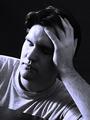
| 12/11/2002 04:19:09 PM | Self Portraitby jkiolbasaComment: CRITIQUE CLUB!
The photo is nicely planned, with good angles and focus. The concept is perfect for the challenge.
You mentioned that you adjusted the contrast yourself. I think you may have gone a bit overboard, as the portions of the photo that are well-lit are REALLY well-lit. Softer light and perhaps a longer exposure would have given you a more even lighting setup.
You also mentioned that you tried to up the blues with the curve tool. I've never had much luck altering color like that. If you want more of a blue cast, and if you have the right software, try doing a very very very slight duotone (or even tritone with a black, grey, and blue). That should give you a more overall blue feel. However, I don't think it was necessary for this photo, as the emotion fulfills the challenge (whether or not some people think so).
Also, and I've said it before, sorry, but you look more sleepy than down. A good off-to-the-side stare would have scored you many more points. And cropping out the table from the lower left would have also helped.
Overall, a great attempt with great technique. Some more work on the setup and processing, and you've got it made.
Rob |
|
Showing 2411 - 2420 of ~2806 |
Home -
Challenges -
Community -
League -
Photos -
Cameras -
Lenses -
Learn -
Help -
Terms of Use -
Privacy -
Top ^
DPChallenge, and website content and design, Copyright © 2001-2026 Challenging Technologies, LLC.
All digital photo copyrights belong to the photographers and may not be used without permission.
Current Server Time: 07/17/2026 06:47:01 PM EDT.
|