| Image |
Comment |
| 08/04/2003 09:24:56 AM |
|
| 08/04/2003 09:20:26 AM |
|
 Photographer found comment helpful. Photographer found comment helpful. |
| 08/04/2003 09:20:02 AM |
|
| Photographer found comment helpful. |
| 08/04/2003 09:18:19 AM |
|
| Photographer found comment helpful. |
| 08/04/2003 09:16:37 AM |
|
| Photographer found comment helpful. |
| 08/04/2003 09:13:24 AM |
Meatby hortopthComment: you got robbed...this is a definite winner! |
| 08/04/2003 09:10:20 AM |
|
| Photographer found comment helpful. |
| 08/03/2003 12:25:50 AM |
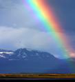
Tuolumneby JPRComment: Hi from the Critique Club --
First Impression: A GREAT shot! Beautiful!
What I like: Well, actually...What I Love: color, focus, subject, scenery, exposure, levels -- all perfect. Just gorgeous. I can't think of anything to improve upon.
What I don't like: I'm afraid I'm going to have to go with the majority of the commenters and say that I don't see the "contrast" in this photo, unfortunately. I know the desire to post a shot like this and hope people make it fit the challenge, but I think this would be a winner for landscapes, postcards, travel, etc... Just not right for "Contrasts"
Congratulations. I'm blown away.
Rob |
| Photographer found comment helpful. |
| 08/03/2003 12:22:27 AM |
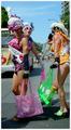
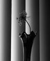
Reaching for the lightby ladpupmoeComment: Howdy from the Critique Club --
Just to start, this is a very striking image that I enjoy quite a bit. It fits the challenge well and was obviously well-received. Congratulations on a great shot.
What I like: the use of the vertical blinds as a backdrop is excellent -- a relatively common object that has a pattern that's easy to contradict. The shape of the flower really pops from the background and that's excellent for this challenge.
What I don't like: the vase. I think this picture would be more effective if the flower by itself was presented as the contrast to the background. I say this for two reasons. One: The reflections of the blinds in the vase make it blend into the background when you want it to pop -- and i totally know that it's very hard to shoot really shiny objects like that. Two: the vase is too vertical, again making it blend into the background too much. The wavy top helps, but again I think the flowerhead alone would have more impact. A bit more lighting on the flower would also help clear up a little of the darkness -- not too much, but just a tiny bit more detail.
Overall, excellent. A photo to be proud of. |
| Photographer found comment helpful. |
| 07/31/2003 10:28:31 AM |
|
Home -
Challenges -
Community -
League -
Photos -
Cameras -
Lenses -
Learn -
Help -
Terms of Use -
Privacy -
Top ^
DPChallenge, and website content and design, Copyright © 2001-2026 Challenging Technologies, LLC.
All digital photo copyrights belong to the photographers and may not be used without permission.
Current Server Time: 07/18/2026 10:27:39 AM EDT.