| Image |
Comment |
| 01/20/2004 06:30:21 PM |
|
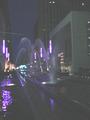
| 01/20/2004 06:22:43 PM |
from inside, when so bad outby fanfuineComment: I think perhaps you should have pointed the camera a bit more upwards. The colours of the buildings look more interesting than the street - too much grey in the foreground. Alternately cropping about a quarter off the bottom and just to the left of the nearest car would look pretty good.
That\'s just my opinion though. It\'s pretty interesting as it is. |
 Photographer found comment helpful. Photographer found comment helpful. |
| 01/20/2004 05:53:46 PM |
|
| 01/20/2004 05:46:41 PM |
|
| Photographer found comment helpful. |
| 01/20/2004 05:44:55 PM |
A Dança de águaby Sly_tonyComment: This looks very washed out - either overexposed or lightened too much in post-editing. With some levels adjustments and neatimage, it would look pretty good. |
| 01/20/2004 05:38:45 PM |
|
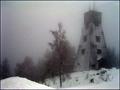
| 01/20/2004 05:27:16 PM |
Snow Wind And Fogby MonaComment: This is a really nice shot - pity about all the noise. I tried running it through neatimage and it looks great. Send me a message with your e-mail address if you want to see the result. |
| Photographer found comment helpful. |
| 01/20/2004 05:23:03 PM |
A Child's Dreamby Melly8522Comment: I'm wondering if it was possible to get into a position where the light was in the middle of the net. It would have made the compostion much stronger. |
| Photographer found comment helpful. |
| 01/18/2004 06:09:50 PM |
|
| Photographer found comment helpful. |
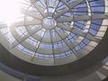
| 01/18/2004 04:57:20 PM |
Design Museumby TTCmpComment: It's a pity there is so much glare in the left top corner. Perhaps if you cropped that off this picture would work better. |
Home -
Challenges -
Community -
League -
Photos -
Cameras -
Lenses -
Learn -
Help -
Terms of Use -
Privacy -
Top ^
DPChallenge, and website content and design, Copyright © 2001-2026 Challenging Technologies, LLC.
All digital photo copyrights belong to the photographers and may not be used without permission.
Current Server Time: 06/18/2026 11:04:55 PM EDT.