| Image |
Comment |
| 06/17/2004 01:19:08 PM |
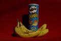
Healthy or NOT?by platy123Comment: This could be a better shot with more lighting. Most product shots try to reduce shadows by throwing multiple diffused light around - removing or reducing the shadows significantly (check out the almond bar photo in this contest - not mine). Also - I don't know how healthy those bananas look - I would have gone for more complete yellow to get the concept across. |
| 06/17/2004 01:17:30 PM |
|
 Photographer found comment helpful. Photographer found comment helpful. |
| 06/17/2004 01:16:48 PM |
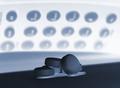
Vanity 5by bil99Comment: I guess I just don't get the choice here. To take the pill or not? To take all the pills at once? and what does the Vanity title mean? Sorry for my ignorance. Interesting photo though - with a nice tinge of the blue (Viagra?). Good work with the lighting as well. Is this a negative image? |
| 06/17/2004 01:14:44 PM |
MY choiceby Sheila_LawsonComment: I like the concept (and I don't know if its intentional), but the sky is missing! This is distracting to me, and loses some of the impact of the phoot. Also, I don't know who you are - so is your choice the two of them? or are you the guy and like the girl, or the girl and like the guy? Get what I mean? Focus on your subject and you'll be able to convey more. A tight crop of the face would better indicate who your "choice" is. |
| 06/17/2004 01:11:21 PM |
What's for dinner?by nicoledbComment: This is nice - but I think a top down shot of the buckets with fish would have conveyed more "choice". The shot subject seems to be the man with the bowl than the fish. Making the fish in the buckets more of the subject would have added more to this. you could crop this in the middle (and keep the bottom), to better convey choice. |
| Photographer found comment helpful. |
| 06/17/2004 01:09:20 PM |
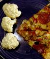
Cauliflower or Pizza?by SMW409Comment: Good concept - but the colors seem flat and dull. Also - the reflection on the plate (near the bottom cauliflower) is a little distracting. Also note that the pizza is cropped slightly off center on the side- perhaps making it more centered on the side would have added some more "structured" lines to the image and created a nicer balance. |
| Photographer found comment helpful. |
| 06/17/2004 01:07:35 PM |
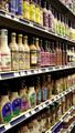
choicesby igfischComment: I thought of a similar concept before I finally entered my shot. Nice work. The picture is quite tall, and I would have gone for a shelf or two less... just to make it easier to view - perhaps a wider shot with a longer depth of field. Nice work. |
| Photographer found comment helpful. |
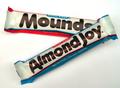
| 06/17/2004 01:06:33 PM |
Sometimes you feel like a nut....by indianzfanComment: Great product shots - nice work reducing the shadows and working out effective lighting. The red looks more saturated than the blue, but thats just a small issue (or perhaps you *chose* it to be that way :-) ) |
| Photographer found comment helpful. |
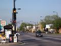
| 06/17/2004 01:05:06 PM |
Choice: Step on Gas or Brakeby TaxladyComment: You could have cropped this tighter around the light. I don't think the clutter to the left of the light is necessary to convey the sense of "brake or not". Good concept. |
| Photographer found comment helpful. |
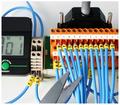
| 06/17/2004 01:04:21 PM |
Just cut the blue wire!by anirenoComment: Great shot - looks complex but actually feels simple - the colors work well, and the timer at 1 sec is a cool extra touch! I would have cleaned the scissor blades - just seems like a small distraction. Nice work. |
| Photographer found comment helpful. |
Home -
Challenges -
Community -
League -
Photos -
Cameras -
Lenses -
Learn -
Help -
Terms of Use -
Privacy -
Top ^
DPChallenge, and website content and design, Copyright © 2001-2026 Challenging Technologies, LLC.
All digital photo copyrights belong to the photographers and may not be used without permission.
Current Server Time: 07/19/2026 09:54:14 PM EDT.