| Image |
Comment |
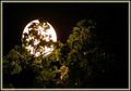
| 01/17/2006 04:38:46 AM |
Backlit Moonby hitmanrrComment: I like the concept of this picture. Perhaps back off a bit to reduce the glare of the light and to create a tighter picture. IF I could have seen the moon features, and the backlit part of the plant it would have been fantastic and gotten a well deserved 10!! |
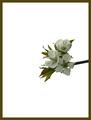
| 05/03/2005 08:51:44 AM |
Cherry Tree in Bloomby roonieComment: Nice idea. Perhaps a different background instead of the glaring white.
This would then enhance the definition of the flowers. |
 Photographer found comment helpful. Photographer found comment helpful. |
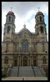
| 05/03/2005 08:50:20 AM |
I'm Here Godby eyesightphotoComment: I'm failing to see how this qualifies for minimalism. I would like to point out that your entire building seems to be leaning to the right. Perhaps a quick visit in photoshop, crop, and rotate slightly to the right would have corrected this.
Other than that it's a nice picture of a church. |
| Photographer found comment helpful. |
| 05/03/2005 08:45:36 AM |
|
| 05/03/2005 08:42:14 AM |
Dandelionsby wgoodeyComment: You really needed the blue sky to make this work...
Unfortunately... you've got clouds...
(But hey... the rain makes the grass grow!!) |
| 05/03/2005 08:40:59 AM |
Long Journey Homeby lissylouComment: Definately minimalist; however, it always helps if people can determine what the subject is. |
| 05/03/2005 08:36:31 AM |
When Less is Moreby DianaBComment: I really like what you're trying to do here.
Perhaps try doing some more bracketing to get more definition to the snail. As it is it's having a hard time looking three dimentional because of the brightness of the white. |
| Photographer found comment helpful. |
| 05/03/2005 08:27:10 AM |
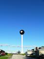
Eight Ball in the Sky Pocketby S_WriterComment: Very cool concept here. Yet the visual grounding is distracting due to the business of it. Perhaps go for a closer shot of the upper section of the water tower. That with the blue background would have been truely minimalist.
As it stands... Cool idea.. Just needs to be developed a bit further. |
| 05/03/2005 08:24:43 AM |
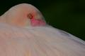
The eye (Flamingo)by RUEDISCHMUTZComment: I like the picture. (although I'm not quite understanding what it has to do with minimalism.)
Personally I wonder what this would have looked like cropped a bit tighter, lightened a bit, with a slight tilt towards the magenta. (CMYK) |
| 05/03/2005 08:21:43 AM |
door knobby robadsyComment: This is definately in the spirit of the challenge!!
Simple yellow... defined black line... and simple blue door...
With an accent of a Door Knob... Nicely done. |
| Photographer found comment helpful. |
Home -
Challenges -
Community -
League -
Photos -
Cameras -
Lenses -
Learn -
Help -
Terms of Use -
Privacy -
Top ^
DPChallenge, and website content and design, Copyright © 2001-2026 Challenging Technologies, LLC.
All digital photo copyrights belong to the photographers and may not be used without permission.
Current Server Time: 07/15/2026 09:56:04 PM EDT.