| Image |
Comment |
| 01/11/2007 10:04:07 PM |
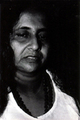
Gimme That Olde Time Religionby pixelpigComment: I'm not sure of the noise in the image is intentional, but it's not working for me (it looks like a scan of an old/worn image). But what really hurts the image for me is that the eyes fade into black. |
 Photographer found comment helpful. Photographer found comment helpful. |
| 01/11/2007 08:19:10 AM |
Deep eyesby CheshireCatComment: Nice sharp eyes, good shallow DOF. Could have used a little more light. |
| 01/11/2007 08:18:40 AM |
|
| 01/11/2007 08:18:24 AM |
|
| Photographer found comment helpful. |
| 01/11/2007 08:17:49 AM |
Pretty womanby BrianDComment: For my tastes... the contrast is just too much. No detail left in her hair, and the side of her hand is completely blown out. |
| 01/11/2007 08:16:23 AM |
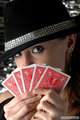
If Looks Could Kill...by commendatoriComment: Nice lighting. Too add a little more "wow factor" to this, you need to sharpen the image overall (but only a little bit), plus selectively sharpen her eyes. |
| 01/11/2007 08:13:53 AM |
Steff_132by printer4uComment: Love the lighting, pose and expression. Nice use of a hair light to separate her from the background. Once more, selective sharpening on the eyes would be helpful, but nothing else to say about this one. |
| Photographer found comment helpful. |
| 01/11/2007 08:11:30 AM |
Steff_066by printer4uComment: Very playful. Here I think the lighting on her eyes and face rocks. Just need to tone it down a little bit on her hands. I like the cards as bright as they are, it's just her right hand (left side of image) that feels blown out. And as mentioned on another image ... selectively sharpening the eyes after you reduce the image for the web would help. Message edited by author 2007-01-11 08:12:02. |
| Photographer found comment helpful. |
| 01/11/2007 08:10:14 AM |
Steff_122by printer4uComment: I like the pose, lighting and expression a lot. You might want to selectively sharpen the eyes just a bit more. (they may be okay in the full size print and simply lost their sharpness when you reduced it for the web) |
| Photographer found comment helpful. |
| 01/11/2007 08:09:07 AM |
Steff_172by printer4uComment: Love the playful look. Could bump the contrast just a bit more to make the colors "pop" a little more. I'd also like to see a little more light on her eyes... which you could easily do in post. |
| Photographer found comment helpful. |
Home -
Challenges -
Community -
League -
Photos -
Cameras -
Lenses -
Learn -
Help -
Terms of Use -
Privacy -
Top ^
DPChallenge, and website content and design, Copyright © 2001-2026 Challenging Technologies, LLC.
All digital photo copyrights belong to the photographers and may not be used without permission.
Current Server Time: 07/22/2026 10:18:40 PM EDT.