|
|
|
Showing 531 - 540 of ~1460 |
| Image |
Comment |
| 10/07/2005 09:07:20 AM | Natural Symmetryby JeanComment: A remarkable photo in every way. Lighting is great, choice of background is genius. A superb entry to this challenge. |  Photographer found comment helpful. Photographer found comment helpful. |
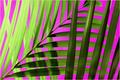
| 10/07/2005 09:06:22 AM | Whirlwind Passion (Floral)by NeilComment: This is quite simply breathtaking. Wow. If you don't get punished by voters who don't care for the abstractness, this ought to ribbon. This is a technique I want to master, thanks to your work. If it's you, NS, superb job buddy. | | Photographer found comment helpful. |
| 10/06/2005 08:59:16 PM | Baseballby hstegComment: Wow, simply beautiful. Great lighting and shadows, wonderful detail on the stitching and leather. But WTF? Coffee shop?? Who cares. 7. | | Photographer found comment helpful. |
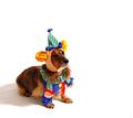
| 10/06/2005 08:34:21 PM | Happy Birthday (Where's The Party?) by idnicComment: Greetings from the Critique Club
by strangeghost
COMPOSITION
Ah, first time I've gotten a ribbon-winner to critique! Here goes: Composition is perfect. A cute dog is a very good choice for a subject. A cute dog wearing an adorable costume is tough to beat. The off-center composition and liberal use of negative space work well. With the dog's very attentive look, it's obvious that you've riveted her attention with something just off camera. The composition creates a sense of anticipation as we're drawn into the expression her face. I'm usually the commenter calling for a tighter shot on faces to bring out the emotion and feel, but I think you've captured it perfectly here, and her body language adds to the attraction. The angle of the shot, using the floor as the whole of the background is great, avoiding any distracting clutter or extraneous detail.
TECHNIQUE
Very nice job managing the bright white backdrop. It doesn't overpower the dog or costume colors, and manages to look so effortless that it's hard to imagine any other color back there. Lighting is very nice, and the understated shadow is perfect. I'd like to see a bit more light on her face but as I've said above, the facial expression is preserved and adds so much to the impact. Good post processing and camera control. You didn't give any details which makes me think auto mode, but whatever, it worked for you and you got a real winner here, in more ways than one.
OVERALL IMPACT
Your score speaks for itself, and a ribbon to boot. I hope you're happy with this image. This is a pet shot that manages to convey tons of personality. Anyone would have been proud to have shot it. It begs to be printed, framed, and hung.
| | Photographer found comment helpful. |
| 10/06/2005 06:51:01 PM | Coffee Barristaby Sherri1209Comment: A very busy shot that manages to capture the ambiance of a typical coffee shop. I'd suggest a tighter crop to eliminate some of the extra detail that doesn't accentuate the main subject, the girl. Using my hands to crop out everything to the left of her right hand and below the left pinky still gives me a great shot of her (and a little tighter on her face) but eliminates the paper cubs, the label on the milk container, etc. There's also a little bit of a red caste to her skin that seems unusual. What I like most about this shot is her face. Profile views are wonderful, and that lock of hair hanging down in her eye is a perfect expression of a hardworking caffeine jockey. | | Photographer found comment helpful. |
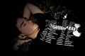
| 10/06/2005 06:44:25 PM | Teen Terra Firmaby Sherri1209Comment: I love the concept behind this shot, but I believe you missed the opportunity to really nail it. I think you were going for a dark feel here but perhaps a bit too dark? You've created a lot of negative space at the left edge and bottom that doesn't necessarily add to the image. Additionally, it feels a little soft to me, maybe a bit too soft in focus. Other detail is lost as well - I can't tell what he's laying on and I can't make out the object just to the left of his chest (music player?). I think you could have tightened up your shot by moving in on his head and upper chest, maybe with the music player laying directly below his chin, to push the concept that he's off in a world of his own, lost in the music. As shot, there's a little too much competing detail that doesn't contribute to this feel (assuming that was your aim). | | Photographer found comment helpful. |
| 10/05/2005 08:38:38 PM | Invitation, Come Join Me At The Beach!by PoobaComment: Greetings from the Critique Club
by strangeghost
COMPOSITION
There's a lot to like in this photo. The blinding orb of the sun sprays its rays downward toward the viewer. Sky, water and reflections are a wonderful feast for the eye. Tones are rich and deep. The bike is a touch of genius - it adds that element of interest and surprise. I'm a little disappointed that the bike is not more prominently placed though. It's SO interesting, I want to see more of it. I want to see it dominate the foreground shot a bit more. I visualize it closer, perhaps right in the large puddle front right, so the bike and it's reflection command the full third square at that bottom right side? As it is, the bike spans the sand, sea, and sky, and seems a little lost in the mix. All my preferences of course. I can see why this shot caught your attention and bravo for having your camera ready!
TECHNIQUE
Good job capturing a scene that spans the entire range from blinding sun to darkest shadows and silhouettes. Too bad you didn't include the technical details of your shot though. Perhaps that means you used full auto mode? My experience with my own Coolpix is that you rarely go wrong using auto, or perhaps the sunset "scene" mode for a shot like this. Works well and paid off in this case. You also give no hint of any post-processing you did, so can't comment on that. Final result is a fine looking pic though.
OVERALL IMPACT
Pretty nice shot and has nice visual impact. Everybody loves a good sunset (or sunrise, in this case) shot and yours is pleasing to the eye. It might have done better in the voting (though a near 6.0 score is quite respectable) if you had stretched more color range out of the sky and maybe toyed with the prominence of the bike a bit. | | Photographer found comment helpful. |
| 10/05/2005 08:21:57 PM | Get Well Soonby TransitComment: Greetings from the Critique Club
by strangeghost
COMPOSITION
He looks like he didn't completely dig being wrapped in gauze! I think you should have filled the frame with the dog. The wide shot with the bed (table top?), bedpan, etc, doesn't really add anything to the shot. The dog, with very high cuteness factor, is the main attraction here so let's see more of him. Tighter on the face and eyes, maybe more detail in the gauze wrappings and pseudo cast on his legs, etc.
TECHNIQUE
I don't think it's brightly enough lit, and the yellowish background is very unappealing. I wish there was more detail to his face and eyes. With 1/40th of a second, I wonder if you were struggling with the low light yourself. The details of his face are difficult to distinguish because everything is in such dark shades. Maybe by eliminating some of the lighter tones in the bed, you could have stretched more tonal range out of the face, showing some more of his personality? Easy for me to say, I haven't shot many dogs.
OVERALL IMPACT
A cute dog with bandages, what could be more endearing? Somehow, you fell short of really pulling it off, IMO, though your score of nearly 5.9 is quite respectable. When I first glanced at your shot, it did elicit an "aaaaawww" from me, just because he's so darned cute. However, the full potential impact of this shot was not realized.
| | Photographer found comment helpful. |
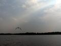
| 10/01/2005 09:15:18 PM | My Grandma and Grandpa used to bring me here..by tolovemoonComment: Greetings from the Critique Club
by strangeghost
COMPOSITION
Composition is excellent. You've placed the horizon near the bottom "third" line giving you a pleasing balance between water and sky. Horizon line is level. The bird is also placed well, adding interest and harmony to the shot.
TECHNIQUE
It is in the technical details that this shot literally falls flat. The colors seem very flat and grays dominate. Other than the pale blues in the sky, there seems to be almost no color at all in the shot. Since you provided no camera setting details, I can only speculate that maybe you were a little over or under exposed and tried to compensate in post-processing. Surely with blue skies, you could have pulled some color out of the water or some greens in the distant foliage? From the appearance of the sunbeam in the sky, it looks like the sun may have been in front of you, to the upper right? That can make achieving the correct exposure tricky, and can fool the camera's internal meter into underexposing the darker parts of the image. At any rate, I can't help but wonder what you might have been able to achieve here with a bit of levels and saturation work in a photo-editor package. With an excellent composition, this image bursts with unrealized potential.
OVERALL IMPACT
Pretty dull and low impact, as your final score of just under 4.3 reflects. Given the emotional significance the shot had for you, I imagine you were a bit disappointed, but surely you see what the voters were responding to? (looking over your voter comments) - Your commenters pretty much touched on everything that I mentioned. "Destinations" was not a huge challenge, but your photo likely didn't cause voters to stop and look more than a few seconds. Let your colors pop. Learn how to use post-processing to your advantage and make a photo - like the bird in this one - soar.
| | Photographer found comment helpful. |
| 09/29/2005 08:57:46 PM | Wednesday's Moonby LadeeMComment: Greetings from the Critique Club
by strangeghost
COMPOSITION
You missed the intersection of the bottom right third by a bit, but I'm not one to take a ruler out on such things. I go by feel, and by what looks right to MY eye, and I suspect you did as well. The moon as a lovely gibbous gem floating in absolute black space is tough to resist, isn't it? Nice composition. Nice feel for how to crop the image and add interest just by subject placement alone.
TECHNIQUE
Astrophotography is damn hard (I know from experience, check my portfolio). The moon seems like such an easy object to photograph, but it's very difficult to photograph well, even with expensive cameras, telescopes, and means to join the two. Your shot has the appearance of a handheld, with enough sharpening and contrast enhancement to make the major lunar features visible. It lacks the critical sharpness and focus that characterizes a classic, drop-dead gorgeous moon shot, but with your composition, that's not really essential anyway. You probably could've tried a slightly faster shutter as some of the lighter areas are a little blown out.
OVERALL IMPACT
I've found that DPCers generally like a nice moon shot, but yours apparently didn't rise to the standard, garnering only a 4.8 final score. As I glance at your comments now, I see some of the voters did decide to take you to task on the placement of the moon, and that probably affected their vote too. I like your shot and hope you continue to experiment with moon shots. Try at moonrise or set, when the moon is low on the horizon and you can compose interesting shots with trees, buildings, people, and other foreground objects.
| | Photographer found comment helpful. |
|
Showing 531 - 540 of ~1460 |
Home -
Challenges -
Community -
League -
Photos -
Cameras -
Lenses -
Learn -
Help -
Terms of Use -
Privacy -
Top ^
DPChallenge, and website content and design, Copyright © 2001-2026 Challenging Technologies, LLC.
All digital photo copyrights belong to the photographers and may not be used without permission.
Current Server Time: 07/18/2026 08:55:36 PM EDT.
|