| Image |
Comment |
| 07/06/2006 03:57:11 AM |
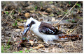
A Day In The Life Of A Frogby JudiComment: Hello from the Critique Club...
Hi Judi,
This is an excellent find, a stunning scene to capture. I would very much like to see the other shots in this series. The cold grey of the birds eyes adds menace to the scene, nature at it's cruelest.
To me it is a shame that this was taken for Motion Capture as it's the motion of the birds head that lets the shot down a little. I think that the birds eye really needed to be in sharp focus. The slight burn in the highlights also distracts. I disagree with Karmabreeze about the color as I think it compliments the birds coloring nicely.
This scored quite low, but would have been up there with the top 10's in other challenges e.g. Nature, decisive moment or Bokeh. Especially with the action frozen. voters are fickle beasts and I think that in the few seconds that the picture is viewed a lot of people would have seen the motion, clicked '4' and moved on. :-(
Your portfolio is excellent and speaks for itself, as does your collection of ribbons. I look forward to seeing more of your work.
Regards
Chris
|
 Photographer found comment helpful. Photographer found comment helpful. |
| 07/05/2006 02:52:59 PM |
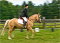
Riding Competitionby docurrieComment: Hello from the critique club...
Hi Doug, This is a really nice shot and meets the challenge very well. There were a lot of panning shots in this challenge but this stands out well. You have shown excellent techniques to keep the heads in focus and there is just enough movement in the horses legs.
The colors are complimentary and the composition is spot on. If I can make any suggestions for improvement it would be that the fence although blurred is s slight distraction and that the highlights (saddle and rail) have been slightly blown out.
Overall an excellent photo that deserved to score higher, but I'm guessing that the voters might have been looking for photos other than pans (?)
I have looked through your portfolio and gongratulate you on some excellent photos.
|
| 07/05/2006 09:31:31 AM |
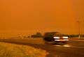
Running from the Martian Stormby nomad469Comment: Hello from the Critique Club..
:-) Interesting title and interesting colors. I have seen Texas storms and can believe that this may well be as it appeared.
Technically the shot is fine, it meets the challenge and the composition is OK. The comments from the voters are interesting. There were a lot of similar entries, well why not it's a good choice for the challenge, but you would need to rise above the rest to really score well. The rainbow is probably the key. On my screen it barely shows and it is a shame that is could not have been more prominent. Perhaps a polarizing filter may have helped in this case to boost the saturation.
Overall nice work and creative title, but it doesn't have the WOW factore to hit the voters between the eyes.
Hope to see more of your work in the coming months.
Regards
Chris |
| Photographer found comment helpful. |
| 07/05/2006 09:14:50 AM |
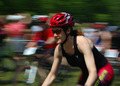
Acceleratingby jduffettComment: Hello from the Critique Club...
Hi John,
This is a really nice photo, technically excellent and a good meet for this challenge. I notice from your portfolio that you have posted other panned photos and your technique here is very good. Especially given the minimal distance to the moving subject. Great work.
The colors really lift the image and you have captured an excellent sense of speed. Voters comments are generally positive as you would expect. I'm not sure I agree with the comment on the harsh shadow, IMO it is not harsh and does not detract from the photo.
Other comments seem to suggest that this was not the only 'bike' picture. It is a reasonably obvious shot for the challenge and as such would need to be exceptional to rise above the others. It is certainly one of the better ones.
It might have been improved had there been more space for the rider to move into and maybe a little more sharpness in the riders face.
Overall I am impressed by this picture and the pictures in your portfolio shows an eclectic mix of subject matter which is always good to see.
I look forward to seeing more pictures from you in the future..
Chris
|
| Photographer found comment helpful. |
| 07/05/2006 03:56:41 AM |
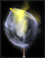
Between Heaven and Earth sits this Balloonby seebrownComment: Hello from the Critique Club...
Hi Chad,
This is really an amazing picture and sits well in your impressive portfolio. I am suprised that you have not scored a ribbon as yet, but am sure it will come very soon. Your photography is of a very high technical standard.
The balloon shot represents an interesting take on the motion blur challenge and this may have contributed to some low votes. Some voters can be very picky on what they expect to see.
The focus point on the tie of the balloon really helps make this stand out for me, although if I can offer any feedback it would be that overall the composition seems a little cramped. It might be nice to givce the balloon a little space to expand in to.
Keep up the great work. This is exceptional and inspirational
Chris |
| Photographer found comment helpful. |
| 07/05/2006 03:48:15 AM |
Eco by TechoComment: Superb. Really like this. |
| Photographer found comment helpful. |
| 07/04/2006 05:31:44 PM |
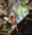
Juvenile Summer Tanager?by amjltComment: Hi Jennifer
Greetings from the Critique Club.
This is an excellent entry for the Bokeh Challenge. You have shown excellent technique and a good choice of DOF and Lens.
The challenge is hard as it requires finding Bokeh to compliment the main subject which you have done perfectly. The Exposure and colors are also spot on.
The overall score is fairly dissapointing, I think mainly because the bird appears slightly out of focus. Voters can be very unforgiving on this point. I suspect as Ozerion mentions that some softness has crept in through re-sizing for the challenge. It is also very useful to get a catch light in the eyes of the subject if possible, as these are the centre of attention they need to have interest.
Regards
Chris |
| Photographer found comment helpful. |
| 07/04/2006 05:22:35 PM |
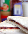
Peanut Butter and Jelly - An American Favoriteby island_girl1Comment: Greetings from the Critique Club.
Interesting photo. I really like the style of your photography, you have an alternative aproach that is quite refreshing.
This is a good example of Bokeh, but did not score well with the voters, why?
The idea of having the jar of PB in the background as the Bokeh is good but just doesn't quite work. I think that perhaps in the few seconds that each voter takes to view a shot they would miss this and see a background that looks a little 'busy' this is a shame as you certainly embraced the challenge and as some voters point out Kudos for bucking the obvious route of birds and flowers!
Minor niggles are that the bread is slightly over exposed and the tray pattern is unnecessary and a little distracting. Perhaps including the whole sandwhich and making the ingedients a little more obvious would help.
Overall I like it and I like your other entries (especially the green cocktail) keep up the great work and don't let anyone tell you what to do... you have a nice style and good eye for a picture.
Regards
Chris (Pixelstate) |
| 07/04/2006 05:12:04 PM |
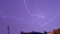
Lucky Strikeby bgslawComment: Greetings from the Critique Club.
Your first lightening photo, really? - Excellent.
You should have seen my first efforts LOL
You received an interesting mix of comments during voting, I am guessing because this is technically very good and a number of voters will be impressed by the cature. The lower votes from those that would expect a better composition.
I really like the sky color and the main subject, the lightening itself is well exposed and captured, but the overall composition is weak. The buildings in the foreground don't add to the shot. It looks like you took an opportunity to capture this from your backroom window and it shows a little. I guess the difference between a good shot and a great shot.
Overall I like it and think that you have done very well. Please, please use this as the beginning and go out and capture more storms. You seem to have a talent for exposure. I look forward to seeing more of your pictures on DPC in the future
Regards
Chris |
| Photographer found comment helpful. |
| 07/04/2006 05:03:48 PM |
Me and just meby naikdarshanComment: Greetings from the Critique Club.
Self portraits are never easy. This is an effective self portrait with interesting lighting and an unusual pose.
The Challenge was to illustrate the effect of Bokeh and your shot does not do that.
Getting good Bokeh effect is as much about the lens and camera as well as good Depth of field. (shallow) the out of focus background needs also to be presented by a pattern that blurs well into interesting abstracts for example water drops glistening in sunlight.
The wood pattern on your bed board might look OK in stronger light with a deeper depth of field.
Chris
|
Home -
Challenges -
Community -
League -
Photos -
Cameras -
Lenses -
Learn -
Help -
Terms of Use -
Privacy -
Top ^
DPChallenge, and website content and design, Copyright © 2001-2026 Challenging Technologies, LLC.
All digital photo copyrights belong to the photographers and may not be used without permission.
Current Server Time: 05/08/2026 05:53:30 PM EDT.