|
|
|
Showing 941 - 950 of ~2507 |
| Image |
Comment |
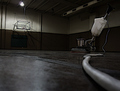
| 06/09/2006 12:55:42 AM | Game Overby DefyTimeComment: Nice shot. Very cool point of view, and a good sound composition. |
| 06/07/2006 03:20:03 AM | Cellar Dwellerby DrAchooComment: Cool shot. Love your title! Sounds like it could be a movie or something :-) |  Photographer found comment helpful. Photographer found comment helpful. |
| 06/07/2006 03:15:17 AM | Emptinessby CarmelynnComment: Although the centered composition can be used effectively at times, I don't think it's working in this case. It looks like you had a lot of space to work with, maybe using the rule of thirds, or an off centered approach would make for a stronger composition here. Some nice natural lighting from the window. With all that space, and the baseboards and corners and such, it just looks like there is more potential here to use some nice leading lines and such. Try exploring different angles and points of view. This appears to be shot from the dreaded 'normal eye level' position. Try from down low, up high, etc. |
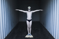
| 06/07/2006 03:01:25 AM | Cool Roomby FirstyComment: Wow, this is a really cool shot. What a great, creative idea. To me, that looks like maybe a self storage unit? Works good :-) Looks like it naturally creates a really interesting lighting effect. This is just a really engaging image. The placement of the subject is great. You've really made the centered comp work well here. In some way, the model works in this room, yet it still has this way surreal out of place feeling. Hehe, and I gotta know, what did you have to bribe 'em with to pose for you? :-) Actually, it looks like it was a real fun shoot. I really like this, great job! | | Photographer found comment helpful. |
| 06/07/2006 02:45:14 AM | Tulipsby kari1Comment: Very nice shot Kari. Congrats on the PB! | | Photographer found comment helpful. |
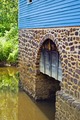
| 06/06/2006 05:39:30 PM | Old Grist Mill 1872 - Detailby jerseyjimComment: Greetings from the Critique Club :-)
This is your entry in Architecture III, and I think it definitely meets the challenge. It's a good subject. Nice interest in the arch (arches just seem to always be so photogenic), and the varying textures of brick, wood and water. I like the angle from which you've shot this. I think it has some good dynamics and 'flow' to the composition. Looks like it was pretty bright at the time, exposure looks good. The image does appear to be a touch on the soft side. There could be different factors here. Did you use a tripod? If not, there could be a little bit of camera shake, although you did have a good fast shutter speed. Possibly a thing to consider would be for a shot like this, maybe going for a little smaller aperture, getting a slightly deeper dof, you can see where at the far edge of the bricks, it is starting to blur, might be nice to show off the detail all across the structure. Since it is just slightly soft, I am wondering if in processing, you used USM on it? Some usm could make the shot more crisp.
I am looking at the shadow and brightness of the light on the trees, and wondering what time of day this was. My guess would be mid-day, or early to mid afternoon? I obviously don't know how the building sits, but if you could catch a time of day to get some low raking light across the structure, it could really show off the texture in the brick face, and really add some tonal depth. It also seems like a little tweaking of basic adjustments could be beneficial. Some levels, curves and or selective color. Hard saying without knowing what editing steps you already used.
Compositionally, like I said, I like the angle, but I think you may have fallen in a place where the image is wanting either a little more, or a little less. I'll try to explain what I mean both ways here. If you went with less- a bit tighter crop, would lose the cut off window at the top for one thing. Something you want to avoid in compositions generally is 'cutting' things off in the frame. It usually comes across as almost haphazard like. The composition should be thought out and things either contribute to the overall image, or shouldn't be there :-) The same with the greenery at left edge. Just a sliver of foliage there doesn't seem to add a whole lot to the shot. Which brings us to the other possibility of going with more- back off, get more of the scene in frame. Include the whole window, more of the greenery, etc. Without seeing the whole building/scene, it is hard to say. I think personally, I would have probably gone for a tighter approach, and really tried to highlight the brick texture and that cool arch and the water. But that's just me :-) Anyways, something maybe to consider in the future.
Overall, not a terrible shot by any means, IMO, just could use a little tweaking here and there. Definitely an interesting subject that looks like it would be well worth exploring further. If you have any questions, or comments or anything, please feel free to contact me.
Happy shooting,
taterbug |
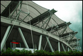
| 06/06/2006 02:26:10 PM | Ecopaby shutterphunkComment: Greetings from the Critique Club :-)
This is your Architecture III shot. Definitely meets the challenge. I think this is a good choice of subjects. There are some interesting lines and shapes formed by the supports of the structure. Technically, looks pretty good. Very good focus. Looks like the weather wasn't cooperating for you :-) The image appears to be just a touch on the flat side, but not too bad. A little bit different lighting conditions perhaps could enhance the photo. It looks like you were going for the dramatic sky. It can be tough trying to capture the perfect conditions within the time frame of the challenge :-) I really like the sweeping curve composition that you've chosen. It makes for a nice 'majestic' vertical across the image, very fitting for this subject, IMO. Although I like the overall composition, I think there are a couple of minor things here that may be holding this photo back. Including bushes, or foliage, especially as a 'framing' element can be a big positive, in this case, I'm thinking that with this building, and especially in the context of this challenge, the bushes don't seem to be adding to the shot. And also, as one commenter pointed out, the red sign I feel is detrimental to the overall presentation here. Splashes of color like that can be great in a shot a lot of times. But here, we are looking at this cool, interesting building, trying to stress the fine architecture, but the eye is strongly drawn to this little red sign, which doesn't really compare to the interest in the structure. I think the same basic shot, from maybe a slightly different POV, eliminating those two factors (bushes and sign) could make for a little stronger presentation in this case.
Overall, not too bad though. A great subject. You've got some nice stuff in your portfolio. I like your leading lines photo, the one of the boy at the window, all in red. And I like the feet one too :-)
If you have any questions or comments or anything, please feel free to contact me.
Happy shooting,
taterbug |
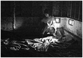
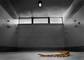
| 06/06/2006 01:11:10 AM | Disturbance in the Shower Roomby bvoiComment: This is a cool idea. Certainly a subject with good interest factor. I see what you're doing with the point of view from down low, but I'm wondering if, given the subject, a shot from high looking down could work, maybe catch the snake in a nice 'S' curve? It's color sure makes him stand out well in the setting you've used. Nice job. | | Photographer found comment helpful. |
| 06/06/2006 01:08:18 AM | Breezeby AnastasiaComment: Cool shot. Very chic looking. Great lighting. I like how you've gone with the pov from down low. I really like how the curtain is 'echoing' the curves of the model. Cool idea. Nice job. | | Photographer found comment helpful. |
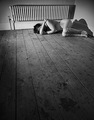
| 06/06/2006 01:03:04 AM | Without You My Heart is an Empty Room.by front_elementComment: Very cool shot. I like the processing, good job. Interesting lighting, creates interesting shadows. Just a great idea. Good choice of setting, and the pose of the subject. The old radiator heater adds some interest I think. A very emotive image, the subjects pose, placement in the comp, and the rough wood plank floor, leading to her really drive the overall concept home. Not everyone can appreciate a good nude, but with a shot like this, I'm sure there will be plenty of folks that like it. I am digging it. Nice job. | | Photographer found comment helpful. |
|
Showing 941 - 950 of ~2507 |
Home -
Challenges -
Community -
League -
Photos -
Cameras -
Lenses -
Learn -
Help -
Terms of Use -
Privacy -
Top ^
DPChallenge, and website content and design, Copyright © 2001-2026 Challenging Technologies, LLC.
All digital photo copyrights belong to the photographers and may not be used without permission.
Current Server Time: 07/24/2026 10:20:51 AM EDT.
|