| Image |
Comment |
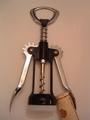
| 01/02/2005 10:48:29 PM |
Protectionby chomaeeComment: A nice idea. Good subject that fits the challenge nicely. I don't like how the cork is cut off though, and the corkscrew looks slightly tilted. I think it might be better if it were either truly diagonal or evenly straight. Lighting looks kind of flat overall except for the hot glare on the left arm of the tool. |
 Photographer found comment helpful. Photographer found comment helpful. |
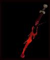
| 01/02/2005 10:42:24 PM |
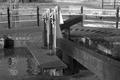
No Way Outby KDOComment: Hmmm, bold statement. Strong image. A little too dark, I think. It is hard to make out detail, that is either a knife or a syringe, hard to tell. An interesting composition though. |
| Photographer found comment helpful. |
| 01/02/2005 10:39:09 PM |
Only Time Will Tellby TDCollinsComment: NIce idea. I really like your lighting here. The hourglass appears slightly tilted to me, I find it just a bit distracting. |
| Photographer found comment helpful. |
| 01/02/2005 10:35:45 PM |
|
| Photographer found comment helpful. |
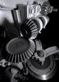
| 01/02/2005 07:00:44 PM |
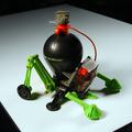
Old Reloaderby bruskiComment: I don't know what a reloader is, but an interesting photo. Definitely looks mechanical to me. Nice opposing lines and angles in the composition. I like the dramatic use of shadows. |
| Photographer found comment helpful. |
| 01/02/2005 06:58:02 PM |
The Simplest of Machinesby MaestroGeek1Comment: A good idea. Nice subject and fits the challenge well. Compositionally, I don't like how the handles are cut off. Should show the whole thing or cut off for purpose. Also I think a use of the rule of thirds would help stronger utilize the negative space and balance the photo out. Lighting is not bad, but IMO, might be better either using a fill to eliminate the shadows, or else make them more dramatic and adding to the shot. |
| Photographer found comment helpful. |
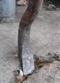
| 01/02/2005 06:52:11 PM |
Prybarby GeneralEComment: Nice idea. I like the 'S' curves of your subject. Looks like some nice textures going on as well. Fits the challenge very well. I think an improvement may be a slightly different perspective, eliminating the post thingy in the upper left corner, it is just a tad bit distracting. |
| Photographer found comment helpful. |
| 01/02/2005 06:48:25 PM |
Safety Firstby aronya1Comment: Good idea. Focus is good. Good lighting and the shadow works in this case. I think a different perspective may be an improvement. Perhaps capturing just the lock and the wood/door that it is on. The curtain or whatever that is in the background kind of clashes and is not to appealing IMO. |
| Photographer found comment helpful. |
| 01/02/2005 06:42:46 PM |
Continue your journey by adjusting the levelby SandymayaComment: I see a lot of potential here for a great shot. I like the b/w. The subject is definitely on topic for the challenge. However, IMO, I find it lacking a little interest factor. It looks like there may be some good lines, and would be worth exploring different perspectives. |
| Photographer found comment helpful. |
| 01/02/2005 06:38:45 PM |
|
| Photographer found comment helpful. |
Home -
Challenges -
Community -
League -
Photos -
Cameras -
Lenses -
Learn -
Help -
Terms of Use -
Privacy -
Top ^
DPChallenge, and website content and design, Copyright © 2001-2026 Challenging Technologies, LLC.
All digital photo copyrights belong to the photographers and may not be used without permission.
Current Server Time: 07/23/2026 05:06:37 AM EDT.