| Image |
Comment |
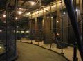
| 06/09/2005 02:54:29 AM |
Scaffolding at Nightby mar10029Comment: This is a great idea. I like the curved path in the bottom of the photo. It seems kind of busy to me though, I find my eye wandering, looking for a strong focal point. Perhaps a different angle/perspective would make a stronger presentation? |
| 06/09/2005 02:51:35 AM |
Barley Streetby whiteroomComment: This is a very nice shot. I like your treatment of it in editing. I find it a very strong composition. It has great leading lines. The men in the center really add to the shot IMO. Great job. |
 Photographer found comment helpful. Photographer found comment helpful. |
| 06/09/2005 02:47:06 AM |
|
| Photographer found comment helpful. |
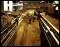
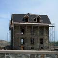
| 06/09/2005 02:44:30 AM |
Building a Haven for Historyby SebiComment: I find this a very interesting shot, but let me say why. I am very torn and undecided as to how much I like it or not, for a couple of reasons. For one thing, I'm not sure if it is how you've edited it in ps, or the lighting or what, but something about it gives me an 'odd' feeling. Also the empty or 'negative' space at right, I am a fan of the use of negative space and I feel it can be a very effective compostional tool, but is also easy to 'over do' it, or not use it properly. At first glance it almost seems like too much here, but upon further examination, I find it balanced in an awkward yet poignant sort of way. I do like the overall composition and framing of the shot. I find it fresh and creative in this field of challenge entries. So anyways, though I am undecided about if I like or dislike, what I conclude is that the photo has compelled me to study and think about that, and that fact makes it a big success IMO, and I am therefore scoring it (not sure exactly where yet) towards the higher end of the voting scale. So in summary - Nice shot. :-) |
| Photographer found comment helpful. |
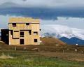
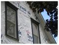
| 06/09/2005 02:27:57 AM |
All Wrapped Upby kswansonComment: Simple, yet interesting composition. The angle you've used creates nice lines and angles with the window frames and roof edge. The tree in the right adds to the shot IMO. I'm wondering if perhaps at least the left window were not cut off at the top left corner, might be a tad bit stronger presentation? |
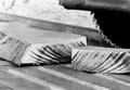
| 06/09/2005 02:19:00 AM |
One step closerby sweet_kibibiComment: Very nice composition. Interesting and uncluttered. Good dof. By the looks of those burn marks on the wood though, maybe the blade needs to be sharpened? hehehe |
| Photographer found comment helpful. |
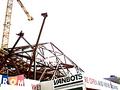
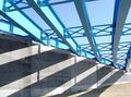
| 06/09/2005 02:16:19 AM |
Bridge Constructionby BarryComment: Wowsers !!! What an awesome composition. First of all, great leading lines and use of vanishing points. The blue girders against the blue sky are very pleasing to my eye. And man, how long did you scope this place out to figure out the perfect timing for those shadows? They really make this shot. This is really a terrific photo, I could just sit and view it for awhile, in fact, I think I will :-) thanks. |
| Photographer found comment helpful. |
| 06/09/2005 02:10:15 AM |
Old and Newby lausiComment: Maybe it's just me, but I find my eye wandering, not really finding a strong focal point. |
| 06/09/2005 02:04:42 AM |
historic restorationby U622Comment: This is a fitting subject and a good idea. The framing is putting me off just a little though. There seems to be an obvious 'tilt' present in the photo. It's hard to tell if the horizon in the distant background is actually level, but the structure itself, and especially the ledge in the foreground are tilted. This could be corrected with arbitrary rotation in ps. I'm also thinking that maybe if the ledge were actually cropped out, or maybe at least to the ledge itself, removing the 'rock wall' portion in the bottom of the frame it could make the shot stronger, as to me, it seems to just be a distraction to your main subject. |
| Photographer found comment helpful. |
| 06/09/2005 01:54:42 AM |
Puzzle Piecesby rr_meyerComment: Interesting concept. Fits the challenge nicely. I'm thinking maybe a tighter crop, filling the frame with the main subject, might improve the presentation of this shot. The pallet of pieces does have some interest, but IMO, the background just doesn't seem to help. |
| Photographer found comment helpful. |
Home -
Challenges -
Community -
League -
Photos -
Cameras -
Lenses -
Learn -
Help -
Terms of Use -
Privacy -
Top ^
DPChallenge, and website content and design, Copyright © 2001-2026 Challenging Technologies, LLC.
All digital photo copyrights belong to the photographers and may not be used without permission.
Current Server Time: 07/24/2026 10:32:42 PM EDT.