| Image |
Comment |
| 06/12/2005 01:34:36 AM |
A Carpenter's Workshopby VISUALperceptionComment: I like the offset angle from which this is shot, and although I've seen similar types of 'busy' photos work, in this case I find my eye wandering listlessly, looking for a strong anchor to focus on and hold my attention, but not finding any thing. Also, overall, the lighting is good, but seems to me like there is a 'harsh' area on the right side. Perhaps if the bench top was not so full and cluttered, it might draw one into the photo more? |
 Photographer found comment helpful. Photographer found comment helpful. |
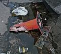
| 06/12/2005 01:20:55 AM |
Crushed and Forgottenby HighwayFlowerComment: This is a great concept but the static composition doesn't really move me. Perhaps a different perspective/angle would make a stronger presentation of this good idea? |
| Photographer found comment helpful. |
| 06/12/2005 01:04:07 AM |
Summer by the seaby nico_blueComment: This is a pretty cool shot. I like the perspective you've used, it seems kind of unique. I imagine there are a lot of boats and stuff around there, I really like how you've isolated the subject and left the shot uncluttered. The photo feels balanced nicely with the dark top and light bottom. Cool sky. I'm wondering though if a slight improvement may be to have a little more gradual darkening of the sky? If possible in your edit? What I mean is, it looks really good how it goes from light blue to black at the top, but seems like it changes from light to dark to black a tad bit abruptly. Not bad really, but maybe something to try? Your contrast change from the earlier version must be very subtle, I can't see much of a difference, but that might be just me :-) Anyways, I do like the shot. |
| Photographer found comment helpful. |
| 06/10/2005 03:37:25 AM |
God Bless....Construction?by cowcollectComment: Although I feel a narrow sizing such as this can make the right photo pleasing, In this case it doesn't really appeal to me. Your focus seems like it could be sharper, it seems like a lot of detail is missing. It seems like with the narrow sizing, the main emphasis of the shot is the flags, but I find the big sign taking the attention away. Perhaps the sign is an integral part of the concept(as hinted too with the title), but with no detail I just can't make out what it actually is or is saying, therefore it ends up being a distracting element to me. Maybe a different perspective/angle would make for a much stronger presentation of this idea? |
| Photographer found comment helpful. |
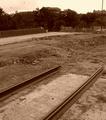
| 06/10/2005 03:25:42 AM |
to be continuedby excaliburComment: This seems like a good subject. I like your b/w treatment. The rails provide good lines. In this case, the background seems to be not helping the presentation here IMO. I'm wondering if maybe framing the shot tighter and showing primarily and perhaps even more of the rails would make for a stronger photo? |
| Photographer found comment helpful. |
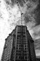
| 06/09/2005 03:20:45 AM |
Upward Ho!by dpakohComment: Very nice shot. Cool perspective. Great sky. I like your treatment of it. Good job. |
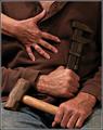
| 06/09/2005 03:17:31 AM |
Pat and Jillyby Bear_MusicComment: Wow. Great composition. Very refreshingly creative for this challenge. Who'd have thought you could make 'construction' sexy? hmm. Nice job. |
| Photographer found comment helpful. |
| 06/09/2005 03:13:30 AM |
The Art of Constructionby PaigeSComment: People have created some great 'abstracts' in this challenge, and this is one of them. Great lines, lots of texture, nice shapes and forms. The play of light and shadows really make the shot. Nice job. |
| Photographer found comment helpful. |
| 06/09/2005 03:01:47 AM |
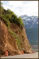
Caution: Hard Shoulderby fifieldComment: Pretty composition. The road has a nice curve to it, I wonder how it would be if the frame were to the right just enough to include the far side of the curve? That is a nice simple, yet complimentary border you've used too. |
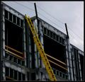
| 06/09/2005 02:58:18 AM |
Yellow Ladderby instepsComment: Nice composition. The shot has great lines and I like the play of light and shadow. The ladder really stands out well against the building background. Good eye. |
| Photographer found comment helpful. |
Home -
Challenges -
Community -
League -
Photos -
Cameras -
Lenses -
Learn -
Help -
Terms of Use -
Privacy -
Top ^
DPChallenge, and website content and design, Copyright © 2001-2026 Challenging Technologies, LLC.
All digital photo copyrights belong to the photographers and may not be used without permission.
Current Server Time: 07/25/2026 08:26:03 AM EDT.