| Image |
Comment |
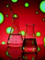
| 03/17/2006 05:01:13 AM |
Chemistry by jodiecostonComment: Wowsers. Cerebral meets psychodelic! Very cool. This is kind of like the classic types of wine glass, bottle type shots done with the chemistry flasks. Cool. Fits the challenge great, very creative. Great lighting. Nice composition. Nice reflections. Just a great idea and execution for this challenge. I quite like it. Nice job. :-) |
 Photographer found comment helpful. Photographer found comment helpful. |
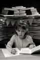
| 03/17/2006 04:49:11 AM |
Consumed by Homeworkby scalvertComment: Awesomely clever! Brought a good smile to my face. I am sometimes slightly disapointed by very clever, cute, humorous ideas, that get translated into poorly executed photos. You, however, have managed to execute this delightfully whimsical and engaging concept rather nicely, IMO. Technicals are fine, and the composition works well. I love the expression on her face, really helps to make the shot, I think. And your treatment of the image works to set the perfect feel for the image. Very nice job! Well done :-) |
| Photographer found comment helpful. |
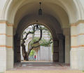
| 03/17/2006 04:36:56 AM |
Late For Classby CamComment: Wowsers!!! This is just an incredible image. It has grabbed my attention and will not let go. Masterfully composed. I can see where most people would try to center the arches, and include the top of the foreground arch, but this just works wonderfully well. Having the slight offset to the archway brings perfect balance against the tree, and makes for a very subtle vertical and leading lines to the tree and girl. The more I look at this stunning photo, I just wiggle with delight! The tree looks as if it were designed to be framed in the archway for just such a photo. The receding arches in the distance add dimension and depth. The girl brings it all together, and adds just a little splash of color. Technicals, focus, exposure and all are good. This scene has been waiting for someone to photograph it, and you had the eye and the will, and the talent to find it. Just beautiful. I like this shot a lot :-) |
| Photographer found comment helpful. |
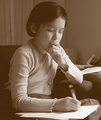
| 03/17/2006 04:23:01 AM |
Enlightenmentby pineappleComment: Nice composition. Beautiful treatment of this photo. Fits the image well IMO. Well done. |
| Photographer found comment helpful. |
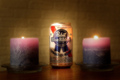
| 03/17/2006 12:47:46 AM |
|
| Photographer found comment helpful. |
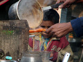
| 03/16/2006 02:21:03 PM |
Practical Education to Run a Tea Shopby abhraComment: A great concept here. Original and creative for the challenge I think. However, it took me a minute to see it. The boy seems easily missed in all that is going on in the shot. You may be suffering some low votes from speed voters that are not catching it. Perhaps a different angle could make him more prominent and strengthen this image. Focus and exposure are good. I really like the concept, just wish I could see a little more of the boy :-) |
| Photographer found comment helpful. |
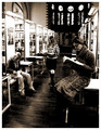
| 03/16/2006 02:16:39 PM |
University of Luxembourgby glodaComment: Nice shot. Good scene, good composition. The whites seem almost blown on the bookshelves and desks, but I think it works with your processing. Great use of triangulation with your subjects. Good job :-) |
| Photographer found comment helpful. |
| 03/16/2006 02:13:26 PM |
|
| Photographer found comment helpful. |
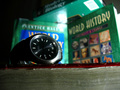
| 03/16/2006 02:12:34 PM |
Sunday Nightby MakrossComment: hehehe, nice idea. The late night cram session :-) I like the dof you've used. The context of the shot is definitely there, but attention is drawn nicely to the watch, to get the concept of the image across. Might be a stronger presentation if the framing were cropped close to the bottom of the watch. It is hard to tell if that is a book or what the watch is sitting on, and feels like it doesn't really add to the shot. Good lighting too, it does have the feel of late at night. Good job. |
| 03/16/2006 02:07:38 PM |
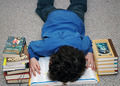
Me falling asleep vs. Educationby krytaComment: hehehe :-), good humor factor in this shot! Good lighting and focus. I like the overall composition, might work well in a portrait crop too. Might be a little stronger if the book were not cut off in the framing at the bottom. Overall, good concept, interesting photo. Nice job. |
| Photographer found comment helpful. |
Home -
Challenges -
Community -
League -
Photos -
Cameras -
Lenses -
Learn -
Help -
Terms of Use -
Privacy -
Top ^
DPChallenge, and website content and design, Copyright © 2001-2026 Challenging Technologies, LLC.
All digital photo copyrights belong to the photographers and may not be used without permission.
Current Server Time: 07/26/2026 11:26:25 AM EDT.