|
|
|
Showing 1031 - 1040 of ~2507 |
| Image |
Comment |
| 03/30/2006 12:02:36 AM | Samplesby jonnieComment: Very cool sensual rush of lines and color. Great composition. It has a very groovy feel of fast motion. Very nice shot. |  Photographer found comment helpful. Photographer found comment helpful. |
| 03/29/2006 11:56:17 PM | America's Pastimeby acoppolaComment: This is a very nice shot. Good composition. Nice lighting, great detail. It doesn't seem very abstract in nature though? | | Photographer found comment helpful. |
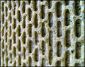
| 03/29/2006 11:55:01 PM | The Eyesby CamComment: Very nice texture in this shot. Interesting in it's repetitive nature. Nice detail. Good job. | | Photographer found comment helpful. |
| 03/29/2006 11:52:39 PM | Holding It Togetherby bruskiComment: This is really cool. Not only fits the challenge, but fits the spirit of this challenge as well, IMO. Strong composition. Nice colors. Great lighting. NIce job :-) | | Photographer found comment helpful. |
| 03/29/2006 02:42:51 AM | Gone in 2 Secondsby fotomann_foreverComment: Greetings from the Critique Club :-)
So this is your '2 second' entry. I think it meets the challenge well. Not only was it a 2 sec. exposure, but you've used the blur nicely to give it a solid feel to the viewer of the 2 seconds. It's nice to see someone that actually took a 2 second shot ;-P
As I first look at this photo, it grabs my attention nicely. The bright red car and the blur, and the lighting you've used, as it brightens to the back, and gives the appearance of tire smoke, it all is catchy. A solid clean composition, forms a nice vertical across the image, and the shot definitely gives a sense of action. I like how you've filled the frame with the subject. Not a bad job on the edit, IMO. I've done similar shots (one of my higest scores is a long exposure shot of a guitar), and, at least I think, they can tend to get quite 'messy', and leave a lot of cleaning up to do to make it look good. I might say though, that some of the dodging seems to come across as a bit 'heavy-handed', like in the smoke area, and especially how the rear wheel is so bright. I like the write up you've included with the shot. I think this would be a fine learning example for this type of technique for newcomers to the site, or even just a newcomer to this type of shot :-)
Overall, not a bad shot, I think. I like it. Has a good interest factor, and is eye-catching. Your score is not too bad, I would think it could be a little higher, but maybe that is just me. Perhaps some were slightly unimpressed by the blur? Maybe some people are just a little put off by models? (at least the non curvacious, non soft and cuddly ones) :-P Although, I must admit, that at first glance, I didn't necessarily see right away that it was not real, but then there is no road, or pavement or anything, right? hehehe I just thought, man, that is some pretty hefty fishing line!
If you have any questions, or comments or anything, please feel free to contact me.
Happy shooting,
taterbug :-) | | Photographer found comment helpful. |
| 03/28/2006 02:49:00 AM | Seasonal Footwearby MarkArtisanComment: Greetings from the Critique Club :-)
This is your entry in the 'Footwear' challenge. You certainly met the challenge here. That is indeed footwear :-) I think this was a good idea, and commendable to go to such lengths to get a shot. The execution though, seems to come up a little short in this case.
The first thing that strikes me about the photo is in it's point of view, it appears kind of 'off the cuff', or too spontaneous. It looks like you put on flip flops, stuck your feet in freezing snow, and took a photograph before frostbite set in :-). What I mean is, it just comes across as very mundane. It's a view anyone would have if they stood and looked down at their feet. Not very stimulating. Focus seems like it could be sharper also.
So what could of been done differently? or what could be done differently in the future? Well, basically it comes down to trying to find points of view that are stimulating, that perk the attention of the viewer. Something that is not normally seen by the typical person. Shooting higher or lower than what would be 'normal'. Sharper, unordinary angles. Use of natural elements as framing, like branches, fences, windows etc. Dynamic compositions, using things like rule of thirds, minimalism, leading lines, perspective, etc. Using a tripod can help with this. You can set up your shot, and use the timer on the camera, mounted on the tripod for the shot. An alternative to a tripod, is to set up shots like this where there is an available surface to set the camera on. Some people use bean bags (of any sort, even 'beany babies') to set their camera on, on a flat surface. Then you have the freedom to position yourself (or whatever the subject) in a well thought out, strong composition. Also, a tripod, or setting the camera on a surface, and using the timer can really help to improve focus and not get any camera shake.
I also think possibly, the shot could of been stronger perhaps if the stray snow wasn't on your feet and pant legs, covering the shoes, etc. It may have made the feet and flip flops stand out more, getting the point across more solidly, and given less of an impression like this person was walking through the snow (albeit with flip flops on) and just stopped and looked down and took a shot.
A nice idea, clever and original for the challenge. Whimsical and humorous. I think it just needs a stronger presentation to garner a higher score in this case.
If you have any questions or comments or anything, please feel free to contact me.
Happy shooting,
taterbug :-) |
| 03/27/2006 05:51:10 AM | Closed-Toe Cruisersby KaupsComment: Greetings from the Critique Club :-)
This is your entry in the 'Footwear' challenge. I think it is safe to say that without a doubt, you fit the challenge well. The shot came close, but didn't get your highest rated spot. So let's touch on technicals real briefly and then focus on that. This part is easy, because I think technically here, you did a fine job. I see no flaws. Focus is great. A nice crisp, very clear image. Lighting is great. Very even and bright, no harsh shadows or any hotspots, nice exposure and good job on the white background. It seems any post processing you did is fine, the image looks very clean.
Now, let's discuss score, and the full impact of your photo. When I first look at this image, the thing that strikes me about it, is that it is a technically well done shot. It meets the challenge. It is a pair of sandals. It would make a very nice stock/product/catalog shot. If I were voting, I would give it a score based on that, and quickly be ready to move on to other images. Do you see what I'm getting at here? :-) There is nothing 'bad' about the shot, but there is nothing really to grab the audience and make them want to stay and further explore the image. People I think, want to be stimulated by a photo. They want to be drawn into it. They want to see new things, exciting points of view. They want to be grabbed emotionally, they want to feel a strong connection. They want to say "Wow, that's cool!" As you say in your own comment "I know this shot isn't that creative..." So, if this is your own assessment, what should be expected from a detached audience's opinion?
So what can be done to get those high scores? Well, I wish there was an easy answer, then maybe I would have a lot higher scores too! :-) I think obviously, you've got a great grasp on the basics, and on the technical aspects. You have to team that up with creative, stimulating ideas and dynamic compositions. I can offer up some suggestions that have helped me to learn and grow, and things I've heard other people say have helped them. First off, as I'm sure you are already doing, practice, practice, practice. Shoot a lot. A LOT!. The worst that can happen is that you wear out the delete button :-) Pick subjects and make a 'study' of them. Experiment, explore. Try different lighting. Try different points of view, etc. etc. Don't be afraid to try out different styles and techniques. Make it a point to study the images that you like here. Study the top photos of the challenges. Try to see what makes them 'work' so well. Study the bottom photos. Try to see what makes them 'not work' so well. Comment and critique photos. Really looking hard and thinking about and articulating about the strengths and weaknesses you see in them will start making you look at your own images that way, and you start adopting those principles without even thinking, it becomes second nature, so to speak. Read books on photography, etc, etc. Follow forum threads that interest you. Check out the tutorials on the site (in the 'Learn' section on the menu bar). Seek out a mentor. Well, I'm going on and on here, but I think you get the idea :-) and this is all of course assuming that that is your desire.
Well, maybe I've let you down here a little. I've spoken mostly in generalities here, and not really strongly addressed this specific photo for you. I guess I felt I sensed from your comments, that basically, you already kind of knew where this shot stands, and really was after more, but maybe I'm wrong (wouldn't be the first time!) If this had been a stock photography, or catalog challenge, you probably would've hit your personal best score. The shot is technically well done. To get the high scores here, I think you really have to find the combination of technical excellance, and stimulating creativity, and that ever-elusive 'wow' factor. I think you're on the right track. 5.3 is not really a bad score, a lot of folks really struggle to get in the fives. Keep working and keep that technical edge you have, and I'm sure you'll have high scores in your future.
If you have any questions, or comments or anything, please feel free to contact me.
Happy shooting,
taterbug :-) |
| 03/25/2006 02:43:19 AM | J.D. Salinger's 'Catcher in the Rye'by nico_blueComment: Greetings from the Critique Club :-)
Well, I don't know wether to feel honored or intimidated :-), you see you are one of my favorite, fAVorite photogs! Also, I must confess,(hanging my head in shame} although an avid reader, I have never gotten around to reading this book :-( I shall try to give you some humble thoughts here though :-)
I think it would be safe to assume, judging by your score and comments received, that you nailed the challenge nicely. The first things that strike me about this image is the quality, the awesome processing and an amazing depth for such a 'tight' shallow scene, if you will. What I mean by this is, I think a good photographer can easily give an image depth when working with say a landscape, or a street scene or things like that. Here, you've got this tiny portion of room, and just a few feet between camera and the wall, but I feel a strong sense of depth to the photo. I think you've accomplished this with the tonality of the edit, the elements used for the composition and wonderful lighting. Even not have reading the book, the tones and feel of this image seem quite fitting, definitely a brooding piece, and easy to get into and want to study. The composition is simple, yet strong and gets the point across, but still leaves room for the viewer to speculate. I like that in a photo.
I can point out a couple of very minor things here, the lighting is a little hot on the wall behind the head, and the right hand and shoe. Also, as mentioned in comments, the little thing under the chair leg, and chips in the floor at lower right. These seem very minor, and I think that the image is just so darn good, it is quite easy as the viewer to be very forgiving of such slight flaws.
Several commenters pointed out the slight tilt to the image. I find it strange, it is obviously at a slight angle, but it just doesn't seem to 'put me off' at all. And yeah, I'm like most ever-critical photographers and readily freak out about tilted horizons and such :-) But I'm thinking maybe with the tilt of the head and pose of the subject, the mood that is set, and the composition as a whole, that tilt just isn't detrimental to the image, and in fact maybe even strengthens it slightly and adds to the overall 'feel'.
Overall, a really cool image. Love the tones. It makes me wish I had read the book so I could appreciate it even more. Well done and congrats!
If you have any questions, or comments or anything, please feel free to contact me.
Happy shooting,
taterbug :-) | | Photographer found comment helpful. |
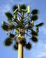
| 03/21/2006 11:34:35 PM | What is it?by Lil_OneComment: Greetings from the Critique Club
This is your entry in the 'Master of Disguise' challenge. I think you've definitely nailed the topic right on the head. Great choice for this challenge. The subject has a strangely high interest factor I find for some reason. Perhaps because it is fascinating to see this kind of iconic symbol of the rapidly advancing technological world of today erected with the somewhat whimsical camoflage, preventing it from being somewhat of an eyesore. Yes, fascinating.
Technicals are not bad here. Focus is good. Color is good, maybe a slight boost in saturation could be nice, but maybe that is just a matter of taste. Exposure is actually pretty good, considering it looks like it was very bright, harsh lighting. I might suggest here that on a shot like this, it might be a good idea to try different times of the day, to see how different lighting conditions will affect the image. A different angle from the sunlight could allow for a little more detail from the darker portions of the 'leaves', and cut down some on the bright spots on some of the vertical surfaces. The blue of your sky is nice, but again, trying various times could also capture differing skies with more or less features, or 'drama' to them.
Your composition works fine here for the chosen subject I believe. It's good that you've kept it simple and clean. There are no distracting elements at all. In shots like these, often times people will catch wires, or tops of buildings or stray signs and things like that, you've payed close attention to your image, nice job. With this particular sky, I think going with the close, centered framing probably was the best choice. If say, you had a stronger featured sky, lots of clouds and stuff, something to consider would maybe be a more off centered approach, and use some of the sky to your advantage. Something to keep in mind for the future. One minor thing here though, the tower does seem to have a slight tilt to it. A more dramatic, more obvious, sharper angle, and it could seem to be done on purpose, to stress a point of view, or add dynamics to a composition. A slight tilt however, usually will come across as an oversight. It is slight in this case, but some voters have pet peaves about straignt horizons and verticals and such. Plus, it just gives strength to the presentation and adds to the aesthetics of an image. Depending on if you do any editing to your photos, straightening is something that can be done in the editing stage. (your mom could probably show you this, or I believe there is a tutorial on the site's learn section).
Overall, a nice shot. This was a great pick for your subject for this challenge. Fits nicely, and you gave a solid, clean presentation of your idea, and I think people could definitely relate to it, and find some interest there. 5.88 is not a bad score at all. Congrats on your personal best! Keep up the good work, I'm sure you'll have more high scores in your future :-)
If you have any questions, or comments or anything, feel free to contact me.
Happy shooting,
taterbug :-)
|
| 03/21/2006 06:57:09 PM | My Waiting Angelby Little KingComment: Greetings from the Critique Club :-)
Well, this is your 'Afterlife' challenge entry. I think you met the challenge in a very creative and evocative way. I am sure most everyone would see the connection, although you probably suffered some low votes from people that simply are put off by this type of image. Still, a 5.
9 is not a bad score at all, so obviously the execution of your idea was not bad.
My first impression upon looking at the image is the grasp of your concept. The idea is definitely effectively portrayed. The model is quite attractive, and the costume seems to nicely fullfill your 'vision' without going overboard.
Your technicals here are pretty good. Focus is great. Deeper dof might have been nice, to get focus on the wings, but I'm not put off at all by the choice of going shallower. The lighting is good, but I could suggest maybe adding some type of fill light from the front left, even some reflectors. I think this could soften the shadow behind her hand and on the neck, as well as bring out just a touch more detail in her hair.
I like the composition with the exception of one thing, the empty space above her head :-) In this case, the space doesn't seem to serve any purpose, and I get a feel of being slightly unbalanced. Her gaze is going off to the right, maybe if she was looking more upwards, the space could come into play, but I don't think that would have worked as well. I believe the composition would be stronger with the framing tighter to her head. Her pose is nice. And I like how you've framed her slightly off centered. A minor attention to detail thing-the strap that is showing has a twist in it, little details like that can add up to increase the power of a photo, IMO.
Overall, a very nice image. A pleasing, creative take on the challenge, albeit one that as I'm sure you knew could polarize some of the voters. Well done, and I like the photo. I think the tighter crop (space at top) could have surely pushed your score above 6. Nice job.
If you have any questions, or comments or anything, please feel free to contact me.
Happy shooting,
taterbug :-) | | Photographer found comment helpful. |
|
Showing 1031 - 1040 of ~2507 |
Home -
Challenges -
Community -
League -
Photos -
Cameras -
Lenses -
Learn -
Help -
Terms of Use -
Privacy -
Top ^
DPChallenge, and website content and design, Copyright © 2001-2026 Challenging Technologies, LLC.
All digital photo copyrights belong to the photographers and may not be used without permission.
Current Server Time: 07/24/2026 08:10:13 PM EDT.
|