| Image |
Comment |
| 05/18/2004 10:27:01 PM |
Fire and Iceby MinnieComment: A very interesting composition - I like the melted ice in the foreground. The exposure on the flame is very good and the detail on the ice and candle is very good. |
 Photographer found comment helpful. Photographer found comment helpful. |
| 05/18/2004 10:18:16 PM |
Formal or Casual.........??by bigjvoltageComment: An interesting choice for the challenge. I think it would be more successful if they shoes were posed or framed a little more interesting - the judge of a shoes appropriateness for an event is not really best shown from above and the flowerpot in the left corner is a little distracting. |
| Photographer found comment helpful. |
| 05/18/2004 10:17:02 PM |
Life and Deathby taterbugComment: I like your framing of the tombstone with the pine boughs. The choice of decolorizing is very interesting and gives more weight to the lines and shapes. The figure isn't terribly compelling to me and feels a little too posed. |
| Photographer found comment helpful. |
| 05/18/2004 10:11:49 PM |
Coming and Goingby LokiComment: Very nice! Abstract yet absolutely clear what it means with the difference between the red and white lights. I like your choice of a wide format. I wish the little sign in the median was more visible. |
| Photographer found comment helpful. |
| 05/18/2004 10:10:38 PM |
|
| Photographer found comment helpful. |
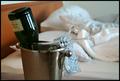
| 05/18/2004 10:09:58 PM |
Cold - Hotby tyrkinnComment: Nice composition - the story is ery compelling and the choice of putting the empty flutes into the bucket really helps to sell it. The "hot" part isn't quite as apparent (some feet in the background would have helped - it could be an empty room as it is now). Good DOF and exposure. |
| Photographer found comment helpful. |
| 05/18/2004 10:07:51 PM |
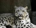
Nature in Black and Whiteby dixonp1Comment: Great detail and textures for the fur and face. The color is wonderful and the POV is very compelling (eye level). It doesn't feel like it an "opposite" but a great capture. |
| 05/18/2004 10:05:30 PM |
Dragby JesuispeureComment: Very nice photo - I like the perspective you chose and the saturation of the colors - the similarity with the red of the roses to the reds of the lips is wonderful. |
| Photographer found comment helpful. |
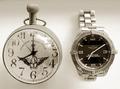
| 05/18/2004 10:04:29 PM |
tempus fugitby whiteroomComment: Wonderful find - I like your choice of decoloring the phoot. I would have liked a bigger difference in the watches (digital vs analogue). The reflection on the left one is a little distracting. Great simple composition. |
| 05/18/2004 08:12:50 PM |
Reflections of the day.by BradComment: I liked this both in the thumbnail and full verison. the differences in color, shadow and texture are really wonderful, you have a great eye for creating something out of the mundane. |
| Photographer found comment helpful. |
Home -
Challenges -
Community -
League -
Photos -
Cameras -
Lenses -
Learn -
Help -
Terms of Use -
Privacy -
Top ^
DPChallenge, and website content and design, Copyright © 2001-2026 Challenging Technologies, LLC.
All digital photo copyrights belong to the photographers and may not be used without permission.
Current Server Time: 07/17/2026 07:30:21 AM EDT.