| Image |
Comment |
| 04/19/2005 07:40:40 AM |
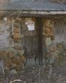
Door that's closed for everby tiki28Comment: Well seen.
Image is a little soft or out of focus and should be a bit sharper. A slight boost in saturation and slight decrease in brightness would richen this image up in my opinion. |
 Photographer found comment helpful. Photographer found comment helpful. |
| 04/19/2005 07:38:55 AM |
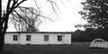
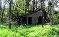
Camp Turleyby LesleyNelsonComment: Though meeting the challenge, there isn't a lot to really capture a viewr's attention here. The focal point shifts back & forth between the dome structure to the main building, fighting for attention (distracting). |
| Photographer found comment helpful. |
| 04/19/2005 07:36:35 AM |
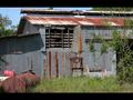
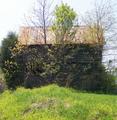
Withered and Weatheredby totaldisComment: Pretty good composition and well seen.
The black borders are hurting this image and a wider aspect crop would have looked better in my opinion. We aren't stuck to 640x480. 640x640, 640x512, 640x480, 640x400 and even 640x320 are fairly popular sizes |
| Photographer found comment helpful. |
| 04/19/2005 07:34:02 AM |
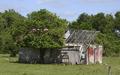
This one has seen better days....by Physics_GuruComment: Perhaps a little too centered composition-wise.
A little different point of view would have eliminated the "pipe" in the lower right corner, which is an element of distraction. |
| Photographer found comment helpful. |
| 04/19/2005 06:06:08 AM |
One day I will be grand.by raykay23Comment: A little to bright/high on the contrast in my opinion.
As a suggestion, try taking the image into Photoshop (assuming you have it), and in the Hue/Saturation adjustments, take the yellow channel hue and saturation to the right a little (may 10 pts) and bright the lightness down a bit (10-20 pts) to give the yellows more of a darker, richer green look, and bring the red saturation up just a little. |
| Photographer found comment helpful. |
| 04/19/2005 06:05:10 AM |
This Old Houseby rexComment: As a suggestion, try taking the image into Photoshop (assuming you have it), and in the Hue/Saturation adjustments, take the yellow channel hue and saturation to the right a little (may 10 pts) and bright the lightness down a bit (10-20 pts) to give the yellows more of a darker, richer green look, and bring the red saturation up just a little. (4) |
| Photographer found comment helpful. |
| 04/19/2005 06:04:07 AM |
long days long nightsby mainestreamComment: At 440x260 pixels, this image is a bit on the small side. making use you 640 pixels on the longest side will help an image alot in a challenge.
The site has some great tutorials on how to prepare a shot for submission in the Forum drop-downs under Tutorials. if you need further help, please PM me now or after the challenge and I can direct you to some great sources of help.
You did meet the challenge and gave you a 4 for effort.
As a suggestion, try taking the image into Photoshop (assuming you have it), and in the Hue/Saturation adjustments, take the yellow channel hue and saturation to the right a little (may 10 pts) and bright the lightness down a bit (10-20 pts) to give the yellows more of a darker, richer green look, and bring the red saturation up just a little.
|
| 04/19/2005 06:01:31 AM |
Plank Houseby eaemthomasComment: Image seems more about the foliage than the building in my opinion.
Perhaps a little more angle on the building would help the composition.
As a suggestion, try taking the image into Photoshop (assuming you have it), and in the Hue/Saturation adjustments, take the yellow channel hue and saturation to the right a little (may 10 pts) and bright the lightness down a bit (10-20 pts) to give the yellows more of a darker, richer green look, and bring the red saturation up just a little. |
| Photographer found comment helpful. |
| 04/19/2005 05:59:49 AM |
Once upon a time....A man's castle was his home.by arminComment: As a suggestion, try taking the image into Photoshop (assuming you have it), and in the Hue/Saturation adjustments, take the yellow channel hue and saturation to the right a little (may 10 pts) and bright the lightness down a bit (10-20 pts) to give the yellows more of a darker, richer green look, and bring the red saturation up just a little. |
| Photographer found comment helpful. |
| 04/19/2005 05:59:27 AM |
JUST LISTED - Charming Fixer-Upperby 2ShayComment: As a suggestion, try taking the image into Photoshop (assuming you have it), and in the Hue/Saturation adjustments, take the yellow channel hue and saturation to the right a little (may 10 pts) and bright the lightness down a bit (10-20 pts) to give the yellows more of a darker, richer green look, and bring the red saturation up just a little. |
| Photographer found comment helpful. |
Home -
Challenges -
Community -
League -
Photos -
Cameras -
Lenses -
Learn -
Help -
Terms of Use -
Privacy -
Top ^
DPChallenge, and website content and design, Copyright © 2001-2026 Challenging Technologies, LLC.
All digital photo copyrights belong to the photographers and may not be used without permission.
Current Server Time: 06/19/2026 02:23:22 AM EDT.