| Image |
Comment |
| 04/19/2005 01:21:16 PM |
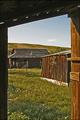
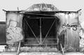
Hardscrabble Timesby autoolComment: Good use of natural framing.
I can't quite put my finger on it and maybe it's neat image that was used? The boards on the one building have an odd texture (plastic-like), a lot of detail is missing in the grass area and I see banding in the sky (also another "signature" of neat image getting aggresive.
Well seen and meets the challenge. |
 Photographer found comment helpful. Photographer found comment helpful. |
| 04/19/2005 11:07:53 AM |
|
| Photographer found comment helpful. |
| 04/19/2005 09:55:57 AM |
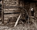
Welcome Homeby kirbicComment: I'm torn on this one.
Some of it I don't like (harshness of the post-processing) and yet enjoy studying it. It's a busy shot with a lot of little details that weren't lost in the shadows.
Well seen (6) |
| Photographer found comment helpful. |
| 04/19/2005 09:52:14 AM |
25 or 6 to 4by sofapComment: Well seen and composed with leading lines & use of diagonals.
Capturing the sun behind the trees was a nice touch, but if it was sunset, a couple minutes later would have helped teh sky be a little less washed-out. (vice-versa if it was sunset). |
| 04/19/2005 09:47:49 AM |
|
| Photographer found comment helpful. |
| 04/19/2005 09:44:46 AM |
saving on hydroby saintaugustComment: Well seen.
i had to study this one for a while to really see all the differences in the rocks/texture.
A bit on the bright side and jut a "hair" oversharpened as seen in the halo effect on the power wires, which is really not hard to do.
Not quite understanding what the meaning of the title is though - saving on hydro (water) ?
|
| Photographer found comment helpful. |
| 04/19/2005 07:57:29 AM |
Yesterdayby msdoubletroubleComment: Well seen. Run down and overgrown.
Foreground foliage is a bit soft and lacking detail and overall the shot may have looked a little better had it been shot at a slight angle so the main focal point wasn't dead center. |
| Photographer found comment helpful. |
| 04/19/2005 07:56:49 AM |
...why not catch it on fire?by hopelessoptimistComment: Nice artistic interpretation on this challenge.
There is beauty in what society calls an eyesore.
Foreground foliage is a bit soft and lacking detail and overall the shot may have looked a little better had it been shot at a slight angle so the main focal point wasn't dead center.
Unusual title too. |
| Photographer found comment helpful. |
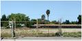
| 04/19/2005 07:52:03 AM |
Please Lock Gate When Leavingby GeneralEComment: A touch of humor at last!
Well seen and an unusual take on this challenge. Not sure if the building is abandoned or the field is, but regardless, the fencing seems to be taking top honors as a focal point instead of a building. Image is a bit soft/needing to be a bit sharper/clearer. (4) |
| Photographer found comment helpful. |
| 04/19/2005 07:45:55 AM |
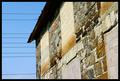
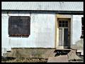
Broken Geometryby CryptonomiconComment: A couple observation on this image.
A good part of the white "plaster" seems to be washed out, and the right tilt of the roof line and wall is a bit distracting. The balck border is competing with the gutter area, and may have been better in white with a 1 pixel line on the inside edge of the white.
Take a look in my portfolio for examples of this type of border if you care to. I use it a lot and often gives an image an actual photograph look to it. |
Home -
Challenges -
Community -
League -
Photos -
Cameras -
Lenses -
Learn -
Help -
Terms of Use -
Privacy -
Top ^
DPChallenge, and website content and design, Copyright © 2001-2026 Challenging Technologies, LLC.
All digital photo copyrights belong to the photographers and may not be used without permission.
Current Server Time: 06/19/2026 05:25:16 AM EDT.