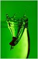
DPChallenge: A Digital Photography Contest You are not logged in. (log in or register
 
Browse Settings
Currently viewing:
Registered UserBrad

Show comments:

Per page:

Order:

Comments:


Comments Made by Brad
Pages:   ... [371] [372] [373] [374] [375] [376] [377] ... [564]
Showing 3731 - 3740 of ~5638
Image Comment
The Gift
05/01/2005 04:08:28 AM
The Gift
by GolferDDS

Comment:
Unusually bright in a way, and is certainly one to pop off the page.
The Red/Orange is bolder than it really should be for an advertisement. The chice of the blue text to match the color of the stone would normally be good, but is very difficult to read against that color background. (5)
Photographer found comment helpful.
Girls can never have enough jewelry!!!
05/01/2005 12:22:15 AM
Girls can never have enough jewelry!!!
by singsunshine

Comment:
Ahh...kids being kids.
From a Jewerly Advertisement standpoint, this probably wouldn't work too well with the sepia toning used. Shadows from the flash add a certain element of harshness, but not all of us can have expensive equipment at our disposal.
Thanks for sharing a cute shot, that I'm sure will be far more meaningful in years otcome than just a macro picture of a ring or similar. (5)
Photographer found comment helpful.
Diamonds Are A Girl's Best Friend
05/01/2005 12:19:19 AM
Diamonds Are A Girl's Best Friend
by DeniseBernadette

Comment:
Cute shot and put a smile on my face when I saw it.
Not really sure this fits the "classic" Jewelry Advertising look, but this one will probably by far be more meaningful years down the road. (5)
Photographer found comment helpful.
Katy
04/30/2005 08:27:45 PM
Katy
by jus6681

Comment:
Love the processing done here Justin.
The softness & tone compliment this shot well.
Phoebe and Big Bird
04/30/2005 08:19:27 PM
Phoebe and Big Bird
by KiwiChris

Comment:
Your kid(s) are lucky to have a parent with the means to preserve precious moments like this, at this level of quality.
February
04/30/2005 05:01:53 AM
February2nd Place
by nico_blue

Comment:
This was a surprise.
The thumbnail certainly didn't do this justice. The reflected banding is a nice touch, and overall the clarity & detail is very good. Colors work well overall here, and the text / font used work for me. (7)
Photographer found comment helpful.
Citizen Blue
04/30/2005 04:59:46 AM
Citizen Blue
by Sandman

Comment:
Oh to have had just a little more in focus....
I really like the composition and lay-out here, and espcially like the color.
Well chosen title too. (6)
Photographer found comment helpful.
The Black Pearl
04/30/2005 04:58:27 AM
The Black Pearl
by vasilkovaya

Comment:
Nice soft lighting used and a pretty decent lay-out.
I only wish the depth of field were a little wider so the focus didn't fall away so fast.
Good clarity & detail in the jewelry. (6)
Photographer found comment helpful.
...dream come true
04/30/2005 04:54:44 AM
...dream come true
by lilnukee

Comment:
Suspect you were thought to be a cheater in your editing?
I have no idea why either.
This is a nice image, but perhaps a littlon the too soft side. Text/font used is a bit plain and a more feminine/italic style would look a little nicer in my opinion. (6)
Photographer found comment helpful.
Spike a Drink
04/30/2005 12:23:08 AM
Spike a Drink1st Place
by Tranquil

Comment:
Greetings from the Critique Club!
"The sign of a photographer: Take a mundane subject and turn it into art"

This was an unusual challenge in that the object was to take an ordinary household object and create an interesting photograph from it, all within in a time frame of 24 hours.

Composition:
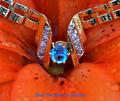
Your image was a unique and very imaginative one that thrilled the viewers and voters. There is dropping a tack into fluid, then there is the tranquil method - with PUNCH! This shot has a lot going for it in the way of punch: The colors are vivid and well chosen. The angular trajectory kept this from being a boring shot, as the eye is drawn not only to where the tack is now, but the mind can easily re-trace where it entered the fluid, and yet does not compete with the main focal point. The depth of field falls off at the right point in the image in my opinion, keeping the focal point in one place.
Interest, wow factor and the tranquil punch all added up to this being THE 24-hour challenge winner, and well-deserved at that.

Lighting:
How much can be said about the lighting here that the image doesn't say for itself? It rocks and was the key element in taking this shot right to the top. Well-balanced with just the right amount of contrast.

Post-Processing:
You have a good handle on your post-processing in this picture. You didn't go off the deep end in the saturation and as easy as this may have been to go over the top with an unusual border, you chose the simple approach, and was effective in being supplemental to the overall look/feel.

Suggestions/Improvements:
I think after studying this for a while, I have found I have nothing to suggest in ways to improve this image within the open challenge editing guidelines.

Congrats on a very fine job and on the Blue Ribbon Lee!

I hope this was useful to you, and please feel free to contact me via PM if you have any questions regarding this critique or anything else relating to the site in general.

Regards,
Brad

Message edited by author 2005-07-31 12:41:20.
Photographer found comment helpful.
Pages:   ... [371] [372] [373] [374] [375] [376] [377] ... [564]
Showing 3731 - 3740 of ~5638


Home - Challenges - Community - League - Photos - Cameras - Lenses - Learn - Help - Terms of Use - Privacy - Top ^
DPChallenge, and website content and design, Copyright © 2001-2025 Challenging Technologies, LLC.
All digital photo copyrights belong to the photographers and may not be used without permission.
Current Server Time: 09/14/2025 11:20:46 PM EDT.