| Image |
Comment |
| 05/01/2005 10:28:56 PM |
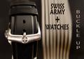
Swiss Army Watchesby TommyMoe21Comment: One of a kind in this challenge.
The overall non-dead center composition is good, though the text is taking away from it inmy opinion. Perhaps not having the "Swiss Army + Watches" in it would have been better, as this shot makes me think belt buckle, as there is no watch visible. (5) |
 Photographer found comment helpful. Photographer found comment helpful. |
| 05/01/2005 10:17:19 PM |
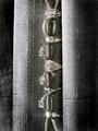
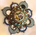
Something Old...Something New...by RKTComment: Unusual layout and theme for this challenge, with good detail & clarity.
The background, though unique in the way it compliments the shot, it is fighting for main focal point and actually is making some of the lower jewelry hide. (5) |
| Photographer found comment helpful. |
| 05/01/2005 10:15:01 PM |
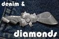
denim & diamondsby GinaRothfelsComment: Interseting theme and composition.
Detail is good, but the text size here is killing this shot in my opinion.
First impression and focal point goes to the text, taking away from the jewelry. (5) |
| Photographer found comment helpful. |
| 05/01/2005 10:13:22 PM |
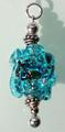
Aqua lampwork beadby PaperfibeComment: Nice colors. Shadow her is a major distractioninmy opinion.
The overall size of the image is on the smaller size at 432x213 pixels. The file size is also very small (27K), which will hurt it's overall quality.
We are allowed 640 pixels on the longest side, and up to 150K. Using as much of the 150K as possible will only help to not compress the image. If you need help in understanding or making these happen, please don't hesitate to PM me and I can give you some pointers. (5) |
| 05/01/2005 10:09:43 PM |
Heirloomby biggood53Comment: Very interesting piece of jewelry, and am sure it is sentimental.
I have a hard time seeing this in a commercial advertisement, as it is very busy, and my eyes are drawn all over the frame trying to find a focal point to settle on. (5) |
| 05/01/2005 10:04:50 PM |
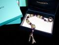
Breakfast at Tiffany'sby OFreasierComment: Overall a good theme and choice for composition lay-out.
In my opinion, the extreme light / dark is kind of hard on the eyes, and the light blue / turquoise clashes in this shot. (6) |
| Photographer found comment helpful. |
| 05/01/2005 10:03:01 PM |
From the Gold Boxby loveComment: Interseting background and choice of it's angles in this shot.
Strong light & dark contrasts work well.
In my opinion, the jewelry is a little too out of focus. (6) |
| Photographer found comment helpful. |
| 05/01/2005 10:01:28 PM |
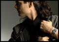
OUTBACKby DrJOnesComment: I have seen ads that look simialr to this and you did a nice job composing this shot and lighting it. In my opinion, the watch is too far to the right and is easily lost. (6) |
| Photographer found comment helpful. |
| 05/01/2005 09:59:53 PM |
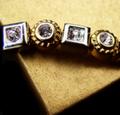
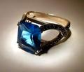
Topazby aerogurlComment: Nicely done!
The choice of lighting and the glow it created around the ring work well.
Detail & clarity are good, and the angle the ring was placed at works well. (7) |
| Photographer found comment helpful. |
| 05/01/2005 09:58:26 PM |
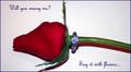
Diamonds are Foreverby slingshotComment: Thought behind this was good. A rose & engagement ring - classics together.
Overalll the lighting is a bit harsh and the shadow(s) are too strong / distracting.
Effective text/font used. (6) |
| Photographer found comment helpful. |
Home -
Challenges -
Community -
League -
Photos -
Cameras -
Lenses -
Learn -
Help -
Terms of Use -
Privacy -
Top ^
DPChallenge, and website content and design, Copyright © 2001-2026 Challenging Technologies, LLC.
All digital photo copyrights belong to the photographers and may not be used without permission.
Current Server Time: 06/20/2026 06:34:39 PM EDT.