| Image |
Comment |
| 05/02/2005 07:18:33 PM |
|
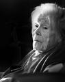
| 05/02/2005 07:00:45 PM |
h.jpgby mmdaigleComment: The left side of the women's face needs to be better lit, enough so that the picture doesn't go into total darkness on that side. |
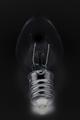
| 05/02/2005 06:59:06 PM |
|
| 05/02/2005 06:56:18 PM |
Golden Dropletsby ZoomdakComment: Overall this shot is gorgeous, the fingers are distracting, it would have been better if they could have been out of the picture or possibly if the earrings were hanging from between the spaces in between the fingers even. A great idea. |
 Photographer found comment helpful. Photographer found comment helpful. |
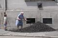
| 05/02/2005 06:54:20 PM |
Monday Morningby labudsComment: This is a really interesting shot. I can't help but wonder what the little boy is doing, is he just watching? passing by? is he supposed to be doing a job? I would make it a panoramic and cut off the top of the picture, the boy, women and coal pile are the important parts, the tope is just meaningless information. |
| 05/02/2005 06:50:42 PM |
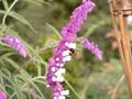
Bee on Flowerby RgarciaComment: Pretty, I like the textur, it would be better is the background were darker so as to distract less from the main focus. |
| Photographer found comment helpful. |
| 05/02/2005 06:47:51 PM |
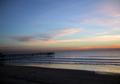
crystal pierby highpriceComment: I like the colors but the left side of the photo needs to be lightened a bit, I can barely see the pier. |
| 05/02/2005 06:45:57 PM |
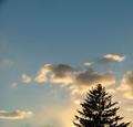
tree_edited-1.jpgby capgalComment: Very nice picture, I love the different levels of the clouds and tree. I would crop the top though, to much empty space with nothing happening. |
| 05/02/2005 06:42:56 PM |
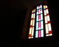
fenêtre 2003-08-20_0080.JPGby nathaliedooComment: Nice picture but would have been better with less negative space and a different angle, since the window appears to be both tilted backwards at the top and tilted vertically. I keep turning my head to the side when I look at the picture. Tilting in one dimension makes the picture interesting but the two different tilts to it together are to much. |
| 05/02/2005 06:37:01 PM |
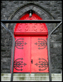
Red_Door.gifby utroComment: Nice picture, I like the contrast of the bright colors against the almost black stone. The bar across the top of the door is kind of annoying. I realize that it can't be taken out of the picture, however it might have been less distracting if it had been framed to but across where the horizontal line of the door fell. |
Home -
Challenges -
Community -
League -
Photos -
Cameras -
Lenses -
Learn -
Help -
Terms of Use -
Privacy -
Top ^
DPChallenge, and website content and design, Copyright © 2001-2026 Challenging Technologies, LLC.
All digital photo copyrights belong to the photographers and may not be used without permission.
Current Server Time: 07/17/2026 02:04:28 AM EDT.