| Image |
Comment |
| 06/22/2004 07:53:47 PM |
Smoking or non smoking? Pick a seatby pbaarnComment: Or move to California where everything is non-smoking! Nice idea and execution. I wonder how may won't "get" the ashtrays on the rear tables. The thin vertical composition is perfect for the subject - but the tiny triangle top right is a wee bit detracting. |
 Photographer found comment helpful. Photographer found comment helpful. |
| 06/22/2004 07:51:13 PM |
Lyssophobiaby CountComment: A good many choices - but not very visually appealing. |
| 06/22/2004 07:50:29 PM |
Chocolateby RUEDISCHMUTZComment: It looks yummy and is a great bunch of choices. I like the flowing yellow/ orange cloth - it has great textures and gives the image a magic feel. BUt, on the other hand - I do not like the way the cloth interacts with the white areas. Seems like it would be stronger if the entire base was the cloth. Exposure seems hot in a few places. Good submission! |
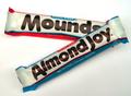
| 06/22/2004 07:46:53 PM |
Sometimes you feel like a nut....by indianzfanComment: Yeah - I remember those commercials! Good idea - well executed and definitely a choice. With the white in the wrappers - I believe it would hqave worked better with a very dark background. |
| Photographer found comment helpful. |
| 06/22/2004 07:45:17 PM |
Decision 2004by MarkComment: It's a good idea - but don't forget the "other" parties! Colors are a bit muted - the blue of the flag seems to be very dark. That causes the donket silhouette to nerge with the flag as there is no (or very little) color separation. It's an original idea and works well for this challenge. I hope our non_US voters recognize the party symbols! |
| Photographer found comment helpful. |
| 06/22/2004 07:41:50 PM |
Dicemanby GarethComment: Nice capture of the falling dice. It's a good idea and demonstrates a way to make a choice. Black border is s bit heavy for me. Exposure right on. |
| 06/22/2004 07:39:37 PM |
heads or tails ?by zjnztComment: Nice capture of the coin in flight - helping someone make a choice. Black background is perfect for this. Exposure and composition right on. A very minor point is the removal of the whitish spot to the left of the bracelet on the wrist. |
| Photographer found comment helpful. |
| 06/22/2004 07:37:28 PM |
Colon or Semi-Colon?by thatannemarieComment: Well - I guess that's a choice - rather obtuse, but a choice. Composition is nicely done on a diagonal - but please clean that keyboard! It's a wonder it works (if it does.) |
| 06/22/2004 07:18:50 PM |
Which way do I go?by TikicharmComment: Uhh - straight ahead? A straight forward choice - well exposed and presented. I like the hint of blue on the right side of the arrow. It's not terrible exciting though. |
| Photographer found comment helpful. |
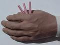
| 06/22/2004 07:17:06 PM |
Short Strawby vernonComment: Original idea - and no one else thought of this old "classic." I wonder if our non-US voters did the same thing as kids? Colors seem a bit dull or muted - but other than that -it's a well done and effective submission. |
| Photographer found comment helpful. |
Home -
Challenges -
Community -
League -
Photos -
Cameras -
Lenses -
Learn -
Help -
Terms of Use -
Privacy -
Top ^
DPChallenge, and website content and design, Copyright © 2001-2026 Challenging Technologies, LLC.
All digital photo copyrights belong to the photographers and may not be used without permission.
Current Server Time: 07/26/2026 06:04:51 AM EDT.