| Image |
Comment |
| 07/27/2004 08:26:41 PM |
|
| 07/27/2004 08:25:07 PM |
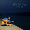
Dark Pier Creek by hopperComment: Excellent lighting, composition, and creation of negative space for your text. It would work better if the t-shirt didn't have text. |
 Photographer found comment helpful. Photographer found comment helpful. |
| 07/27/2004 08:22:18 PM |
|
| Photographer found comment helpful. |
| 07/27/2004 08:21:12 PM |
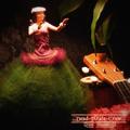
Dead Pirate Crewby parrotheadComment: Nice composition - and it does look like an album. I love the skirt - it's a nice touch. On the other hand - the blouse area seems a bit bright, |
| Photographer found comment helpful. |
| 07/27/2004 08:19:44 PM |
|
| Photographer found comment helpful. |
| 07/27/2004 08:18:24 PM |
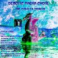
Demotic Pagan Choirby hfngotphotoComment: It does look "albumy" - but not very "photographic." Text is very difficult to read - especially some of the featured tracks. |
| 07/27/2004 08:13:49 PM |
|
| Photographer found comment helpful. |
| 07/27/2004 08:11:53 PM |
|
| Photographer found comment helpful. |
| 07/27/2004 08:10:56 PM |
|
| Photographer found comment helpful. |
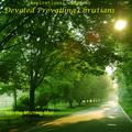
| 07/27/2004 08:09:44 PM |
Devoted Prevailing Christiansby ladpupmoeComment: Great submission - the perfect image for religious songs. It does look like an album cover - I can see it on the shelf! My only problem is that you've used three different fonts - which was not necessary. Finally - I think a more "golden" font color would be better than the bright yellow. Overall - it's a rel winner! |
| Photographer found comment helpful. |
Home -
Challenges -
Community -
League -
Photos -
Cameras -
Lenses -
Learn -
Help -
Terms of Use -
Privacy -
Top ^
DPChallenge, and website content and design, Copyright © 2001-2026 Challenging Technologies, LLC.
All digital photo copyrights belong to the photographers and may not be used without permission.
Current Server Time: 07/26/2026 06:03:15 AM EDT.