| Image |
Comment |
| 04/07/2004 08:30:26 PM |
I'm Spoked about it!by jmleliiComment: It's not sharp enough... i like the approach in black and white... i am not sure i fancy that much the composition as it's kind of unballanced... and I do not understand the title. |
 Photographer found comment helpful. Photographer found comment helpful. |
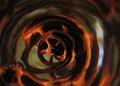
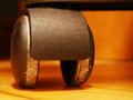
| 04/07/2004 08:28:31 PM |
Real Wheel Reflectionsby sfaliceComment: I love this shot! I would have tried a different composition, but as visual effect, I love it. I think I would have tried to have the wheel a bit blurred, so not entirely sharp... the contrast between the sharpness of the wheel and the fantasy of its reflection is a quite high... nevertheless GOOD job! |
| Photographer found comment helpful. |
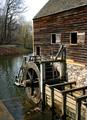
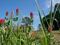
| 04/07/2004 08:15:36 PM |
Wood Wheel And Sun Wheelby MonaComment: WOW! A very very beautiful subject!
I would have preferred a closer shot... and not the reddish thing in front view... it kind of obstructs my view which longs to go to the house in the background... |
| Photographer found comment helpful. |
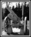
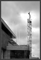
| 04/07/2004 08:12:40 PM |
US War Cannon, Pontiac Michiganby TikicharmComment: the challenge theme is the wheels so this shot must have been a profile shot... but try to make the wheels the subject and not the entire cannon.
it's also a bit blurred |
| Photographer found comment helpful. |
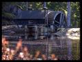
| 04/07/2004 07:57:13 PM |
Grist Millby JMSComment: I love the light and the colors in this shot! It's a wonderful and quiet atmosphere...
I would have tried to crop the shot closer to the subject who is supposed to be the wheel... nevertheless i like it |
| 04/07/2004 07:55:36 PM |
|
| Photographer found comment helpful. |
| 04/07/2004 07:54:51 PM |
Highwayby davidbedardComment: this has a good potential , and what i imagine it would have fitted perfectly here would be an old carriage wheel; unfortunately the car was moving, so one can barely see the wheel; nice colours, but... |
| Photographer found comment helpful. |
| 04/04/2004 08:58:36 PM |
The kiss that ruined the photoshootby HayaneComment: it's unballance; the fact the subject is placed so much to the right has no motivation... and the lipstick mark is not visible enough...
the title should be more mysterious, not that obvious, but it was a good idea |
| 04/04/2004 08:56:30 PM |
On the beachby AlexysComment: Visually, it's an enchantment! I love it!
But I am not sure... if it fits the challenge since it looks like the apple was put there, and not that it ended there by chance. |
| Photographer found comment helpful. |
| 04/04/2004 08:53:22 PM |
Stairway to heavenby gstrotmannComment: Nice shot! I would have named it "Out... of (its) place" because the title does not help it at all.
It has a nice look! |
| Photographer found comment helpful. |
Home -
Challenges -
Community -
League -
Photos -
Cameras -
Lenses -
Learn -
Help -
Terms of Use -
Privacy -
Top ^
DPChallenge, and website content and design, Copyright © 2001-2026 Challenging Technologies, LLC.
All digital photo copyrights belong to the photographers and may not be used without permission.
Current Server Time: 07/17/2026 02:58:43 AM EDT.