| Image |
Comment |
| 10/11/2005 08:57:18 PM |
|
 Photographer found comment helpful. Photographer found comment helpful. |
| 10/11/2005 08:55:51 PM |
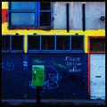
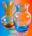
Façadeby aznymComment: Seems more like primary colors than complemenary. I like the image on it's own merit though |
| Photographer found comment helpful. |
| 10/06/2005 11:50:35 PM |
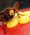
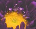
A Hornetby LindaEComment: I'm not seeing the complimentary colors. I would expect to see green with red, blue with orange, or purple with yellow. Nice macro of a bee though. |
| Photographer found comment helpful. |
| 10/06/2005 11:47:42 PM |
|
| Photographer found comment helpful. |
| 10/06/2005 11:46:43 PM |
|
| Photographer found comment helpful. |
| 10/06/2005 11:44:20 PM |
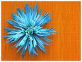
Mum's the Wordby mkalandrosComment: Really nice take on the challenge. The colors are very flat - I think you need a major boost in contrast to make the picture "pop" |
| Photographer found comment helpful. |
| 10/06/2005 11:42:08 PM |
|
| Photographer found comment helpful. |
| 10/06/2005 11:41:42 PM |
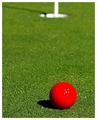
Design by Nature™by ajschelComment: Nice job exposing the red channel - something a lot of people have had trouble with in this challenge. Very sharp and well composed. 8 |
| Photographer found comment helpful. |
| 10/06/2005 11:39:21 PM |
|
| Photographer found comment helpful. |
| 10/06/2005 11:37:20 PM |
|
Home -
Challenges -
Community -
League -
Photos -
Cameras -
Lenses -
Learn -
Help -
Terms of Use -
Privacy -
Top ^
DPChallenge, and website content and design, Copyright © 2001-2026 Challenging Technologies, LLC.
All digital photo copyrights belong to the photographers and may not be used without permission.
Current Server Time: 07/21/2026 11:45:44 PM EDT.