| Image |
Comment |
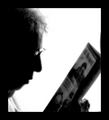
| 06/01/2006 10:03:08 PM |
Ticket to Rideby JutildaComment: Thia is a difficult one for me to score. What I like: The silhoette, the reference to the title, the profile of the model. What I'm not so keen on: there is a overprocessed look to this (NeatImage or such??). The border is really big. I'm voting a 7 |
 Photographer found comment helpful. Photographer found comment helpful. |
| 06/01/2006 09:59:53 PM |
Junk, 1968by bvlroComment: I love the colors in this. My only issue is the arrangement is too organized for "Junk" I'm voting a 7 for the colors and technically good image. |
| Photographer found comment helpful. |
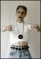
| 05/24/2006 11:07:21 PM |
When good photographers go badby DrAchooComment: Just so you know that not all camera owners are brand zealots, I gave you a six - I liked the attitude and the toned down colors, but didn't care for the wrinkled background.
When I was younger and into Chevy muscle cars from the late '60's one of my favorite pastimes was ridiculing Ford. For the last 15 years I've been driving Ford trucks. Go figure. |
| Photographer found comment helpful. |
| 05/20/2006 08:48:12 AM |
|
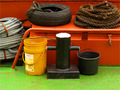
| 05/19/2006 07:28:16 PM |
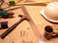
Construction Still Lifeby JSAYBComment: The object are all good, but I would have liked to see the arrangement tightened up. There is too much space and that negatively affects the continuity for me. 6 |
| Photographer found comment helpful. |
| 05/19/2006 07:26:11 PM |
Intimate Affairby javamooseComment: I like this one very much. The items and colors work well. I wish the wine glasses had been arranged differently though as the shadow is pretty harsh. 8 |
| Photographer found comment helpful. |
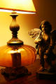
| 05/19/2006 07:19:38 PM |
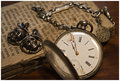
My Grandfathers possessionsby thorgilsComment: I like the richness of color and the objects. I think the lid of the stop watch is a great distraction and wish you could have arranged the items differently to take it out of center frame. |
| 05/19/2006 07:12:17 PM |
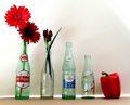
Are You a Pepper, Too?by RebeccaComment: What I like: I like the technically well lit, well focused image. I like the balance of the reds in opposite corners. What I think could be better: the objects look too linear to me. I think the arrangement could have been better if the objects were on different levels to allow them to be closer together. Just my .02 7 |
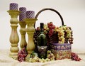
| 05/19/2006 07:04:54 PM |
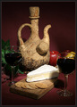
The Basket and the Bottleby LindaocComment: I like the objects and the arraignment. I think the lighting is too flat to create a "mood", at least for me. I meets the challenge well (something to be said for that in this challenge) 8 |
| Photographer found comment helpful. |
| 05/18/2006 10:57:00 PM |
|
Home -
Challenges -
Community -
League -
Photos -
Cameras -
Lenses -
Learn -
Help -
Terms of Use -
Privacy -
Top ^
DPChallenge, and website content and design, Copyright © 2001-2026 Challenging Technologies, LLC.
All digital photo copyrights belong to the photographers and may not be used without permission.
Current Server Time: 07/18/2026 08:01:42 AM EDT.