|
|
| Image |
Comment |
| 03/04/2010 04:53:16 PM | Odd danceby gauravComment: Hi, Critique Club here...
I like this photo! I like the movement blur that really helps sell this as a dance photo. It's interesting for me to look at because it's a culture different from my own. The low angle really works to add drama to the shot.
What hurts the image in my opinion are two things. 1) As someone mentioned, the dancers face has lost some contrast and color due to the backlight. 2) I find the person sitting on the right to be a distracting element, particularly the way he is cropped. I think you could have easily cropped him out without negatively affecting the image.
Hopefully these comments will give you something to consider. |  Photographer found comment helpful. Photographer found comment helpful. |
| 03/04/2010 04:45:19 PM | Tagus park gardens on Infraredby duartixComment: Hi, Critique Club here...
This is a fabulous photograph. The colors are just right, I love the IR, and the curve of the bridge leads the eye right into the picture, although unfortunately stopped by the bench. The dramatic clouds are icing on the cake.
My suggestions: I think the hot spot is really distracting and would probably consider making this a pano crop to get rid of it. I would have liked to see the bridge extending all the way out, maybe just a couple feet to the left to avoid the bench would have done it.
Finally, and a testiment to how nice the photo is, I don't necessarily think this is a good fit for the challenge. I'm actually surprised it recieved the relatively few low votes it did.
If I had voted in this challenge I would have voted either a 5 or a 6, simply because I tend to have a hard line on images meeting challenge descriptions. If this were a free study, or other challenge, and 8 or 9 for the hot spot and the bench.
Of course these are just one person's opinions and are offered for your consideration only. | | Photographer found comment helpful. |
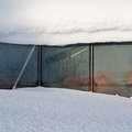
| 03/04/2010 04:21:28 PM | My (not so) Greenhouseby korpenComment: Hi, Critique Club here...
I'm in the same boat as you, no gardens in the Winter.
I think this scored low because a lot of people didn't really relate it to garden. Also, I think it's a bit too linear, nothing for the eyes to really explore that would make people stop and look around for awhile. One of the commenters referenced the diagonal and I agree with them that it kind of breaks up the patterns of glass.
One last thing, you might want to crop all but the last edge of snow from the top. First because it's blown out, and second because it will move the glass panels off center which might help the interest level.
Just one person's opinion, hopefully it will give you something to consider. | | Photographer found comment helpful. |
| 03/04/2010 02:21:27 PM | Kingby sheajosh1Comment: Hi from the Critique Club...
I'm sure you know by now that the primary reason this didn't do well is that the viewer has no way of telling that this is in a garden. You have to show it. In addition, while the droplet crown is very nice, to do well it will also have to be sharp. If you look at the other shots like this on this site, you will see the ones that do well are very sharply focused.
I see that this was your first challenge. Don't be discouraged by your low score on this one. In time you will see what it takes to score well, and your photography will improve by being here.
Good luck next time. | | Photographer found comment helpful. |
| 03/04/2010 01:00:32 PM | Calmby radarbratComment: Hi, Critique Club here...
I like your interpretation of the challenge and I think the interesting photo was well seen.
I like the drip and the reflection, but as someone else said, the background is just too powerful for the subject of the chimes. I also would have liked to have seen the two main chimes to be tack sharp, where the one on the left, in particular, is soft. It appears that the tip of the one in the upper left is the sharpest of them all.
Of course this just one person's opinion, but hopefully it will give you something to consider. | | Photographer found comment helpful. |
| 03/04/2010 12:51:57 PM | Dance in the sunby Rino63Comment: Hi, Critique Club here...
I like this image very much. I like environment aspect of it, and I like the addition of the umbrella. I also like the balance between the bent leg and the umbrella, it just works.
The hot spots don't bother me, it seems natural.
One critique that might make it even better is all the sky on top doesn't do anything for me. You probably included it to make the person seem smaller in the environment, but the lack of details in the sky just make it a rather uninteresting element to me.
As for the theme, if I didn't know this was about dance, I would have thought this was about Yoga. The image doesn't scream dance to me but that's OK.
These are just one person's opinions. Hopefully they give you something to consider.
| | Photographer found comment helpful. |
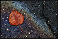
| 03/04/2010 12:15:04 AM | All that is left...by sekarmalathyComment: Hi, Critique Club here...
This one is easy for me because there is so much right about it. The colors all work together and I love the diagonals in the composition.
I can understand the comments and some of the lower scores for not being garden enough though. Even with those, you finished above 6, which is great.
What I would nitpick though is I think the white rock in the asphalt is a bit distracting. The black crack I both like and dislike. I like it because I think it balances out the composition. I dislike it because it's bold enough to attract attention and following it leads the eye out of the picture in either direction.
I didn't vote in this challenge but if I had, this would have gotten a 7 from me. Holding it back a little would have been the weakness in relating to the challenge.
Of course this is just one opinion, I hope it's helpful.
| | Photographer found comment helpful. |
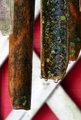
| 03/01/2010 11:59:09 PM | No Woman No Cryby MArteSiComment: Hi, Critique Club here...
I enjoyed this image but for a couple reasons I can understand the lower scores (although I do not believe it deserved and twos).
You've gotten the technical aspects nailed down well. Exposure of the subject, Sharpness, DOF, all good.
So what held the scores back?
My opinion is there is too much going on that detracts from the actual subject, the shoes. All those onions are dominating the photo to the point where the shoes seem like they were added to a photo about onions. I think if you had used only one onion the photo would have been stronger for the challenge theme. You still could have propped a shoe on it, and also maybe had a diagonal to play with in the composition. I would have gotten rid of the stem that is on camera left.
Just one persons opinions. If I voted in the challenge, I would have given this a 6 for meeting the challenge and being technically well done. | | Photographer found comment helpful. |
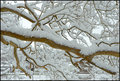
| 02/27/2010 08:25:08 PM | Constructed Viewby FireBirdComment: Hi, Critique Club here...
I love these days where the snow is heavy and builds up on branches. I have also tried to photograph it in an interesting way (other than a full landscape), and have had trouble making an interesting composition. I think composition is where this one doesn't work very well. It has no depth to pull a viewer into it. There is no focal point to hold interest. It's just a bunch of lines (branches) with snow. If there was another element in there, like say a red cardinal for example, this would have been beautiful and probably would have been in the 7 range. But as is, the viewer dismisses it quickly with a "nothing more to see here" process. One other thing that kind of jumps out at me is there is a strong yellow cast to it, maybe a white balance setting?
So to sum up, while technically, there is nothing wrong with this image at all, compositionally, it needs to be more focused.
This is just one opinion so take it as that. | | Photographer found comment helpful. |
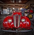
| 02/27/2010 08:10:23 PM | Classic Dodge Fire Engineby signal2noiseComment: Hi, Critique Club here...
This is a really nice image with some eye-popping color. It scored pretty well too so that should tell you something.
Regarding the clutter. When I first opened the image, that was my second thought, the first being the cool wide angle perspective on the front of the fire truck. You say there was nothing you could do, and maybe that's true, but it is there and is somewhat distracting nonetheless. Maybe you could have minimized it by taking a different angle approach, or not. You were the one who was there. But I seriously think that if you had options like if you could go in there and light it so you could use a very small aperture to allow the background clutter to fall off into darkness, this would have been a 7 score. Of course I don't know if you were there as part of an open house type thing, or if you have influence to be able to set up a shot like that but if you do, it would be very cool.
I like that you listed your edit settings here.
If I had voted in this challenge, I probably would have scored this an eight.
| | Photographer found comment helpful. |
Home -
Challenges -
Community -
League -
Photos -
Cameras -
Lenses -
Learn -
Help -
Terms of Use -
Privacy -
Top ^
DPChallenge, and website content and design, Copyright © 2001-2026 Challenging Technologies, LLC.
All digital photo copyrights belong to the photographers and may not be used without permission.
Current Server Time: 07/16/2026 11:16:58 PM EDT.
|