|
|
|
Showing 4231 - 4240 of ~6721 |
| Image |
Comment |
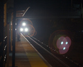
| 11/01/2006 06:29:09 PM | Taking The Late Trainby EssAreDubyaComment: Greetings from the Critique Club: I have been assigned your photo to critique and here are my thoughts:
Personal Reaction: My initial reaction to your photo was quite positive. It clearly met the challenge. You took some risks with the photo and in general it worked well. I like a risk taker, keep it up!
Composition: I absolutely love the composition. The leading lines and the placement of the headlights are virtually perfect. You have just enough of the station wall to sell the notion of depth. The silhouetted person completes the image. Very powerful.
Technicals: The focus might be a little soft but clearly forgivable. The lens flare is actually helpful and an integral part of the composition and the mood. Usually it’s a no-no, but here it works great! I think you probably lost 2 points from most voters for not cloning out the secondary flare in the lower right. It is exactly at a rule-of-thirds intersection and is therefore a major distraction. Try cloning it out as an exercise and see if you don’t like it better. I suppose someone could claim that cloning it out was removing a major element and hence, illegal. In my opinion, it would be legal and in any event, worth the risk.
Conclusions: Great photo well captured and presented, with a major distraction that probably cost you a point or a point and half in your average score.
As always, it is my personal opinion. Feel free to disagree, or to PM me if you’d like further dialog.
|  Photographer found comment helpful. Photographer found comment helpful. |
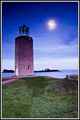
| 11/01/2006 05:33:17 PM | Lighthouse by Moonlightby brownsmComment: I have a pet peeve about tilted horizons. My problem really, but it cost you a point or two on this fine photo. | | Photographer found comment helpful. |
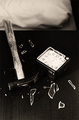
| 10/26/2006 12:13:55 AM | morning temperby xantangummiComment: Greetings from the Critique Club: I have been assigned your photo to critique and here are my thoughts:
Personal Reaction: To be honest, I didn’t like the photo that much. There were many in the challenge along the same lines, “kill the alarm clock.” And this was not among the best executions of the idea. But I want to look past my personal reaction.
Composition: The composition was interesting. I liked the corner of the bed for context. I liked the dynamic triangle (hammer head, clock, and the handle of the hammer). It gives the photo an active (rather than passive) feel. I might have trimmed a bit off the top, but that’s personal taste on my part. And I like duotone treatment. It makes me believe it’s morning … early morning in fact.
Technicals: I am not sure how much of the resulting image originated in the camera and how much resulted from post processing. There are some issues from my perspective: Focus is off a bit with nothing in really sharp focus; the lighting is such that most details are lost in the blacks or blown with the whites. Without any commentary from you I can’t tell if this is intentional, or an oversight. I wear glasses, and when I wake up without them, everything is a bit blurry and ill defined, especially if I awake before dawn. So if this was your intention, you nailed it! Well done! If not intentional, it’ll be something to work on next time.
Conclusions: In your comments, you indicate “great idea but poorly executed.” I am interested in your self diagnosis … what was poorly executed, from your perspective? In the end, I think it scored lower than you might have hoped because it became cliché during the challenge and because the gritty technicals don’t have much of a mass appeal. I wouldn’t necessarily change it because voters weren’t wowed by it, but if you’re looking for higher scores, working on the lighting and focus may help.
I took a look at your portfolio. You have some stunningly good photos there. I especially like the photos titled: unborn, Zen frames, and quicksilver. Good luck in future challenges.
As always, this is my personal opinion. Feel free to PM me if you’d like further dialog.
| | Photographer found comment helpful. |
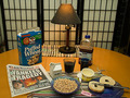
| 10/25/2006 08:49:10 PM | Good Morning Bad Newsby EssAreDubyaComment: Greetings from the Critique Club: I have been assigned your photo to critique and here are my thoughts:
Personal Reaction: Looks like my breakfast except I have Cheerios instead of Puffed Wheat and coffee instead of Cranberry Juice. It’s a pleasant morning photo which meets the challenge well. It’s an uncomplicated image but feels a bit busy to me.
Composition: The composition is generally fine. I noted above that it feels busy. By striving for completeness, you have over loaded the image and the only place for my eye to rest is on the screen in the background. The screen was a good choice of backgrounds, but it would have been stronger if it had completely covered the background. The dark area to the right distracts me.
Technicals: In general the technicals are all fine except for the lighting which could be improved. You have the lamp on the table and probably an overhead light. The overhead is so strong it flattens the image and washes out most of the shadows which would have given more dimension to the photo. There’s a bit of a yellow color cast due to the incandescent light. This can be removed in Photoshop or similar and would have improved the photo. The foreground seems a bit over exposed. You’ve lost the detailed texture of the bagel and the butter in the tub as a result.
Conclusions: It’s hard to draw a lot of conclusions with no commentary from you on what you were trying to achieve in the photo. In general, it’s a solid workmanlike photo with a few opportunities for marginal improvement. I think your choice of subject probably depressed your score, not enough there to hold my interest or invite many second looks.
Not every photo will score well, and I like a photographer who takes risks, so keep taking them. You have an obvious command of the camera and post processing. Try for subjects that tell a story, that entertain that surprise with a different point of view, and your cameral skills will lead you to a winner. Best of luck in future challenges.
As always, this is my personal opinion. Feel free to PM me if you’d like further dialog.
|
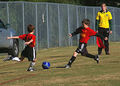
| 10/25/2006 08:11:56 PM | Wait! Aren't We On the Same Team?! -- Saturday Morning Gamesby dallasduxComment: Greetings from the Critique Club: I have been assigned your photo to critique and here are my thoughts:
Personal Reaction: My first reaction to your photo was, “Nice snap!” My kids all played soccer and I loved the fall morning games … crisp, clear, bright. These were great times with my young family. So I can resonate with the photo. Good job catching that spirit and feeling.
Composition: I like some elements of the composition. The placement of the 2 boys is good. You have a nice dynamic triangle going on with the ball and their two heads. The stopped motion of their legs points to the center of the action which leads you eye into the photo. All good stuff. The fence and the car in the background distract me. They are unnecessary for the image. When shooting sports, one crucial element is managing the background and this could have been done better. Perhaps a better background would have been the rest of the team, or the opposing team’s members behind the action. Still the action happens where ever it will and it’s not always easy to anticipate where to stand to manage the background. That’s something to work on next time. Watch the flow of the game. Observe where things seem to happen. And position yourself so they will happen between you and a desirable background.
Technicals: The technical execution is actually pretty good. Using a long lens, hand-held, and capturing fast action with good focus, good lighting, and good stopped motion isn’t so easy. You did a good job here, although it feels slightly over exposed. One thing you might try next time is to use the shallowest possible DoF by choosing you widest available aperture. If you are close enough to the action, you will get some DoF blurring which will help isolate your subject and focus attention on the subject players. If you look at Sports Illustrated photos, this is a technique that the pros use to great effect.
Conclusions: When we take snapshots, we are usually recording something about someone we know, or something we have a personal affinity for. In this case, it was your nephew. You or a family member will look at the photo and it will bring back the memory of the game. Which is great, and on that level, this is a great photo. But a disinterested party won’t have the personal affinity with the subject. If (s)he is a DPC voter, the photo will need to impress them without relying on the personal affinity. In this case, the subject wasn’t strong enough, and the tie in to the challenge theme wasn’t strong enough to carry the photo.
You haven’t been a member very long and haven’t entered that many challenges yet. Don’t be disappointed. Give yourself some time to find your personal style. Work on your subject choices and point of view with each. Try to tell a story a disinterested observer will resonate with.
As always, this is my personal opinion. Feel free to PM me if you’d like further dialog.
| | Photographer found comment helpful. |
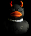
| 10/24/2006 04:50:11 PM | The little devill inside you.by svt_gEEkComment: Greetings from the Critique Club. I have been assigned your photo to critique and here are my thoughts:
Personal Reaction: To honest, I’m not resonating with this photo very much. But the challenge was whimsical and your photo exhibited a nice sense of humor, so let’s not take ourselves too seriously.
Composition: Frequently a centered composition doesn’t work very well and can feel very static. In this case it seems to work pretty well, I think because the orange lifts the eyes and the horns lead my eye back around into the photo. You’ve got a nice dynamic triangle going with the beak and the horns. So although you have a risky composition, I like it. Well done!
Technicals: Your lighting is very good. It helps me feel the texture of the duck. Your post processing added to the feeling by removing some glare, good job. I see what you’re doing with the side light and I like the definition and dimensionality it gives the duck. I like the resulting black on black contrast. Focus is good. DoF is good.
Conclusions: I can really see this image as the background in a magazine ad, or as the accompanying graphic in an ad. In that respect, it wouldn’t compete with words laid over the top and could really grab a reader’s attention. So why didn’t it score better? Those who commented seemed to like it. In the end, I think the subject (which met the challenge well) just didn’t appeal to voters that much. It’s a minimalist photo, not that there’s anything wrong with that. Maybe they were expecting more, or expecting yellow ducks, or … well who knows.
You haven’t entered that many challenges, but in your portfolio I see some real talent behind your photos. Keep shooting and you’ll find your style. Your technical capabilities are evident. IMO you just need to concentrate on subject choice and try to show your audience the subject from a perspective that surprises, or teaches, or entertains them.
As always, this is my personal opinion. Feel free to PM me if you’d like further dialog.
|
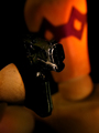
| 10/24/2006 10:50:38 AM | I have ways of making you talk.by electinaComment: Greetings from the Critique Club. I have been assigned your photo to critique and here are my thoughts:
Personal Reaction: I confess my first reaction was, “How does this meet the challenge?” Then I began to wonder what the table leg was doing in the background. Then, “What’s the black thing in the foreground?” In the end I puzzled out that the table leg was a wooden head with a mask, the black foreground object was a gun. Then the previously mysterious title made sense. I’m still not sure what the round thing on the left is, a foreshortened finger or hand? This all took longer than most voters will give an image. I suspect many voters voted it lower because they didn’t take the time to puzzle it out.
Composition: The composition was just okay. The gun (the main subject?) is almost dead center. Sometimes with highly symmetrical subject and compositions, this works well but often leads to static feeling composition. It doesn’t work so well here. The tilted head in the background helps some; but not enough to rescue the composition.
Technicals: Focus is good on the hand (finger?) and on the gun. I like the shallow depth of field which blurred the head a bit. Lighting is good on the hand and head, but weak on the gun. On my calibrated monitor the only detail I can see on the gun is some scaring on the barrel and a bit of definition of the handle. If you are only hinting that it’s a gun, this is fine, but it made me want more detail on the gun which I couldn’t see very well. If you look at the histogram for the photo, it is “U” shaped; lots of darks, lots of lights, but little in the middle which leads to a high contrast image. I generally like photos like this but in this case you have lost some of the mid-tone detail as a result.
Conclusions: Woody was a whimsical challenge so maybe we shouldn’t take ourselves too seriously here. You’ve submitted a whimsical image with a sense of humor which I like. Comments indicate that voters who “got it” liked it. The main problem was that it was subtle, possibly too subtle for most voters to spend the time on to appreciate. When shooting for a specific challenge, and if you care about scores, try to be less subtle in how the image meets the challenge and make the image more quickly approachable. Toys and abstracts often turn voters off, so use them with caution.
As always, this is my personal opinion. Feel free to PM me if you’d like further dialog.
|
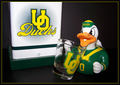
| 10/24/2006 12:53:04 AM | Go Ducks!by elizadebComment: Greetings from the Critique Club. I have been assigned your photo to critique and here are my thoughts:
Personal Reaction: My daughter went to school at Oregon which gives me some affinity to the school. I liked the photo right away. It would make a great poster for a dorm room or a frat house, for example. However, in the end I didn’t feel there was enough here to hold my interest. I doubt there are enough Oregon fans to carry the photo in the voting based on similar affinity.
Composition: Good composition. I like the placement of the duck, the shot glass and the U of O logo. I am normally not a border fan but yours works and you chose a great color for it, reinforcing the Oregon Ducks theme.
Technicals: Good focus and depth of field. The lighting seems a bit harsh leading to very little shadowing. It’s the shadows that give a photo depth.
Conclusions: I don’t want to read a lot into this. The challenge was intended to be whimsical and I suppose your photo was too. So let’s not over analyze. Without knowing your intentions with the photo it’s hard to draw a lot of conclusions. Next time you request a critique, it would help to have some commentary in the “Photographer’s Comments” when you submit the photo. I noticed from your portfolio that you are a relatively new member and haven’t submitted to a lot of challenges yet. This is clearly among your best work so far and shows a positive trend. I believe you have the potential to do well here and wish you good luck in future challenges.
Feel free to PM me if you’d like further dialog.
| | Photographer found comment helpful. |
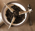
| 10/24/2006 12:29:19 AM | Coffee and Toast - "Breakfast of Champions"by srbrubakerComment: Greetings from the Critique Club. I have been assigned your photo to critique and here are my thoughts:
Personal Reaction: Your photo makes a good first impression. It is creative and avoids cliche. It is pleasant to look at and invites a second look. It conveys a sense of humor. Your thumbnail version is also good and invites a view leading to vote. All good stuff and I gave it a 7 when I voted.
Composition: The composition is good. You offset the bowl, beans and center of the toast points which increases the dynamic feel of the photo. However, the crop feels crowded to me and the various elements a bit too close together. A little more space above, below and to each side would take care of this and allow each element to have a bit more of its own space. I like that you included the newspaper. If you had controlled the reflection is the spoon, I would have liked it better.
Technicals: Your focus is very good. I like the lighting; low and from the side shows off the texture of the placemat and beans. It looks like you have multiple light sources which help the 3 dimensional feel of the photo. Depth of field is good. Tonal range is good.
Conclusions: Without knowing what you were trying for (and there’s no help for this in your “Photographer’s Comments”) it’s hard to draw a lot of conclusions. I would have thought it would have scored higher than it did. My hypothesis is that voters found other subjects more appealing and gave them higher scores.
As always, these are my opinions. Feel free to PM me if you’d like further dialog. Good luck in future challenges.
| | Photographer found comment helpful. |
| 09/29/2006 12:18:21 AM | | | Photographer found comment helpful. |
|
Showing 4231 - 4240 of ~6721 |
Home -
Challenges -
Community -
League -
Photos -
Cameras -
Lenses -
Learn -
Help -
Terms of Use -
Privacy -
Top ^
DPChallenge, and website content and design, Copyright © 2001-2026 Challenging Technologies, LLC.
All digital photo copyrights belong to the photographers and may not be used without permission.
Current Server Time: 06/24/2026 07:20:36 AM EDT.
|