| Image |
Comment |
| 03/26/2008 08:40:16 PM |
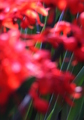
Dockland Bluesby vladoComment: Great perspective. I love the composition and the colors. Nice Work! |
 Photographer found comment helpful. Photographer found comment helpful. |
| 03/26/2008 08:39:28 PM |
|
| 03/26/2008 08:37:58 PM |
|
| Photographer found comment helpful. |
| 03/26/2008 08:37:28 PM |
Diagonal Linesby mfzComment: Tremendous shot! I guess I can see some patters if I look hard, it certainly doesn't communicate "Patterns" when I look at it. |
| Photographer found comment helpful. |
| 03/26/2008 08:35:05 PM |
|
| Photographer found comment helpful. |
| 03/26/2008 08:32:58 PM |
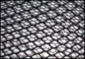
Cage Matchby fantomfotoComment: To be honest, this really doesn't do anything for me. I can't tell if there background has a texture, or if the photo just has a lot of noise. My eyes don't really have any place to go. I think if there was some colorful element between the mesh and the shadow, it would give me something to focus on. |
| Photographer found comment helpful. |
| 03/26/2008 08:29:33 PM |
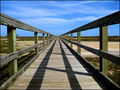
Long Walkby CamComment: Great job! I have seen so many people mess up this type of shot, but you nailed it. Everything is in focus, it's well composed, the vanishing point is right on the horizon line, the colors are vivid and there is nothing really distracting in the background. I wish that building on the left weren't there, but I'm sure you would have thought to remove it if this was not a basic editing challenge. |
| Photographer found comment helpful. |
| 03/26/2008 08:24:35 PM |
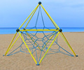
Games by the seasideby sunraygpComment: Not bad. The 2 things that caught my eye are:
(1) There are two horizon lines here that are not parallel. If they weren't close to being parallel. that would be fine, bur because they are close, it makes it look like it was an error in composition.
(2) The structure is close to, but not centered. Again, if it were way off center it would look intentional and would be fine, but because it is close, it looks like a mistake.
The thinks I really like are the vivid colors. I like that there are large portions of the image that are the same color. It's a bit of cubism in that way. I also like that the subject is IMO exactly what this challenge is about.
Nice work! |
| Photographer found comment helpful. |
| 03/26/2008 12:36:55 AM |
|
| Photographer found comment helpful. |
| 03/26/2008 12:29:55 AM |
Zig-Zagby paynekjComment: I like the colors here. It would be easy to mess the composition up here, but you nailed it. |
Home -
Challenges -
Community -
League -
Photos -
Cameras -
Lenses -
Learn -
Help -
Terms of Use -
Privacy -
Top ^
DPChallenge, and website content and design, Copyright © 2001-2026 Challenging Technologies, LLC.
All digital photo copyrights belong to the photographers and may not be used without permission.
Current Server Time: 06/19/2026 12:06:12 PM EDT.