| Image |
Comment |
| 01/28/2005 04:44:52 PM |
|
 Photographer found comment helpful. Photographer found comment helpful. |
| 01/28/2005 04:44:20 AM |
|
| Photographer found comment helpful. |
| 01/28/2005 03:21:17 AM |
Beadsby shavenwalrusComment: I like the minimalism. I think a stronger focus would have helped. The black border is very heavy for such a light colored image. |
| 01/28/2005 03:13:53 AM |
|
| Photographer found comment helpful. |
| 01/28/2005 03:11:39 AM |
Composition in 3sby atsxusComment: Division in thirds seems kind of arbitrary. I think the black outline is distracting... might have worked better with black background/50% grey outline. |
| Photographer found comment helpful. |
| 01/28/2005 03:09:39 AM |
|
| Photographer found comment helpful. |
| 01/28/2005 03:07:49 AM |
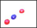
Primary Colorsby sparklyComment: Hm... for this sort of ultra-clean composition I think that unused crayons would have worked best. Just my two cents. Otherwise very nice. |
| Photographer found comment helpful. |
| 01/28/2005 03:02:11 AM |
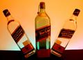
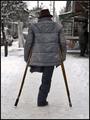
All for one and one for allby RgarciaComment: Hm. Powerful symbol. Too bad it's not more centered. (Sometimes I think centered composition is okay, blasphemous though it may be.) |
| Photographer found comment helpful. |
| 01/28/2005 02:59:22 AM |
|
| Photographer found comment helpful. |
| 01/28/2005 01:07:28 AM |
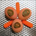
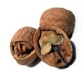
Nutsby asijComment: Great picture. I love the quarter-cracked nut. |
| Photographer found comment helpful. |
Home -
Challenges -
Community -
League -
Photos -
Cameras -
Lenses -
Learn -
Help -
Terms of Use -
Privacy -
Top ^
DPChallenge, and website content and design, Copyright © 2001-2026 Challenging Technologies, LLC.
All digital photo copyrights belong to the photographers and may not be used without permission.
Current Server Time: 05/07/2026 03:38:26 AM EDT.