| Image |
Comment |
| 04/29/2005 11:52:33 PM |
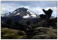
Lava rock cutting the skyby lastefComment: I think this photo could have done a lot better, but didn't for two reasons: (1) it's too small, and (2) it's too dark. I'm glad you didn't burn anything in, because it certainly doesn't need to get darker! Making it bigger and bringing out some foreground detail (which probably would have been possible within basic editing), and maybe sharpening it a bit, would, I think, turn this into a really stunning picture. |
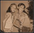
| 04/29/2005 11:42:44 PM |
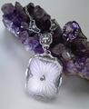
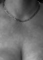
Something Old...Something New...by RKTComment: great texture, lovely lighting, impressive jewelry collection - but it doesn't really look like an advertising image to me. the rings here are part of the composition and not the sole focus. |
 Photographer found comment helpful. Photographer found comment helpful. |
| 04/29/2005 11:40:53 PM |
|
| Photographer found comment helpful. |
| 04/29/2005 11:39:43 PM |
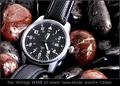
OUTBACKby DrJOnesComment: killer lighting and background. I like the subtlety. while this image is not in-your-face in the way many advertisements are, it is still direct and its product is clear. I can easily imagine this being in a magazine. the one thing I might want to change would be that I'd try burning in the hand a bit, to put more emphasis on the wrist and watch. (8) |
| Photographer found comment helpful. |
| 04/29/2005 11:37:48 PM |
History In The Makingby RedOakComment: is the text at the bottom all in the same font size? it looks very strange and chunky. 6 - would have been 7 but the text is really throwing me off. |
| Photographer found comment helpful. |
| 04/29/2005 11:36:37 PM |
|
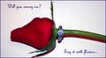
| 04/29/2005 11:35:55 PM |
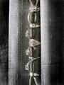
Diamonds are Foreverby slingshotComment: some things to think about-
1. seems like "Will you marry me?" should have been enclosed in quotation marks.
2. the next line is "Say it with flowers," but there's only one flower...
3. if we're supposed to say it with flowers, what is the ring doing there?
4. if this is a jewelry advertisement, why should we say it with flowers?
(4) |
| Photographer found comment helpful. |
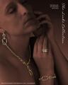
| 04/29/2005 11:33:38 PM |
The Links Collectionby EddyGComment: great color treatment - the jewelry really stands out. the typography is good too, though perhaps just a wee bit small, and I think the text in the upper right ("The fine art . . .") should have been vertically aligned with the script at the edge. (7) |
| Photographer found comment helpful. |
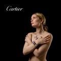
| 04/29/2005 11:32:05 PM |
Defining Beautyby arnitComment: hi, arnit. *wink*
great job matching the font used in cartier's logo. though the placement looks rather arbitrary to me. |
| Photographer found comment helpful. |
| 04/29/2005 11:26:04 PM |
|
| Photographer found comment helpful. |
Home -
Challenges -
Community -
League -
Photos -
Cameras -
Lenses -
Learn -
Help -
Terms of Use -
Privacy -
Top ^
DPChallenge, and website content and design, Copyright © 2001-2026 Challenging Technologies, LLC.
All digital photo copyrights belong to the photographers and may not be used without permission.
Current Server Time: 05/08/2026 10:45:40 AM EDT.