| Image |
Comment |
| 05/06/2005 11:35:32 AM |
|
 Photographer found comment helpful. Photographer found comment helpful. |
| 05/04/2005 12:06:54 AM |
Trim Hereby snowboardlauraComment: Yay for submitting!
Don't be discouraged by the poor finish; my first showing was lousy, too, and I've gotten as low as the 4th percentile. You take good pictures--it's just a lot harder to take a good picture that fits a theme within the space of a week than it is to take a good picture of whatever kind. I hope to see more of yours on here, and someday one on the front page :) |
| Photographer found comment helpful. |
| 05/04/2005 12:04:14 AM |
|
| Photographer found comment helpful. |
| 05/04/2005 12:01:57 AM |
|
| Photographer found comment helpful. |
| 05/03/2005 01:25:38 AM |
Sunflower riseby SandmanComment: All your pictures, especially this and "Sprout," have really great colors. I really like the tonal range and depth of the hues. What they are lacking, however, is sharpness - do you use photoshop? If so, or if you use any other program that has such a feature, I recommend acquainting yourself with the Unsharp Mask. In Photoshop, a good place to start for a 640 x ~480 image is 100% sharpening, Radius .5, 0 Threshold. I think sharpening would make the difference between nice and good. |
| Photographer found comment helpful. |
| 05/02/2005 08:30:21 PM |
Ocean's Mystery Braceletby SondaComment: Hey Eva, I gave this an 8. It was definitely one of my favorites from the challenge. I like your treatment of the type, too, and good typography was rare in this challenge. (I like GulimChe as well--its unevenness is really appealing.) I actually don't see the texture of the stocking at all. I guess my monitor is darker than yours. But that does answer the question of how you got the great silhouette-like effect, which I thought was amazing. Very well done. |
| Photographer found comment helpful. |
| 05/02/2005 08:23:07 PM |
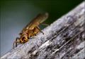
Bug.jpgby SondaComment: this bug is so cute!! I wish the eyes were a bit sharper, but the colors and DOF are really nice. |
| Photographer found comment helpful. |
| 05/02/2005 02:13:02 PM |
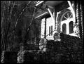
Shineby DeniseBernadetteComment: Greetings from the Critique Club!
The first thing I notice in this picture is the front of the house: certainly that's strongly the focal point. Too much so, actually, as the house itself is very bright and the rest of the image very dark. The excessively high contrast makes this image unbalanced, and blown-out highlights are generally undesirable as well.
To cut down on this sort of thing, there are two things you can do: stick a neutral-density filter over your lens (such as a UV or Skylight filter, and even a polarizer might help), or simply expose for the highlights and fix the levels in Photoshop. In digital photography, one wants to make sure that the highlights are not overexposed even more than make sure that the shadows are not underexposed, which is the reverse of proper technique in film photography. I see in this picture a lot of rich detail in the shadows, which is great... but the detail needs to be in the highlight areas as well.
As this was a Free Study, there is not much to say about whether or not this meets the challenge. But I still might ask, what is it that made you pick *this* photo? Judging by the title, what caught your eye was the brilliant light on the facade of the house while the stairs leading up to it were still in shadow. Was this the best angle to depict this lighting? Did you try shooting from straight in front of the house, from the other side, with a looser or tighter crop? Not that this shot seems arbitrary, but these are just good general things to think about.
I hope you found this critique helpful, and good luck to you in future challenges!
Damon |
| Photographer found comment helpful. |
| 05/02/2005 01:58:21 PM |
Boredom at the O-K Corralby NathanWertComment: harsh shadow from the flash would be okay by itself, but with the high grain this picture winds up looking amateurish... which is a shame, because in its other respects (composition, interest, relevance to challenge) it is very strong. (6) |
| Photographer found comment helpful. |
| 05/02/2005 01:57:03 PM |
A shade of blueby nico_blueComment: is it a nico shade of blue?!@
it looks like it could be, but I wouldn't put money on it... |
| Photographer found comment helpful. |
Home -
Challenges -
Community -
League -
Photos -
Cameras -
Lenses -
Learn -
Help -
Terms of Use -
Privacy -
Top ^
DPChallenge, and website content and design, Copyright © 2001-2026 Challenging Technologies, LLC.
All digital photo copyrights belong to the photographers and may not be used without permission.
Current Server Time: 05/08/2026 11:39:56 AM EDT.