| Image |
Comment |
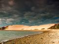
| 10/17/2005 12:51:21 PM |
The Dunesby OlyuziComment: I like the contrast between light and dark in this picture, but the gradient in the sky looks artificial. |
 Photographer found comment helpful. Photographer found comment helpful. |
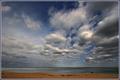
| 10/17/2005 01:53:27 AM |
|
| Photographer found comment helpful. |
| 10/17/2005 01:51:19 AM |
|
| Photographer found comment helpful. |
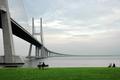
| 10/17/2005 01:50:49 AM |
Contemplationby NunoComment: great lines in this picture. I'm sure a lot of people are going to tell you that. they're right. the people add a lot to this picture as well. while this picture has a lot of merit, I feel like it's lacking a strong focal point. My eye is sort of drawn to the bridge tower, and sort of drawn to the people below it, but neither really grabs me. a version of this with a bit more contrast between the tower and the sky (darker tower, maybe) might be worth seeing. |
| Photographer found comment helpful. |
| 10/17/2005 01:48:56 AM |
18mmby OdysseyF22Comment: good old 18mm...
for all-purpose control of bright skies, try duplicating the sky (select it and copy it to another layer) and set the layer's blending mode to "multiply." that often helps a lot. |
| Photographer found comment helpful. |
| 10/17/2005 01:48:00 AM |
Early morning before the tourists comeby RUEDISCHMUTZComment: Great reflection. The boats in the foreground add to the sense of depth. The glow above the mountains is off-putting... I don't know if the sky was really like that or if that's an artifact of post-processing, but I wish it weren't there. |
| Photographer found comment helpful. |
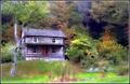
| 10/17/2005 01:46:54 AM |
An Acreby JeileenComment: There are some bright spots in this image (e.g., stripes on the house, highlights on bushes to the left, strip of grass in the foreground) that draw the eye overmuch. rein in your highlights and this would be more effective. |
| Photographer found comment helpful. |
| 10/17/2005 01:45:53 AM |
|
| Photographer found comment helpful. |
| 10/17/2005 01:44:58 AM |
Clutterby TranquilComment: Nice, rich duotone. Very crisp looking. Inclusion of the window is a nice touch, and balances the dark corner in the LR nicely. I take it your intention was to illustrate how overwhelming "too much stuff" can be. Point well taken. |
| Photographer found comment helpful. |
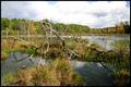
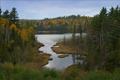
| 10/17/2005 01:42:06 AM |
Autumnby ShutterPugComment: Great shapes in this picture. A bit of sharpening (Unsharp Mask works best) would really bring out the detail in the trees. |
| Photographer found comment helpful. |
Home -
Challenges -
Community -
League -
Photos -
Cameras -
Lenses -
Learn -
Help -
Terms of Use -
Privacy -
Top ^
DPChallenge, and website content and design, Copyright © 2001-2026 Challenging Technologies, LLC.
All digital photo copyrights belong to the photographers and may not be used without permission.
Current Server Time: 05/09/2026 07:19:19 PM EDT.