| Image |
Comment |
| 03/06/2006 10:51:23 PM |
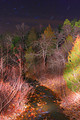
Cedar Creekby NitenComment: I wish there were a more organized pattern to the light splashes. as it is, it just looks like scribbling with a flashlight. |
| 03/06/2006 10:49:43 PM |
|
 Photographer found comment helpful. Photographer found comment helpful. |
| 03/06/2006 10:49:00 PM |
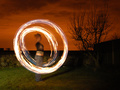
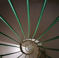
Rings of Fireby JonoComment: have you seen Nazgul's shot of this sort? I'm afraid that's become the standard in my mind, and any such photo will have to compare favorably to that one in order to get a good score from me. |
| Photographer found comment helpful. |
| 03/06/2006 06:37:15 PM |
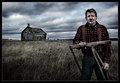
Desolationby Joey LawrenceComment: Your comments here remind me of my own attitude toward a lot of my old processing jobs... I tend to feel like newer is better, and I look back at stuff I worked months (or years) ago and think "boy, how primitive." Sometimes I think that's the correct attitude, and sometimes I think it's just a knee-jerk reaction to the old vs. the new.
The point of all that was that I think that the challenge entry was edited with no less finesse; if you could have gone back and redone your challenge entry with this sort of processing (grain aside), I wouldn't be able to say that I think that this is better. Of course, it's kind of hard to make a direct comparison when the composition differs.
That's my $1.32. ($0.02 for the thoughts, $1.30 for S&H) |
| Photographer found comment helpful. |
| 03/06/2006 06:33:36 PM |
|
| Photographer found comment helpful. |
| 03/06/2006 12:41:16 AM |
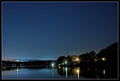
unpluggedby RikkiComment: On the upside, the score you actually got is very close to the average of your two guesses. So this says something good about your predictive abilities :)
|
| Photographer found comment helpful. |
| 03/06/2006 12:34:53 AM |
|
| Photographer found comment helpful. |
| 03/06/2006 12:24:27 AM |
|
| Photographer found comment helpful. |
| 03/05/2006 11:36:10 PM |
Scenaryby saadatComment: i'm giving this a 2 for the following reasons:
- clearly does not meet the challenge
- technically poor
- compositionally poor
- title is spelled incorrectly |
| 03/03/2006 03:03:01 PM |
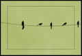
Wiredby JutildaComment: This is very strong. The untraditional border works well here, and the muted, low-key palette is really nice. I'm glad you left the sky so dark, and whatever you did to make it that color, I like it. This photo has an air of elegance and refinement. |
| Photographer found comment helpful. |
Home -
Challenges -
Community -
League -
Photos -
Cameras -
Lenses -
Learn -
Help -
Terms of Use -
Privacy -
Top ^
DPChallenge, and website content and design, Copyright © 2001-2026 Challenging Technologies, LLC.
All digital photo copyrights belong to the photographers and may not be used without permission.
Current Server Time: 05/09/2026 02:28:01 PM EDT.