| Image |
Comment |
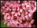
| 04/10/2003 08:38:30 PM |
Pinkby BAMartinComment: beautiful color and great DOF. the background is also very colorful without being distracting...well done! |
 Photographer found comment helpful. Photographer found comment helpful. |
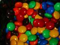
| 04/10/2003 08:37:26 PM |
My candyby hilmarsigComment: great colors! the focus is a bit too soft and the dark shadow on the left is distracting. if you're a member, you should try it again for this week's challenge! |
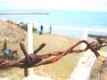
| 04/10/2003 08:33:12 PM |
"Rust"by timboydwhiteComment: good color and great DOF. the background is a little too busy and distracting, though. |
| Photographer found comment helpful. |
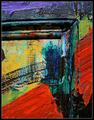
| 04/10/2003 08:30:28 PM |
Painted Doorby ndsComment: oh, i love this! great saturation of colors and nice cropping. what a cool door! nice work! |
| 04/10/2003 07:35:14 PM |
Suntec City Towers Singaporeby ashwinComment: Greetings from the Critique Club!
First, let me preface this by telling you that this is my first official critique. Please bear with me as I learn.
I really like this photo. I think it's a very strong image and the symmetry is great. I'm not one who thinks that a mirror image is necessarily the perfect form of symmetry, rather that the photo should have a balanced look. I think this photo achieves that balance.
Like others have said, the tree at the bottom is distracting and cropping it out would have made the photo stronger. That's really the only thing I can see that I would change.
The colors are nice...pretty blue sky, white clouds without being blown out...good focus and interesting perspective.
All in all, I think this is a very good shot and most impressive for your first submission!
Good luck with future challenges and keep up the good work! |
| Photographer found comment helpful. |
| 04/08/2003 08:42:59 PM |
|
| Photographer found comment helpful. |
| 04/08/2003 04:38:59 PM |
Many Colors One Birdby gowf67Comment: great colors! is this reflected in a mirror? seems a little grainy and the focus looks like it was more on the reflection than on the subject. nice, vivid colors, though. |
| 04/08/2003 04:35:23 PM |
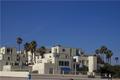
Baby's got blue skiesby darrenmeiselComment: beautiful sky and i love how it matches the building awnings and the can in the foreground. i think getting a little closer to the building would have made this a more powerful image, though. also, don't forget to check your horizon when taking a photo. a nice, straight horizon always helps (unless it's obviously suppose to be tilted). |
| 04/08/2003 04:31:12 PM |
My orange!by sissiComment: very creative. i think a different cropping might work better as the sides of the transparency are visible. good lateral thinking, though. |
| Photographer found comment helpful. |
| 04/08/2003 04:09:20 PM |
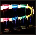
A Streak of Lightby mariomelComment: very creative. the light is a bit harsh at the top of the glasses, but, the colors are very nice. |
| Photographer found comment helpful. |
Home -
Challenges -
Community -
League -
Photos -
Cameras -
Lenses -
Learn -
Help -
Terms of Use -
Privacy -
Top ^
DPChallenge, and website content and design, Copyright © 2001-2026 Challenging Technologies, LLC.
All digital photo copyrights belong to the photographers and may not be used without permission.
Current Server Time: 07/22/2026 10:43:57 AM EDT.