| Image |
Comment |
| 04/17/2006 01:35:44 AM |
Gravity by thegrandwazooComment: So glad this was yours...by far one of my favorites in the challenge...should have ribboned!!
Clint |
 Photographer found comment helpful. Photographer found comment helpful. |
| 04/12/2006 12:38:24 PM |
Plastic Pornby fotomann_foreverComment: She might not be naked now but not all porn starts off with everyone doing it. It's the build up....great shot shame on your placing...easily top ten in my book. People are loosing their humor I believe. |
| Photographer found comment helpful. |
| 04/06/2006 03:19:31 AM |
Slinky Revisited (Candlelight Challenge - Nordlys)by QikiComment: :: Critique Club ::
I can’t believe how perfect of a job you did copying the other image. You did exactly what you were called to do…wonderful. The only thing I can say as criticism is that yours feels a tad more sharp/harsh. The other one has a bit more softness to it. Not really saying it looks bad just can tell that small difference. Again great job producing this replica.
Clint
|
| Photographer found comment helpful. |
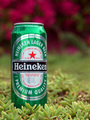
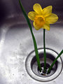
| 04/06/2006 03:13:00 AM |
Beautiful Garden and a Beer = Comfortby tembaComment: :: Critique Club ::
Technically can’t really find anything wrong with this shot. I like the colors of green on the ground and the red in the background, makes the can stand out more. I do like your choice of DoF, glad the words are clear and the background is blurred. Wish the can were turned a smidge to the left so the word Heineken were more centered. Couldn’t find the shot you were going for as far as being Déjà vu…not saying you didn’t do a good job in that aspect just maybe didn’t look hard enough. Overall it’s a nice simple shot and you did a good job setting it up and lighting is also good.
And on a side note I also received a perfect 5 on the abstract challenge…never have received a perfect anything before…always is like 5.3478, or something like that. Guess that means you were right in the middle of the road on this one.
|
| Photographer found comment helpful. |
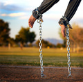
| 03/30/2006 03:33:55 AM |
Cyberspaceby Mal37Comment: :: Critique Club ::
Very odd feel to this. I like how strange and original it is though…can see it took a bit of brain power to make it happen. Nitpicking I would have not cut the top of the photo so close to the hand…given it a little more room. Thinking your choice of blue to symbolize coldness or even lifelessness has a certain weight to the image…other just might think it looks too weird. I think you did a great job shooting for the challenge and being creative at the same time.
|
| Photographer found comment helpful. |
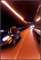
| 03/30/2006 03:28:10 AM |
2 Second Pulseby fotodudeComment: :: Critique Club ::
I don’t care that it is your filler image…it looks very cool. I have seen shots like this before but I think this is the only one with other cars in the photo also…I like it very much…the colors, the lights, the motion…it all works here. I know this is all about the setup…the end image is more of luck and how many shots you take to make sure you got something good. Well your setup was perfect and from that you got a wonderful image.
|
| Photographer found comment helpful. |
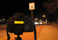
| 03/30/2006 03:23:26 AM |
Two Secondsby MadMan2kComment: :: Critique Club ::
As far as meeting the challenge…you did. As far as making an interesting or appealing photo I would say it is lacking. The only focus here is the camera which is the subject only to show that it is a 2-sec exposure…which it really doesn’t do that either because that camera isn’t taking the picture. If you had something in the photo that made you look to the background and tie your image together I think it would have been better. Maybe if you had set the camera up all the way to the right with a small streak of the cars going by. I think you tried hard to think outside the box and shoot something original and I give you points for that. Next time look at the whole photo as one and see what else can hold the viewers attention.
|
| Photographer found comment helpful. |
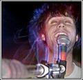
| 03/29/2006 08:39:56 PM |
Vi i i b b be eby ElmakiasComment: :: Critique Club ::
I think this is exposed very well...good use of the flash to burn in the subject and not have a blurry mess. I like the blue outlines...almost looks like his spirit or aura. Very interesting shot. The mike stand coming from the bottom left is just a tad distracting...but you might not have been able to help that due to where you were sitting or something else. I like the expression that you got from him. Overall I like the image and way to make it work for the challenge.
|
| Photographer found comment helpful. |
| 03/22/2006 12:36:50 AM |
|
| Photographer found comment helpful. |
| 03/21/2006 12:01:21 AM |
|
| Photographer found comment helpful. |
Home -
Challenges -
Community -
League -
Photos -
Cameras -
Lenses -
Learn -
Help -
Terms of Use -
Privacy -
Top ^
DPChallenge, and website content and design, Copyright © 2001-2026 Challenging Technologies, LLC.
All digital photo copyrights belong to the photographers and may not be used without permission.
Current Server Time: 07/18/2026 01:28:35 PM EDT.