| Image |
Comment |
| 05/10/2006 11:48:43 PM |
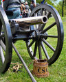
A New Shineby CyndaneComment: :: Critique Club ::
Like I said before nice shot. There are a few ways I can see how you could have made it work better. First off the placement of the canon…don’t know if you have any control over that or not, this is just what I see. It seems to be odd that it is facing the opposite direction than the people in the background. What I gather is this is a re-enactment of the civil war or something along those lines. I would also assume that it looks like they are lined up, for battle is what I’m thinking. Why would the canon not be facing toward your enemy, or why would you have your back to your enemy. But in reality they are probably all just standing around doing nothing but watching something else that is taking place during the show. So for that reason I find the people in the background distracting, from what I see as just a shot of a cannon, which I also have to say is a technically good shot of the canon. As far as if this shot is technically good I would say it is…just has a few hang ups in the composition. That is one of the most important parts to a photo especially one put into a photo contest. If this were taken at a different angle to remove the people or, if you are capable of doing so, move the canon to make it look like it is a part of the battle. I also think by it self it would look great in B&W…but color works as well with the bright greens in the background. To sum up good shot as far as exposure and contrast, but you have to look and see what else is in the shot and if it adds or takes away from your main subject…which is pretty cool in this case.
|
 Photographer found comment helpful. Photographer found comment helpful. |
| 05/10/2006 11:33:46 PM |
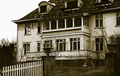
The Bellevue - call for reservationsby RefwhettComment: :: Critique Club ::
I like this shot…and I think it works very well in B&W. The contrast is very well also. One thing I would like to see is more of the house. Seems you cut the top off and you are left with ground to fill your shot. One reason might have been to keep the picket fence in and I don’t know if that adds enough to not see the whole house…if it because your lens is not wide enough you could just back up a bit. That is really the only thing I have against this photo is that I think a wider shot of the property would have benefited your image more. As far as the subject…it looks great and a very interesting old building to look at. Good choice in that account and again good tone.
|
| Photographer found comment helpful. |
| 05/10/2006 03:38:19 AM |
Cycle of Boom and Bust.by ArtanComment: :: Critique Club ::
If you let it this photo will tell you the story. Like I said I like the tone but maybe a tad more contrast would have benefited it a bit more...good simple shot...good work
|
| Photographer found comment helpful. |
| 05/10/2006 03:28:28 AM |
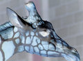
Don't bite me!by hannekeComment: :: Critique Club ::
Like I said before, the coloring looks a bit strange...but not in a bad way. It's a very simple shot done very well. Has humor to it and is technically sound. The eye detail is amazing and the flower looks beautiful. The hat was a definite plus...great work.
|
| Photographer found comment helpful. |
| 05/10/2006 03:20:27 AM |
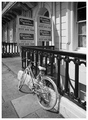
Breakfast Rideby neophyteComment: :: Critique Club ::
Like I said already...cool B&W...but I will go further now. I like it because you have great contrast and good tonal range. You have a great subject and now I know the story behind it. So it's even that much "cooler" Great work |
| Photographer found comment helpful. |
| 05/10/2006 03:16:52 AM |
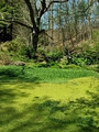
Marshlandby MinstrelComment: :: Critique Club ::
First off you exposed the image great...no blown out highlights or anything like that. The one thing is it's missing a subject. The only thing that really stands out is that tree. In a perfect world an alligator peeking out would have made this score a 6. Maybe a closer look at the marsh would have also done better...never quite sure with the voters here. But I think you did a nice job capturing this corner of the world.
|
| 05/10/2006 03:09:21 AM |
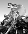
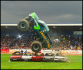
Swamp Thing grabs victory again!by arminComment: :: Critique Club ::
Well technically I've already left you a message...I really don't know what else to say. I'm pretty sure this was just a snap shot...you had the settings down and were just clicking away. It looks great...the only thing I can say is that the neon green on the front of the truck looks like it has be brought to it's limit...maybe if you stood down a bit from going that far...but just nit-picking. Like I said, for what this is all about...it's great.
|
| Photographer found comment helpful. |
| 05/09/2006 03:42:02 AM |
Fate and her violin....by theSajComment: :: Critique Club ::
This is a very nice image...looks to be a very well exposed shot and I enjoy the angle you gave this...definitely adds to the shot. I also like the tad bit of negative space at the top. Good work here. If I had to nitpick maybe a total black background would have pushed it to the next level and done away with the slightly distracting shadow...again though...good job.
|
| Photographer found comment helpful. |
| 05/09/2006 03:37:18 AM |
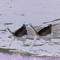
Ghoulish geese make landfallby KrozarComment: :: Critique Club ::
A tighter crop would have benefited this image more...I do like the reflection...maybe even crop out the grass completely...kinda distracting from the birds.
|
| Photographer found comment helpful. |
| 05/09/2006 03:35:17 AM |
Day at the Zooby mbmcnabbComment: :: Critique Club ::
I think this would have been better if you hadn't cut of the animal’s mouth. Maybe the darks could be a tad darker making for more contrast...which would make your image pop a bit more. The eye is a bit washed out...with a negative shot that means this image might have been a bit too dark...not sure though...I do like the shot for what I am seeing.
|
Home -
Challenges -
Community -
League -
Photos -
Cameras -
Lenses -
Learn -
Help -
Terms of Use -
Privacy -
Top ^
DPChallenge, and website content and design, Copyright © 2001-2026 Challenging Technologies, LLC.
All digital photo copyrights belong to the photographers and may not be used without permission.
Current Server Time: 07/25/2026 11:23:08 PM EDT.