| Image |
Comment |
| 09/06/2006 06:20:31 PM |
Prayersby theresafloresComment: I'm sure the situation didn't lend itself to be able to, but this image would be MUCH stronger without the people behind the biker. The 2nd biker right behind your subject is the most distracting as it pulls your eyes away even though it's been desaturated. The black outfit surrounding the main black helmet de-emphisizes (is that a word? ;) your real subject.
The main subject itself is nice & strong otherwise. |
 Photographer found comment helpful. Photographer found comment helpful. |
| 09/05/2006 01:43:58 AM |
|
| Photographer found comment helpful. |
| 09/02/2006 06:40:09 PM |
Rainbow Delightby daboardergirlComment: Great colors. I see the rainbow part, but since I have no clue what it is, I can't see the delight. Itleaves me with feeling of unfulfillment, which kind of feels odd for such a vivid image. |
| Photographer found comment helpful. |
| 04/24/2006 06:21:04 PM |
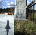
Two Old Friendsby aberrationComment: Well I'm sure this got quite a few comments telling you how you shouldn't take a pic showing the name on ahead stone. Commenters were quite vocal when I entered a pic of my nephew's ;)
That said...I like the lower angle, but the stone taking up the lower left corner takes away from the impact & the sky looks too bright a blue & not quite real. I probably would have toned down the color or went sepia or B&W. |
| Photographer found comment helpful. |
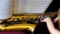
| 04/24/2006 06:05:47 PM |
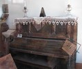
pianoby tootsComment: I think I see reflections...was this taken through a window? A polorize filter can cut the reflections when taking pics through glass, but sometimes you still can't get rid of them all. |
| 04/24/2006 05:57:12 PM |
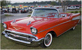
What was old is new again!by texaskevComment: Beautiful car, but the background is too busy to make the image stand out among almost 400 entries. If no clear background could be had, you could have tried a quarter panel close up or something similar. |
| Photographer found comment helpful. |
| 04/24/2006 05:48:43 PM |
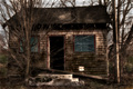
This Old Houseby JayWalkComment: I like the look you were going for, but it seems too processed for my taste. Old depicts character & the finer details have been smoothed over too much. I could be wrong, but it also looks like the sky has been burned in a way that makes it very noticable. |
| Photographer found comment helpful. |
| 04/24/2006 05:40:21 PM |
Something Old, Discovered by Someone Newby weiszComment: It feels like there is either not enough or too much of the child in the image. A single hand or the whole head would look better. The whisps of hair that are there now are disctracting. |
| Photographer found comment helpful. |
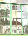
| 10/26/2005 12:41:12 AM |
Pastel Reflectionsby LtHousLadyComment: Thank you all for the comments. The lighter high key color was intentional. I liked the look. For the lighthouse, I think it spoke more about its history this way. Judging from the comments & score spread, many like it & many don't....just a matter of taste. As a whole, I photograph to appeal to a select market, so it wont appeal to all. |
| 10/25/2005 11:46:50 AM |
HDDby maryannComment: High tech things look a little odd in this type of old feel tone. |
Home -
Challenges -
Community -
League -
Photos -
Cameras -
Lenses -
Learn -
Help -
Terms of Use -
Privacy -
Top ^
DPChallenge, and website content and design, Copyright © 2001-2026 Challenging Technologies, LLC.
All digital photo copyrights belong to the photographers and may not be used without permission.
Current Server Time: 07/16/2026 07:57:21 AM EDT.