| Image |
Comment |
| 04/16/2014 05:54:00 AM |
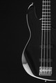
Jazz Bassby Jackson_HComment: This was one of my favorites. One of my 10s. I'm sad to see a straight out copy of the previous winner get the blue and creative photos like this one get low ranking.
|
 Photographer found comment helpful. Photographer found comment helpful. |
| 04/11/2014 11:06:52 AM |
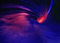
Spiral Anomalyby Yo_SpiffComment: To artsy and blurry for my taste. For a challenge named Stripes, that is. Stripes remind me of something more graphic. |
| Photographer found comment helpful. |
| 04/11/2014 11:03:47 AM |
|
| Photographer found comment helpful. |
| 04/11/2014 11:02:22 AM |
|
| Photographer found comment helpful. |
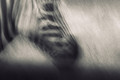
| 04/11/2014 11:01:06 AM |
migrationby whiteroomComment: To artsy and blurry for my taste. For a challenge named Stripes, that is. Stripes remind me of something more graphic. |
| Photographer found comment helpful. |
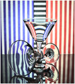
| 04/11/2014 10:56:47 AM |
Captureby MondComment: WOW! I love it. Love the idea, love the colors and the sharpness and the way yoou camouflaged the end of the spiral (it is a plastic spirally toy thingy, right?).
If i have to find a remark, it's the reflection if the light on the ball. the small radial lines are OK, the big one at 8 o'clock (inside the ball) bothers me. Probably couldn't be avoided. |
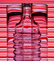
| 04/11/2014 10:52:36 AM |
One Drink to Manyby JCrest01Comment: Interesting.
A bit underporcessed, IMO. Visible CA on the black stripes in the glass, yellowish cast on the whites on the right. Some uneven ligting in the left. Composition-wise, i would have preferred more straigh-on angle. |
| Photographer found comment helpful. |
| 04/11/2014 10:46:28 AM |
Red Striped Trioby illini75Comment: I like the idea, but the stripes become a bloody mess when they hit the bottle.
You clearly focused on the background. I wonder what the shot would look like if you focused on the glasses, or went for deeper DoF to have both the glasses and the background in focus. |
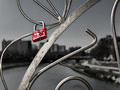
| 04/11/2014 04:12:47 AM |
Everlasting loveby damjanevComment: Originally posted by nam:
I gave this one of my top scores (9 and I only had two 10's in the challenge) and hoped it would be higher - but I was afraid it wasn't "fence" enough for many. I do adore the depth of field and though I am not usually all that fond of selective color, I think it works nicely here. Nice finish. |
I knew it wasn't a typical fence shot, but i went for it anyways. The more standard ones that i made i didn't like. 6+ is a decent score. Finished in the Top20. The depth of field was slightly tuned in post processing. Just slightly. As for the selective color, i'm kind of a sucker for it. I love it. I made a version with the gold color left on the "fence" (actually it's a bridge railing). It was too shiny. This way, the red padlock really stands out.
For the curious ones, the writings are in Cyrillic and it says: Moni Viktor. Moni is short for Monika i guess. Message edited by author 2014-04-11 04:13:35. |
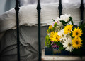
| 04/10/2014 12:42:28 PM |
foot of the bedby flahermaComment: Cute.
I would have preferred if there was no soft focus around the border, but i still like the shot. |
| Photographer found comment helpful. |
Home -
Challenges -
Community -
League -
Photos -
Cameras -
Lenses -
Learn -
Help -
Terms of Use -
Privacy -
Top ^
DPChallenge, and website content and design, Copyright © 2001-2026 Challenging Technologies, LLC.
All digital photo copyrights belong to the photographers and may not be used without permission.
Current Server Time: 07/17/2026 12:57:58 AM EDT.