| Image |
Comment |
| 12/28/2006 12:07:37 PM |
Pencil Patternby GoboltsComment: cute concept. However, it doesn't feel balanced for me. Just missing a certain consitancey I would have liked to see. |
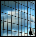
| 12/28/2006 12:06:40 PM |
Window to the skyby onarComment: I like the reflection the angle and the open window. I think this is very well composed and the colours are very nice. Good Job. |
 Photographer found comment helpful. Photographer found comment helpful. |
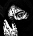
| 12/28/2006 12:06:04 PM |
Pattern Adornesby WildcardComment: thisis a really interesting concept. But for me it is a bit washed out, and I would ahve liked to seen smoother lines. |
| Photographer found comment helpful. |
| 12/28/2006 12:05:33 PM |
Produce Patternsby shelley1017Comment: these veggies look ill. All slimy and stuff. Interesting concept, but doesn't hold enough pop for me. Maybe a tighter crop and don't have to show the mirror. |
| 12/28/2006 12:04:35 PM |
Leafby tonizedComment: The bright side of the leave is great, but for me the dark side ruins it. I think it would be better to have the full leaf like the light side. |
| Photographer found comment helpful. |
| 12/28/2006 12:03:47 PM |
In Stitchesby izadoodleComment: This is great I really enjoy this image. Maybe a touch curves to make it pop a bit more. |
| Photographer found comment helpful. |
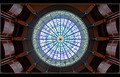
| 12/28/2006 12:03:06 PM |
Oculus Deiby DrAchooComment: This is really neat. The lines look drawn, but it is very fun feel too it. Just something isn't fully capturing me. |
| Photographer found comment helpful. |
| 12/28/2006 12:02:22 PM |
Tropical Garden Pathby KaizerComment: This is kinda neat. Not sure if it is steps or just a path. I am wondering though what this may look like with a angalur look to it instead of horizontal. |
| Photographer found comment helpful. |
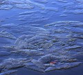
| 12/28/2006 12:01:32 PM |
Azure Iceby basicentryComment: This is a really nice find. I would love to see this more viberant and maybe a touch more contrastiness |
| Photographer found comment helpful. |
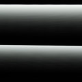
| 12/28/2006 12:00:59 PM |
linesby ralphComment: it is a mostly a pattern, however, I don't really care for it at all. Maybe for a texture overlay but only half. I think the look of the image being stacked light dark light dark, just to me ruins the patern. |
Home -
Challenges -
Community -
League -
Photos -
Cameras -
Lenses -
Learn -
Help -
Terms of Use -
Privacy -
Top ^
DPChallenge, and website content and design, Copyright © 2001-2026 Challenging Technologies, LLC.
All digital photo copyrights belong to the photographers and may not be used without permission.
Current Server Time: 07/23/2026 06:19:46 AM EDT.