| Image |
Comment |
| 02/06/2006 01:26:16 AM |
zestyby myceliumComment: Pretty shot Damon, simple and straightforward.Your work has been so rich and quirky lately that I would never have guessed this was yours. Sounds like you aimed at a top ten and hit the mark.Is this gonna be a new direction or more in the way of an experiment? |
 Photographer found comment helpful. Photographer found comment helpful. |
| 02/06/2006 01:18:02 AM |
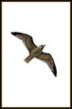
Flightby SDWComment: I like the idea of the border, but this seems a bit heavy. I like the more dynamic framing here with the use of the angle. Any shot of a bird the week after the wildlife challenge was going to be hammered on the basis of the "seen that before" deduction. Not fair, not warranted, but not unexpected.
|
| Photographer found comment helpful. |
| 02/05/2006 06:00:45 PM |
Antoine2_web.jpgby muckpondComment: very nicely done! If it isnt too much of a pain, could you sketch out your steps to get this sweet result? |
| 02/01/2006 05:48:20 PM |
Selling the concept...by CreativeFlyPhotoComment: The composition seems tilted counterclokckwise a bit and the highlights in the dress are blown out. The lighting is well balanced if overwhelming of some detail, especially nice is the line around her left arm and side of ther face, switching tones at the sholder. The massing/ framing is good, but that loss of detail bother me, I can't make out what she is holding in her right hand. |
| 02/01/2006 05:42:10 PM |
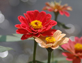
~ Symbol of Love ~by PERCOMComment: While I dont care for shoehorning flower shots into challenges, the colors here, particularlly the way the blue grey backround sets off red peach, make this work pretty well. Nice DOF and bokhen, but it's still a stretch |
| 02/01/2006 05:37:59 PM |
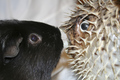
Dangerous romanceby anibal187Comment: Silly, but alot of fun. The flash is too harsh to show off the little furball's fur and it makes ugly reflections in real and glass eyes. That patch of open backround in the upper left seems a waste. |
| Photographer found comment helpful. |
| 02/01/2006 05:35:15 PM |
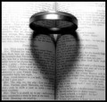
Enter Romeoby aerogurlComment: The top of the text is blown and the uppermost part of the filter is outside the focal range. The idea is a classic (i.e. used alot but still good) and I like the clever use of the text and the centerness. Rotated square and with more carefull lighting would have helped a nice image score better |
| Photographer found comment helpful. |
| 02/01/2006 05:31:45 PM |
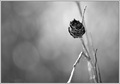
Lost Romanceby nephotoComment: the framing seems too sparse, I realise that you were going for the lost and lonley look, but the image leaves my eye hungry for more. Technically the twig closest to us is a bit blown out and the over all composition might have been helped by darker blacks. |
| Photographer found comment helpful. |
| 02/01/2006 05:28:28 PM |
Amor est vitae essentia by kiwinessComment: Tell me you didn't dodge the edges here, because the subject is handled tastfully, with just a bit of heat and the lightng is almost perfect (the man's hair is a bit blocked up) and the composition of the models with strong diagonals pulling the eye through the frame is all so good that this will ribbon. So I hope you did those falling off edges with lighting and no dodging because I'd like to see this with a blue ribbon and not under a pink stripe. |
| Photographer found comment helpful. |
| 02/01/2006 01:18:47 PM |
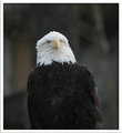
Eagle1.jpgby halcyonComment: I like your other entry better as a photograph, but it was so clearly a zoo shot that I think this one which could have been shot in nature would have scored better. It would benfit from a bump in saturation and a bit of shadow filter to bring out the feathers on the chest. |
| Photographer found comment helpful. |
Home -
Challenges -
Community -
League -
Photos -
Cameras -
Lenses -
Learn -
Help -
Terms of Use -
Privacy -
Top ^
DPChallenge, and website content and design, Copyright © 2001-2026 Challenging Technologies, LLC.
All digital photo copyrights belong to the photographers and may not be used without permission.
Current Server Time: 07/22/2026 09:29:10 AM EDT.