| Image |
Comment |
| 05/31/2004 10:01:03 AM |
|
 Photographer found comment helpful. Photographer found comment helpful. |
| 05/31/2004 09:01:02 AM |
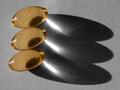
Domino Effectby Dr.ConfuserComment: I really like this, and the composition is perfect with the "quad' threes about to knock over the "double" threes. Perfect job on the background. I hope you ribbon. |
| Photographer found comment helpful. |
| 05/31/2004 08:57:54 AM |
Around we goby jmritzComment: This needs a bit more light and maybe a little extra saturation to be top notch. As is, a nice shot. |
| Photographer found comment helpful. |
| 05/31/2004 07:37:46 AM |
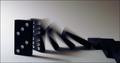
Hold On Looselyby jmsetzlerComment: I hope you do OK on the scoring with the "3" out of focus. Clever how the title and the sharp focus on the barrle work together, but I bet most people don't "get it". |
| 05/31/2004 04:40:00 AM |
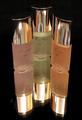
A 3 Day Supplyby BradComment: One of the only desaturations that I really like, probably because of the way you used the shadows. I think this is great composition and is a ribbon pick for me. |
| Photographer found comment helpful. |
| 05/31/2004 02:28:15 AM |
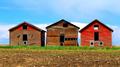
Three Shacksby artvetComment: Great colors (though they might be just a touch oversaturated.) Also looks a bit oversharpended on the roof line (left house) but issues aside, this image has real eyecatching appeal. |
| Photographer found comment helpful. |
| 05/30/2004 10:36:36 PM |
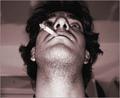
mafia styleby theodor38Comment: Where was this in the Centered Challenge? With the exception of maybe a bit too much grain, you are hammering these duotones you've been putting up lately. Lighting is pretty solid as well, as it looks like you used all the range without over blowing anything. |
| 05/30/2004 08:51:24 PM |
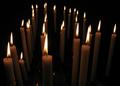
Candlesby ghotiComment: Certainly meets the challenge, but needs something else to excel, maybe something in the sea of candles to rest your eye on? Not sure, but that aside, hte flames are perfectly exposed, not overblown with some detail. |
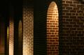
| 05/30/2004 08:48:59 PM |
Arches and Alleywaysby borisonComment: I like the multiple arches and the composition. I gave tis a 6 and would have scored it a little higher if the you had been just a touch luckier on the light, as the middle arch is just a little dark. Nice eye, most people would have walked past this without seeing it. |
| 05/30/2004 08:32:56 PM |
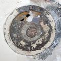
Nothing is safeby eradhelisiComment: Pretty well lit, could use a touch sharper focus but not bad. I'm just not sure you could have done too much to make this subject score really well against the other entries. Might have done well in Rust. |
| Photographer found comment helpful. |
Home -
Challenges -
Community -
League -
Photos -
Cameras -
Lenses -
Learn -
Help -
Terms of Use -
Privacy -
Top ^
DPChallenge, and website content and design, Copyright © 2001-2026 Challenging Technologies, LLC.
All digital photo copyrights belong to the photographers and may not be used without permission.
Current Server Time: 06/11/2026 08:06:58 PM EDT.