| Image |
Comment |
| 04/19/2004 09:12:11 AM |
Green Giantby zwhitleyComment: Take care when exposing sunlit things when there is also a have shadows, this is tricky. Since the background is rather distracting I think you should have used wider apperture to blurr it out and concentrate the focus on the main subject. This can also be tricky in sunlit thing since then you have to use extreamly fast shutter speed and maybe ND-filter or some lightcapturing glass.
To be honest I dont find this image not good or eyecaching and also I find it technically bad. |
 Photographer found comment helpful. Photographer found comment helpful. |
| 04/19/2004 09:06:45 AM |
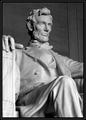
In the Beginingby daveitComment: Think it´s no doubt that people can find strength and power in relegion so the idea is ok. But I think you could have performed this better technically and also with more creativity. |
| Photographer found comment helpful. |
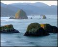
| 04/19/2004 06:02:56 AM |
Strength of Ages: Easter Sunriseby ZoomdakComment: Very good image. Like to see waves on the sea and the lines on the montains. Maybe you should have waited of half an hour or an hour to get some sunshine on the rock in the forground (just a suggestion, I dont know the place so I dont know your situation there)? Did you try to convert it to B&W and increase the contrast?
Fine image. |
| Photographer found comment helpful. |
| 04/19/2004 05:58:29 AM |
Old strength symbolby pisuComment: Good angel and technically very well done. Dont know of shallower DOF would have been better but at least it´s very good as it is. |
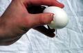
| 04/16/2004 09:57:42 AM |
cracking throughby Cjorgy2oo4Comment: Dont know if the egg is the reprentitation of strenght or is it the hand who brakes it?
To be honest then I think this image is technically hopeless and everything else than eyecaching. The main subject(s) are out of focus and if there is anything in focus than it is the background sheet. Iron it next time.
But dont give up and continue experimenting. |
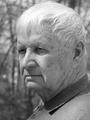
| 04/16/2004 09:53:59 AM |
Dadby basia03Comment: Great portrait which expresses more than just a face of a man. Technically it also seems very good. If I should put in some critique then maybe it seems rather monotonal and if it wasn´t for the hair I think you could increase the contrast a litle. Don´t know if it works in this situation but maybe a polarizing filter would have come in hand to reduce the withe glance of the hair.
But as I said in the begining, very good image. |
| Photographer found comment helpful. |
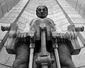
| 04/16/2004 09:48:43 AM |
The Union of Liberty & Humanityby MichelleSComment: The low angel is very proper and good for what you are trying to express and overal the image seems very fine. For my opinion I think the border is to thick and complicated and therby draws the attention from the main subject in stead of fixing it in. |
| 04/16/2004 09:45:52 AM |
Strength In Stoneby reeveyComment: The idea is fine but maybe not very well performed. Maybe a closer angel would have been better and also it has to be sharper for my opinion |
| Photographer found comment helpful. |
| 04/16/2004 07:36:48 AM |
Position of Strengthby radpixComment: Strong hand. The idea is ok and the technical performance is ok too. Maybe the cards needs a litle more sharpness and overal more contrast of the image. |
| Photographer found comment helpful. |
| 04/16/2004 07:34:35 AM |
economic strengthby fstopopenComment: It´s a very good idea to show some powerful tool which also stands for other powers and strength and the image it self is fine. The sky is great but there are some strange blue colored "flairs" (or what to call it) at the edges of the tool, down left (is it a sony F828?). |
Home -
Challenges -
Community -
League -
Photos -
Cameras -
Lenses -
Learn -
Help -
Terms of Use -
Privacy -
Top ^
DPChallenge, and website content and design, Copyright © 2001-2026 Challenging Technologies, LLC.
All digital photo copyrights belong to the photographers and may not be used without permission.
Current Server Time: 07/18/2026 04:18:35 PM EDT.