| Image |
Comment |
| 03/08/2004 05:12:57 AM |
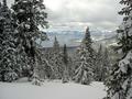
SILENCE Of The SNOWby smfsnowindComment: The clouds and whole of the background is very good but the shadowy forground could be better (although the subject is very nice). Flash would probably not do much in this situation but how about longer exposure (or would it burn out the background)? Or how about B&W? |
| 03/08/2004 05:08:27 AM |
|
 Photographer found comment helpful. Photographer found comment helpful. |
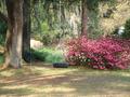
| 03/07/2004 10:36:51 AM |
|
| 03/05/2004 12:05:19 PM |
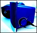
Silent Bluesby EnzoComment: The blue tones and "texture" of the image is fine and relates well to the tile. Othervise its quite difficult to comment and vote for this image. |
| 03/05/2004 12:02:14 PM |
finally quiet caféby KainnonComment: Overall the image seems to be a litle underexposed but their are bright spots on top midle and right wich are litle distracting. Also the glass reflection makes the image litle caotic. |
| 03/05/2004 11:41:50 AM |
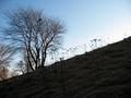
Tall Flowersby AbelianComment: I think that you´ve been trying to ad to much brightness into this image to make the forground visible but the lower sky gets unnatural. Maybe you should have tryed to use some fill in flash. |
| 03/05/2004 11:37:32 AM |
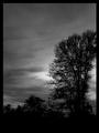
Night Fallby katlynComment: Its seem a litle grainy but that dont have to be distracing when trying to capture some atmosphere. On the other hand the lines (power lines?) are distracting and one of the thing that I think most photographer should try to avoid when taking pictures in the nature. Also I find the border to thick. Borders can make good images better but one has to be carful with them. |
| Photographer found comment helpful. |
| 03/05/2004 11:33:51 AM |
|
| 03/05/2004 08:29:19 AM |
Childs Playby stucknhicktownComment: Colors of the flower shines well throug and you are getting the texture of the trees. Think maybe litle more colorsaturation and maybe more contrast could make this image better. |
| 03/05/2004 08:27:51 AM |
Tranquilityby tolyanchikComment: Good perspective but the sun is not very convincing. Maybe its a litle to contrasted. Think the whitebalance is also a litle to cool. Would have liked to see litle more red and orange insted of blue and purple. |
| Photographer found comment helpful. |
Home -
Challenges -
Community -
League -
Photos -
Cameras -
Lenses -
Learn -
Help -
Terms of Use -
Privacy -
Top ^
DPChallenge, and website content and design, Copyright © 2001-2026 Challenging Technologies, LLC.
All digital photo copyrights belong to the photographers and may not be used without permission.
Current Server Time: 07/16/2026 07:42:29 PM EDT.