| Image |
Comment |
| 07/20/2005 01:02:23 AM |
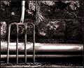
A Hard Day's Workby KonadorComment: Nice composition. Great placment of the pitchfork. The lighting and contrast is well shot. 8 |
 Photographer found comment helpful. Photographer found comment helpful. |
| 07/20/2005 01:01:30 AM |
The Bootby jpetersComment: Great shot. Black and white is perfect for this image. The crop is really well done and the detail of the leather is terrific. I might up the contrast just a touch but otherwise realy nice. 8 |
| Photographer found comment helpful. |
| 07/20/2005 01:00:02 AM |
|
| Photographer found comment helpful. |
| 07/20/2005 12:58:50 AM |
|
| Photographer found comment helpful. |
| 07/20/2005 12:57:12 AM |
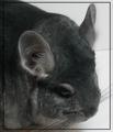
Witheringby mocabelaComment: Awesome use of light and shadow. This is really cool. It pulls your eye in to search around. Seems slightly out of focus to my eye though. |
| Photographer found comment helpful. |
| 07/20/2005 12:56:07 AM |
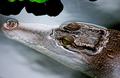
Don't Grab Meby docurrieComment: Great macro. The lighting seems a tad harsh. Maybe due to the time of day. I like the contrast of green ahd the purple/white. Great for the challenge. |
| Photographer found comment helpful. |
| 07/20/2005 12:54:19 AM |
|
| Photographer found comment helpful. |
| 07/20/2005 12:53:59 AM |
The warm soft touch of a new born babyby aKiwiComment: Sweet! This gets the AWWWW factor for sure. Maybe a black background instead of white? Just a suggestion. Nice skin tones . Wish it were a touch more focused or obviously blurred. |
| Photographer found comment helpful. |
| 07/20/2005 12:51:49 AM |
Oasisby zenelfComment: A touch overexposed. Maybe darken the overall shot. |
| Photographer found comment helpful. |
| 07/20/2005 12:49:42 AM |
|
| Photographer found comment helpful. |
Home -
Challenges -
Community -
League -
Photos -
Cameras -
Lenses -
Learn -
Help -
Terms of Use -
Privacy -
Top ^
DPChallenge, and website content and design, Copyright © 2001-2026 Challenging Technologies, LLC.
All digital photo copyrights belong to the photographers and may not be used without permission.
Current Server Time: 07/27/2026 11:12:05 AM EDT.