| Image |
Comment |
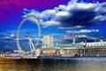
| 07/28/2005 09:10:25 AM |
London Colorsby davidus428Comment: This is truly spectacular. Perfect title. The roundness of the ferris wheel is awesome amidst the blue sky beside the lines of the buildings. Your use of color is perfect. I've not seen a more beautiful sky!! This would make a great postcard. Excellent. |
 Photographer found comment helpful. Photographer found comment helpful. |
| 07/28/2005 09:09:05 AM |
IMG_6719b.jpgby benhurComment: God Save the Queen!!!!
This is really cool. What technique did you use to achieve this look? Very graphic! I like it alot. |
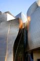
| 07/28/2005 09:03:31 AM |
Guggenheim.jpgby maralomarComment: This is fabulous. Great architecture makes for great photos and you certainly captured this one. The light and tones are lovely!! I might up the blue in the sky for an even more intense image. GOOD JOB. |
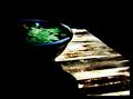
| 07/28/2005 08:58:34 AM |
lillypad.jpgby amberComment: This is lovely. I like the use of shadow and light very much. Maybe tone down the brightness on the wood slats just a touch. Your composition is well done. |
| Photographer found comment helpful. |
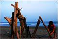
| 07/27/2005 10:22:57 AM |
it takes time to build...by zenelfComment: Nice composition. The child has a touch too much red - but you can desat that out. I like the depth of the blue tones. |
| 07/27/2005 08:55:02 AM |
The days keep raking onby eyeronikComment: I'd zoom in even more and up the contrast a bit. This would be as effective against a solid backdrop to highlight the detail of the tines. |
| 07/27/2005 08:53:16 AM |
Mothers Quilt Making Toolsby woodseyComment: I like the idea of this. I'd remove the price tag and maybe place the thimble and spool on something less textured as it is a tad distracting. I'd be at the same level as them with the camera and really sharpen the focus. This would be quite effective using black and white as well. |
| Photographer found comment helpful. |
| 07/27/2005 08:50:43 AM |
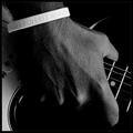
Resoundby aznymComment: Nice one. The detail of the hand and the bracelet is well done. Great use of black and white. This may be one of my favorites (and in this challenge - this is a diamond!) Great composition. |
| Photographer found comment helpful. |
| 07/27/2005 08:49:06 AM |
Paybackby kmanzComment: Great title. Interesting shot and very imaginative. The simple composition works. The one bent nail in the front adds a little "quirk" which is fun. Thanks for an "out of the box" moment. |
| Photographer found comment helpful. |
| 07/27/2005 08:44:12 AM |
Craftsmanby gbautista87Comment: Very artfully done. Great use of line and symmetry. This is very interesting and has a clean graphic feel to it. ONe of the best in the challenge. |
| Photographer found comment helpful. |
Home -
Challenges -
Community -
League -
Photos -
Cameras -
Lenses -
Learn -
Help -
Terms of Use -
Privacy -
Top ^
DPChallenge, and website content and design, Copyright © 2001-2026 Challenging Technologies, LLC.
All digital photo copyrights belong to the photographers and may not be used without permission.
Current Server Time: 05/11/2026 08:35:22 AM EDT.